Are you looking for Modern website color schemes for your websites? Give us a shot!
Have you ever thought about why you like one website more than another? It’s not just about the content, but also the design!
In fact, more than 60% of your decision is based on colors and visuals alone. So, it’s really important to pick the right color scheme for your website if you want it to perform well.
Don’t worry, though! We are here to help you out! Let us walk you through the basics of color theory and show you over 30 examples of modern and unique website color schemes.
We promise it will get your creative juices flowing!
Vibrant And Friendly: Coral And Turquoise
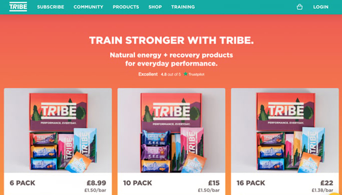
If you’re not sure whether to go for blue or green, why not try something in the middle? Teal is an awesome choice that blends the best of both worlds, according to color theory.
Blue is known for making us feel calm, like taking a deep breath and feeling relaxed. Green, on the other hand, gives us a sense of nature and organic vibes.
If you check out the Tribe website, you’ll notice they use four colors that are evenly spaced on the color wheel, which creates a nice balance and harmony in their design.
Daring And Fun: Bright Red And Yellow
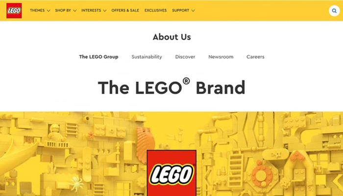
Did you know that yellow is actually one of the most attention-grabbing colors for website design?
Many famous brands like Lego, McDonald’s, KFC, Wendy’s, and Burger King use a combination of bright red and yellow to stand out from the crowd.
I think Lego’s website does an awesome job of incorporating these two bold colors into its design.
By using white space and background, the contrast really makes the colors pop! These two colors, even though they are similar, really complement each other well.
If you use enough white space on the web page, it can result in a really smooth and enjoyable user experience.
Current And Vibrant: White, Black, And Sky Blue
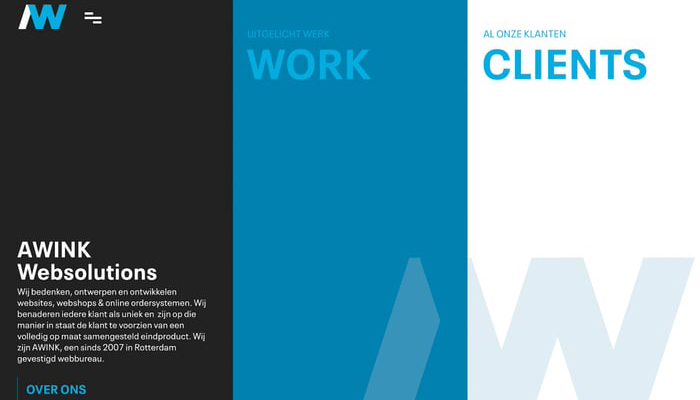
Awink, this Dutch web developer, is doing something cool with their website’s triadic color palette.
They’ve made a sky blue hue their primary color, with different tones of blue, black, and white backing it up.
By sticking to one main color, Awink has created a simple and easy-to-use design.
The main color, combined with other shades, gives a sleek and functional color scheme that’s perfect for web design.
Sleek And Chic: White And Dark Blue

Shaw‘s online store has a really nice look with a combination of dark blue and teal colors on a clean white background, and it just looks really good together.
The blue shades are known to evoke a feeling of peace and productivity, and being a color often preferred by men, it suits the store’s target audience, which is the urban, fashionable, and contemporary man.
Shaw’s web design aptly showcases their understanding of their customers and their preferences.
Moreover, Shaw’s website is not only offering clothes but also a distinct lifestyle and attitude that comes with wearing their products.
Traditional And Immaculate: White And Royal Blue
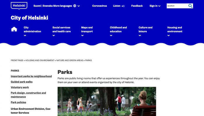
Blue is such a versatile color that can be used in many ways. The City of Helsinki‘s monochromatic website color scheme is a great example of how to use it effectively.
Royal blue is a very calming color and works really well for a city administration website.
It also makes it easier for people to find information on the website.
It’s great that the city is making bureaucracy more enjoyable for everyone!
Opposing And Calm: Coral And Forest Green
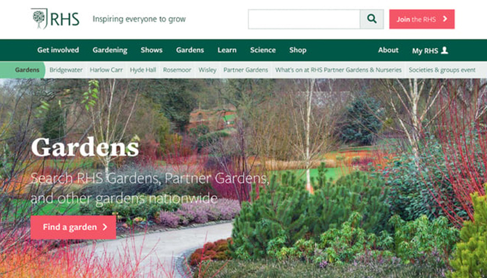
Did you know that using darker shades of green in website design can help businesses in the environmental sector stand out?
That’s because green is often associated with nature, and it helps convey a sense of eco-friendliness.
The Royal Horticultural Society (RHS) is a great example of this. Their website color scheme features earthy greens, which reflect their focus on nature.
And get this: by adding a complementary coral accent color in CTA buttons and ribbons, the RHS draws attention to important information, like upcoming events or membership sign-ups.
The beautiful color scheme reinforces the society’s values and mission, while also being visually appealing. It’s a win-win for everyone, especially for nature-loving folks like me!
Lovely And Coordinating: Dark Blue And Pastel Pink
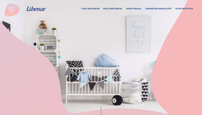
I totally get why you’d say that Libenar‘s website color scheme is rad. There are two things I love about it too!
First off, the use of pastel colors like the super soft pink background gives off a really innocent and cute vibe. It’s perf for showing off stuff made just for kids!
Second, that dark blue color is perfect for highlighting key stuff like CTA buttons and the menu bar, which makes it super easy for users to navigate the site. It’s a really smart move.
Minimalist And Stylish: Dark Grey And Beige
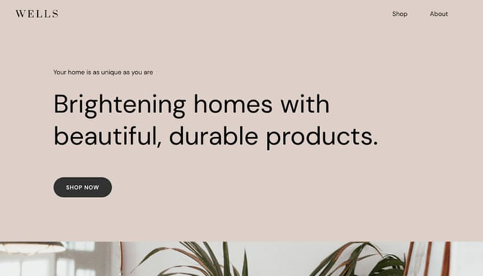
Beige has become quite trendy lately, and it’s a great color to use on websites.
Designers love working with beige and taupe tones because they can feel either cool or warm depending on the surrounding colors.
Beige is particularly ideal for website backgrounds since it doesn’t grab all the attention but instead enhances the other website elements.
Wells, an online store, has adopted a beige color scheme for their website.
By using this color, they’ve made their photography of products and dark CTA buttons unique, making it easier for customers to browse and find what they’re looking for.
Striking And Notable: Red And Grey
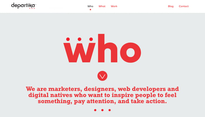
Departika‘s website design is a testament to how less can be more.
By using a neutral color (in this case, grey) as the primary hue, the brand’s bright red accent color stands out and catches the visitor’s eye.
The contrast results in a crisp and modern look, while still maintaining its visual appeal.
If you’re aiming for a website with a lively or daring character, you can create a one-of-a-kind and unforgettable color scheme by using a neutral background color along with a vibrant text color.
Dynamic And Invigorating: Purple Gradient And Light Blue
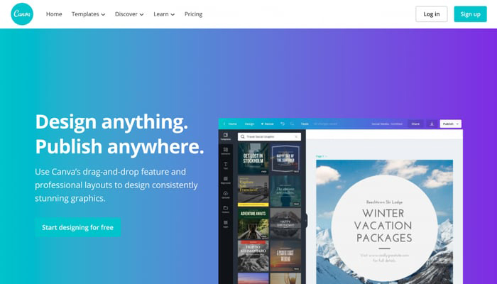
Canva‘s reign in the design world is thanks to their smart use of blues and purples in their signature color palette.
The gradient effect and pastel colors are used to great effect, with Canva blue being an absolute showstopper that’s become almost synonymous with the brand.
Gradients give designers the power to create amazing color schemes that use many different shades and tones of the same color.
Canva’s consistent use of blue is so iconic that the term “Canva blue” is immediately recognized by most graphic designers out there.
Sleek And Minimal: Turquoise Accent, Black And White
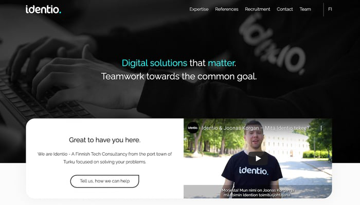
Turquoise and teal might be the go-to colors for many web designers nowadays, especially when combined with white or black backgrounds.
But if you want your website to truly stand out, why not take inspiration from Identio and use your favorite shades as an accent color instead?
This fintech firm knows how to keep things simple yet innovative, with a minimalist web design that only features black, white, and a hint of turquoise.
And trust me, using a limited color scheme like this can lead to some of the best website designs out there, just look at Apple as an example.
Unexpected And Rare: Purple And Beige
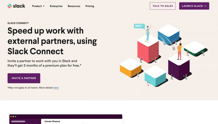
Sometimes, even the most unexpected color combinations can work wonders, and that’s definitely the case with Slack‘s brand colors.
It’s obvious that a lot of care and consideration went into choosing the initial color, which happens to be a lovely shade of purple.
And when you’re competing in the cutthroat world of software-as-a-service, having a memorable and recognizable brand is key.
A good color combination, like the one Slack uses, can help visitors remember your brand and keep coming back for more!
Crunchy And Striking: White And Black
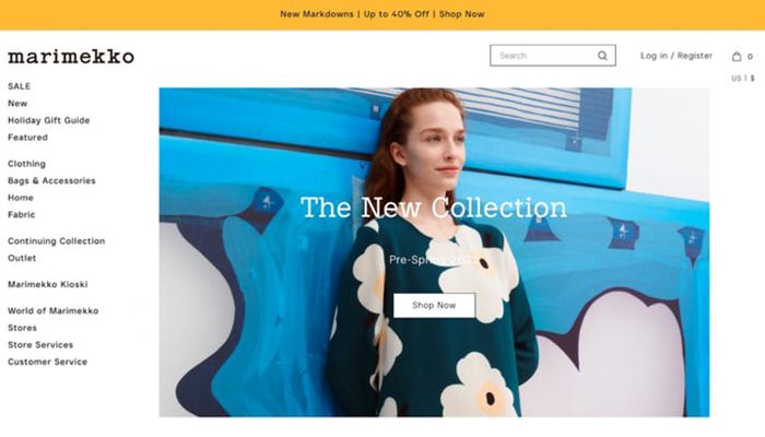
Sometimes, you don’t need to reinvent the wheel when it comes to website design. Marimekko, for example, uses a strict black-and-white design with simple fonts.
Instead of relying on lots of colors and flashy features, they use bright product photos and small pops of color to make their eCommerce website look interesting and dynamic.
This approach puts the focus on its products, which is perfect for any website that wants to showcase what they offer.
Whether you’re running an online store or a portfolio website, a black-and-white color scheme can work well and make your content stand out. Give it a try and see how it works for you!
Serene And Organic: Grey And Olive Green
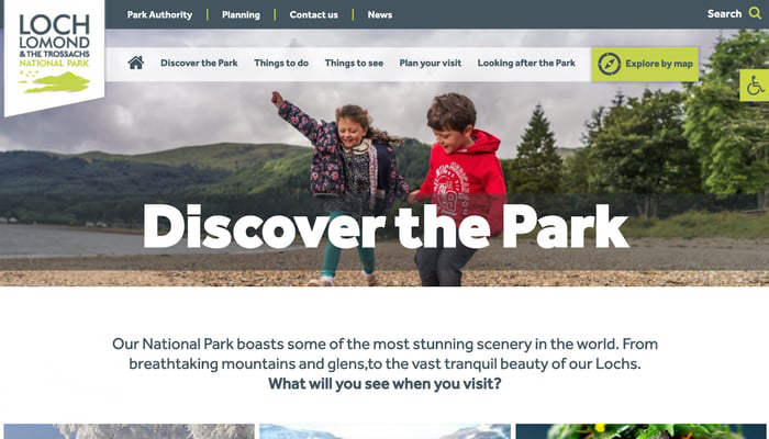
Green is often associated with nature, which is why it’s a great choice for a national park’s website. Plus, science has shown that green has a calming effect on the human brain.
This national park’s website uses olive green paired with neutral grey to create a tranquil color scheme that feels natural and peaceful.
But just because it’s calming doesn’t mean it’s not functional! A green-yellow accent ensures that all the important information is visible and easy to find.
This color scheme is a win-win: it looks great and it works great, all while making visitors feel at ease.
Shades Of Boldness: Gold And Black
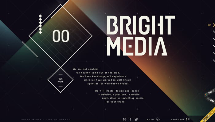
Bright Media‘s website color scheme may sound ironic since it’s primarily based on black. However, this doesn’t mean the website is dull or gloomy.
On the contrary, the website looks sophisticated and upscale thanks to the clever use of muted accent colors and a rainbow gradient that includes green, yellow, red, and blue.
By desaturating these shades, the colors create a subtle but striking effect against the dark background, allowing the gold and white text to stand out clearly.
Courageous And Radiant: Teal Blue And Sunshine Yellow
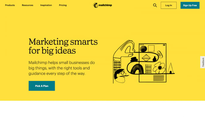
Mailchimp‘s website is a stunning example of how bold accent colors can add life and energy to any design.
By utilizing a striking palette of teal blue and sunshine, the website stands out with its vibrant and refreshing style.
The clever use of white space allows these colors to really shine, while the yellow hue grabs the attention of any visitor.
The teal blue is also cleverly incorporated into the website’s CTA buttons, making them easy to spot and inviting to click.
The color palette is also well-suited to Mailchimp’s brand identity, with bright, cheerful hues that evoke feelings of sunshine, bananas, and tropical jungles.
It’s a fun and engaging color scheme that perfectly captures the spirit of Mailchimp.
Youthful And Energized: Gradient Blue And Bright Orange

While many designs rely on a single color to make an impact, Storyboard takes a different approach with its complementary color scheme.
The vibrant orange is complemented by a cool blue, creating a pleasing contrast throughout the site. Gradients are also used to add depth and interest to the smaller design elements, bringing the pages to life.
To make sure the important buttons stand out, the brand’s signature orange is used for most CTA buttons, providing a pop of color against the muted background of beige and white.
Earthy and Inviting: Yellow, Green, And Red

If you’re struggling to choose just one color for your graphic design, why not take a cue from Todoist and use all of them?
A triadic color scheme can give your website a vibrant and engaging look, with endless possibilities for combining and contrasting different hues.
In Todoist’s case, the primary color is red, but they’ve also incorporated shades of yellow and green throughout their site, bringing each section and illustration to life in a unique and eye-catching way.
Generous And Elegant: Grey And White
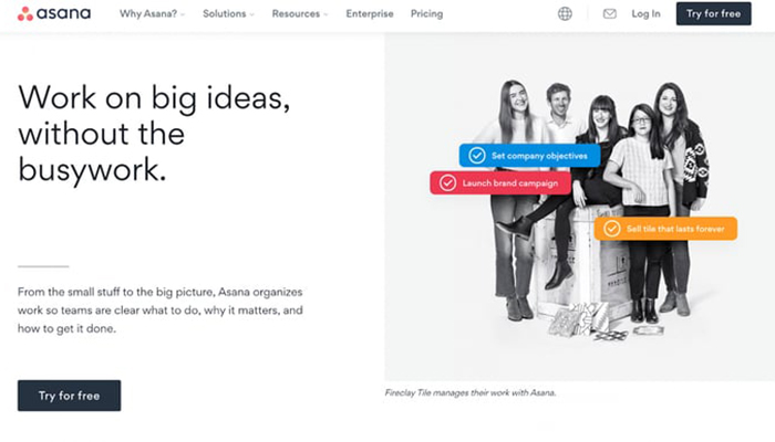
Sometimes, website color schemes don’t have to be bold or unexpected. By choosing a neutral palette, you can create a feeling of openness and lightness on your website, just like Asana did with their site.
Asana’s color scheme is simple and clean, appearing not just in their web design, but also in their hero images.
Asana’s product benefit snippets are the sole source of vibrant hues, brilliantly highlighting the reasons why users should opt for Asana.
These snippets are designed to resemble the tasks in Asana’s product management tool, complete with matching colors.
Funky Feline Fun: Pink And Orange

Have you met the fabulous and flamboyant Pablo the Flamingo? You’ve got to check him out! His website is a perfect example of how to create an eye-catching color scheme that’s both analogous and triadic but with a unique twist!
Using pink and orange hues that sit harmoniously next to each other on the color wheel, Pablo’s website looks naturally stunning. But he doesn’t stop there! He adds a pop of turquoise blue to grab visitors’ attention and add that extra oomph!
After all, Pablo is simply too fabulous to be ignored! Let’s take inspiration from this flamboyant flamingo and create website color schemes that are as striking, unique, and perfect as he is.
Organic And Subtle: Moss Green And Olive

If you’re searching for a refined website color palette, look no further than Namale‘s stunning example!
This jewelry entrepreneur has crafted a seamless and avant-garde mood board website that’s sure to impress with its well-curated color scheme.
The harmonious combination of beige, olive, and moss-green hues is visually appealing, and the ample white space allows the product images to take center stage.
The muted greens evoke a sense of tranquility, creating a serene and captivating browsing experience for visitors.
Perkily And Playful: Red And White
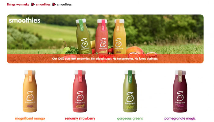
Innocent, the popular drinks brand, makes clever use of white space and color themes to keep its branding fresh and engaging.
The brand palette is primarily white and red, but the company employs a variety of techniques to keep it visually interesting.
By using plenty of white space, the colors of individual products pop, and the brand aligns the color of the product with its accompanying text.
For example, visitors can expect the “seriously strawberry” smoothie page to be adorned in red or the “gorgeous greens” page to be filled with lush green hues.
The result is a visually cohesive and aesthetically pleasing website that is easy to navigate and visually stimulating.
Polished And Reliable: Cornflower Blue And Turquoise
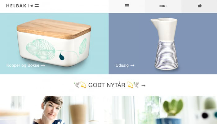
Choosing the right colors for your website is important as it will reflect your business.
Take, for example, the e-commerce site Helbak, which uses a calming blue color in its design to create a unique shopping experience that fits its brand perfectly.
One cool thing is that the colors they use in their website design are also used in many of their products, which makes everything look consistent and cohesive, just like they want it to be according to their brand style guide.
Helbak showcases how thoughtful branding can streamline not just the website design, but also the overall brand identity, making it a shining example to follow.
Sleek And Energetic: Black And Hot Pink

It’s all about the color schemes! The best ones make sure the text is easy to read on any post and screen. But combining colors can be tricky, especially with bright hues like pinks.
Klarna, though, they’ve got it down pat! Their website color scheme rocks a bold pink that dominates the design, with black and white used for CTAs and type.
It’s a great reminder that you don’t need a gazillion different shades to make your website design shine. Sometimes a strong base color does all the heavy lifting.
Colorful Nostalgia: Red, Blue, And Black

HAUS definitely knows how to create an impact with their triadic website color scheme!
The bold reds and blues they’ve chosen are truly eye-catching, yet the overall design still maintains a sense of openness and airiness.
How do they do it? Well, they cleverly use lots of blank, white space and keep their copy sections short and sweet.
This creates a perfect balance with vibrant colors, making the design eye-catching and intriguing!
Streamlined And Harmonious: Baby Blue, Navy Blue, And Red
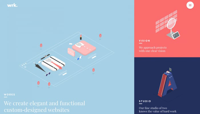
The website design team from France has done an amazing job with their choice of colors!
They’ve combined two main colors in a really cool way, using contrasting shades that make the website stand out.
The colors look especially striking against a calming blue background.
The harmonious interplay of red and blue gives the design a striking yet familiar feel. The saturation levels are perfectly balanced, ensuring that the white text stands out and remains easy to read across the site.
Vibrant Contrast: White And Yellow
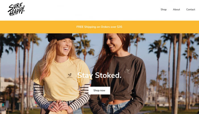
Are you searching for the perfect color scheme that truly captures your company’s mission and values? Look no further!
Let me tell you about Surf Happy, the groovy t-shirt and apparel store. Their bright yellow, sunkissed photography totally vibes with their sunny San Diego roots, bringing those good vibes to life.
The color palette is totally rad and totally aligned with their mission of creating a safe and happy space for surfers, so everyone can ride those waves with a smile.
Rejuvenating And Memorable: White And Burnt Orange
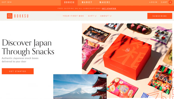
So, you know how there are subscription boxes for everything these days, even snacks? Well, Bokksu, the Japanese snack box brand, is totally different! They didn’t go for the typical cute anime box with KitKats.
Instead, they chose this bright and fiery orange color that’s super memorable and energizing!
And they balanced it out with chill neutral colors like white and beige, so the whole website looks attention-grabbing without being overwhelming.
Revitalizing And Contemporary: Pink And Dark Purple
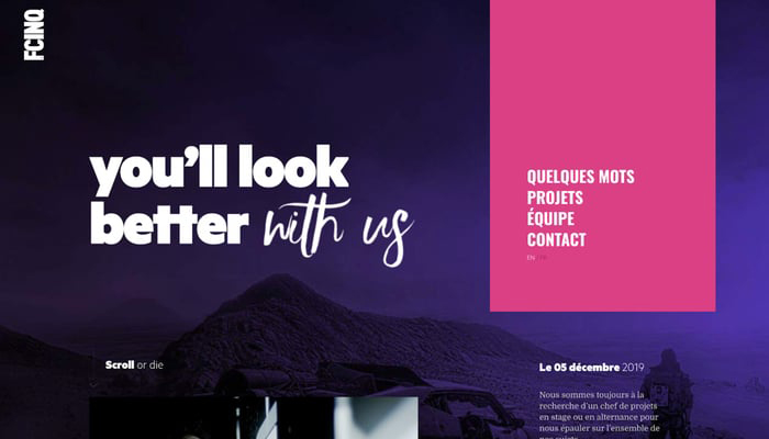
If you’re yearning to design a website with a captivating, mysterious ambiance and a burst of vibrant color, look no further than FCINQ!
This French design studio has crafted one of my favorite dark website color schemes that are sure to capture the user’s attention from the moment they land on the site.
An analogous color scheme is a star here, with shades of purple and pink that could easily be found together in nature, just like warm-hued flowers!
To achieve this look, choose a dark color that you adore and use a color palette generator!
Sometimes you might come across a mix of colors that look really bright and beautiful, and they also seem to go together really well, while at the same time creating a big difference between them!
Vibrant And Amusing: Pink Hues and Bright Green
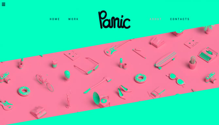
Panic, a creative design and animation studio, has nailed the art of capturing attention with their website. Their color scheme is far from ordinary, featuring lively shades of green and pink that instantly draw the eye.
They don’t need any additional accent colors because these vibrant tones speak for themselves.
This bold and fun approach communicates to visitors that Panic’s brand is all about creativity, playfulness, and taking risks. It’s a clever strategy to stand out in a crowded online landscape and leave a memorable impression.
Using bright colors in web design can be a powerful way to convey your brand’s personality and make a statement that sets you apart!
Gentle And Ethereal: Blue Pastels And Pink
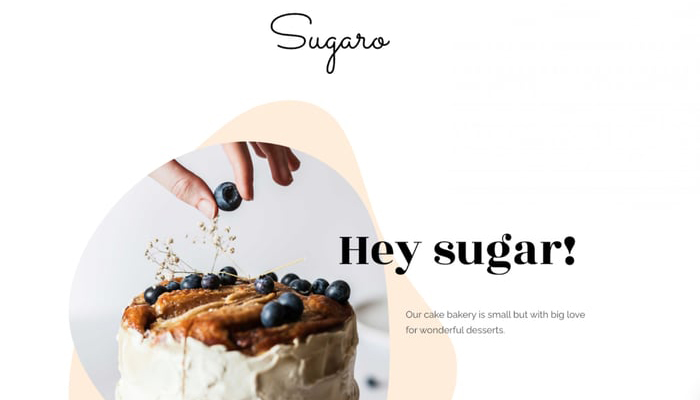
When it comes to bakeries, we usually think of all things sweet and scrumptious, right? So, it’s no surprise that pastel colors work like magic for bakery website color schemes!
Just like in the design of Sugaro, where soft colors are used to subtly mimic and emphasize the café’s delicious product photography. And when paired with the right font, it’s a whole package.
Sugaro’s elegant cursive font is the perfect finishing touch, adding an extra layer of charm to their website design!
Fresh And Innovative: Turquoise And Bright Blue
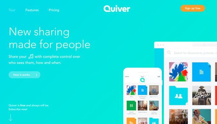
Quiver‘s landing page has a cool color scheme that’s really calming. When you arrive, you’re greeted with a background in turquoise and light blue that makes you feel at ease and helps establish trust right away.
It’s a smart choice for a company that focuses on secure file sharing because it instantly conveys a sense of reliability.
Plus, the colors they’ve chosen for their website have a modern, youthful vibe that’s also techy. It’s a winning combination!
Secretive And Royal: White And Pastel Purple
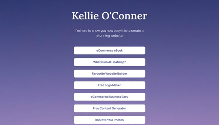
Sometimes, simplicity is key when it comes to choosing colors for your design. Take this landing page as an example. The gentle hue of pastel purple used in the background adds an element of mystery and excitement.
The contrast with the dark base color makes the white text and buttons easy to see and follow, without distracting the visitor from the intended marketing message.
It’s all about creating a seamless and effective user experience.
Energetic And Vivid: Blue And Orange Accents

Don’t hesitate to play with different colors for your website’s color scheme!
The landing page for the ‘A Short Journey’ project is a great example of how shades of orange and blue can work together harmoniously.
Even though it may seem like an unlikely combination, when used with vibrant colors, it really catches the eye of visitors.
By using orange as a background color, the other elements on the website stand out and draw attention.
The creators of the website deliberately want visitors to focus on items that contrast against the bright orange hues.
It’s a clever use of color to create an energetic and captivating design that leaves a lasting impression.
Fresh And Unadulterated: White And Dark Green
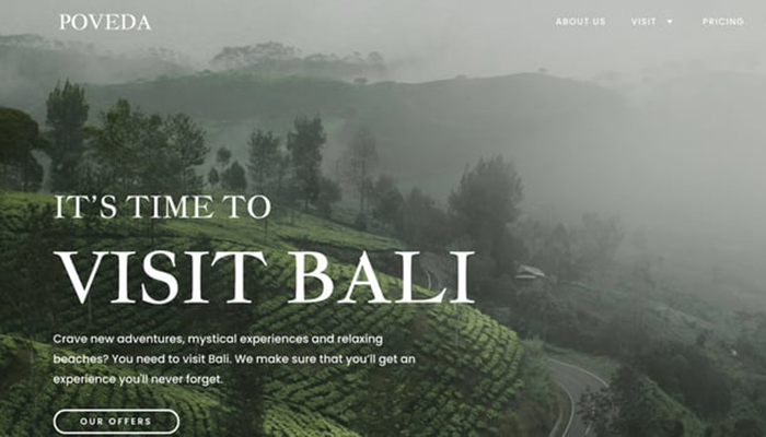
When choosing colors for your business, it’s important to consider what’s appropriate for your industry. For instance, take the travel agency Poveda as a great example.
They’ve cleverly used lush green shades reminiscent of Balinese forests in their web design, which creates a captivating visual representation of the travel experience they offer.
This clever approach allows them to market the ambiance of their trips even before visitors make a decision to book.
It’s a strategic way to capture the attention and interest of potential customers right from the start.
Innovative And Avant-garde: Teal And Cool Blue
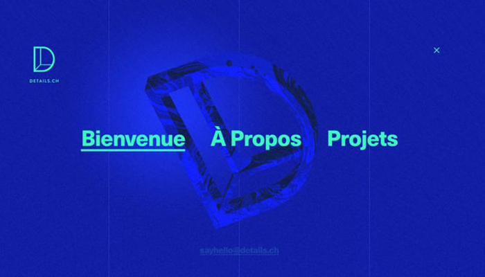
Do you want your brand to instantly look like a top business partner? This creative agency knows exactly how to create that impression.
With eye-catching hues and a sleek website design, they exude a confident, trendy, and edgy vibe to potential customers.
Despite blue typically being associated with tranquility and peace, Details, the agency, utilizes it to symbolize stability and dependability in a distinctive manner.
Choosing a bold color is a smart move for Details because it shows that they are a professional and talented creative agency.
They are using the psychology of colors in a clever way to make their brand image more attractive and to prove to people who visit their website that they know what they’re doing.
Trendy And Exploratory: Purple And Neon Blue
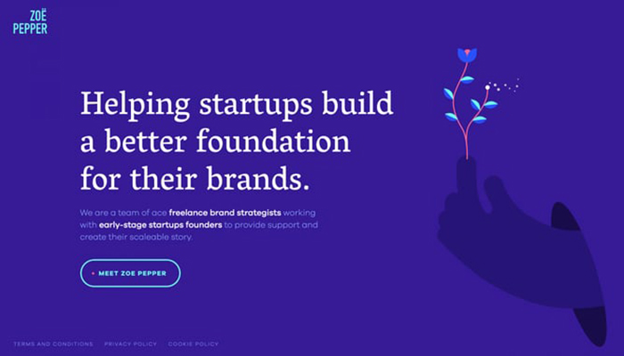
On Zoe Pepper‘s portfolio website, the color scheme is both sleek and experimental. The site features a unique combination of bright colors alongside muted blues and purples.
The clever use of a single purple color in the background allows the illustrations, which are done in a similar style, to seamlessly blend in and add depth to the landing page.
The darker background of the website provides a great backdrop for a lively accent color to pop. They chose a bright blue for buttons, icons, and the logo, which adds a bold touch to the design without being too loud.
This adds to the variety of colors used on the site and makes a strong impression on visitors.
It’s a powerful color scheme that truly grabs attention and sets Zoe Pepper’s portfolio site apart.
Elegantly Understated: Black And Lime Green
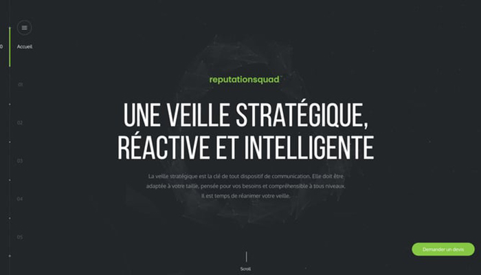
When you visit ReputationSquad‘s website, you might think they’re using only one color at first. But if you explore further, you’ll notice that they’ve actually chosen some smart primary and secondary colors.
By using a vibrant lime green hue for their CTA sections and buttons, they make them really stand out against the dark background.
This clever use of color helps guide users and makes it easy for them to find and interact with those important buttons.
Delicate And Charming: White And Pale Pink
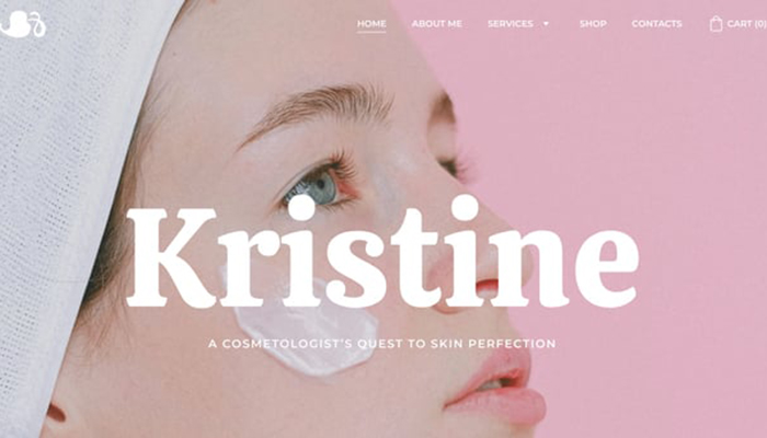
It’s also a good idea to consider your ideal customers when choosing your website’s color scheme, just like this cosmetologist’s site does.
This website is designed to appeal to young women, so it uses soft pinks and other skin tones to create a feminine and youthful look.
To choose the perfect colors for your site, it’s important to stay updated on color trends in your industry and understand the color preferences of your ideal customers.
Conclusion on Modern Website Color Schemes
When it comes to choosing the perfect color scheme for your website, it’s all about expressing your unique style and personality while keeping your customers happy!
You’ve got some great options above! If you want to create a vibrant and friendly feeling, you can combine coral and turquoise! For a sleek and classy look, white and dark blue can be a perfect choice! If you love the traditional and perfect feel, white and royal blue can do the trick!
For something bold and fun, you can choose bright red and yellow! If you want to keep it modern and vibrant, white, black, and sky blue can make a splash! And if you’re looking for something contrasting and calm, the coral and forest green can make a great contrast!
Whatever color scheme you choose, remember to have fun and express yourself. Happy website design!
Contact US | ThimPress:
Website: https://thimpress.com/
Fanpage: https://www.facebook.com/ThimPress
YouTube: https://www.youtube.com/c/ThimPressDesign
Twitter (X): https://x.com/thimpress_com


