Storepify is our very first Shopify theme that we have put so much time and effort into. To keep it up-to-date and better our Storepify users’ experience, we would love to deliver a big update – Storepify v2.0. Let’s go find them, shall we?
Storepify v2.0 Update Detail
Well, it’s time to discover what will come up in this next version. This is Duke and I will personally lead you through new features.
New Demo Outlook
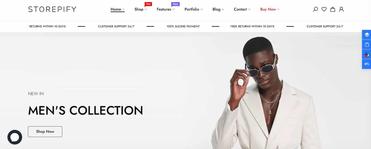
With our users, you must have been very familiar with the light tones including white (#FEFEFE & #FFFFFF) and light grey (#F3F3F3). Also, the space between pages in the Menu bar is quite far from each other, and the “STOREPIFY” logo is quite thin, too.
Then, here is the Storepify 2.0! With the intention to make things a little bolder, we have added a new Storepify logo with the main purple color scheme (#5B5091, #4B3B9B, #48389B, & #483B8B). The UX/UI has become minimalist and distinctive. Also, we have pulled all elements in the Menu bar closer – we shouldn’t be afraid of COVID-19 anymore, right?
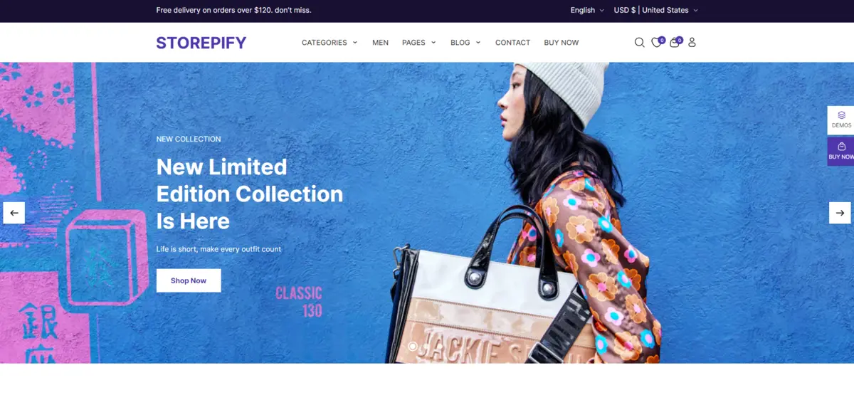
In case you wanna check the new demo, you can access it here with the password to the store as “1” – yeah, just “1”.
Some Significant Changes About Loading Speed
In this update, we have made various improvements to make the theme run faster and more user-friendly. Therefore, your sites using Storepify will have better loading speed.
Upsell Bundle
We would love to introduce you the new feature “Upsell Bundle” – a powerful widget to boost your sales and conversion rates. You may find how to set up an upsell bundle in the Upsell Product Bandle documentation so I will how you an example of it below.
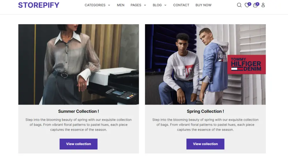
From above, I have mentioned how to access the new store demo, right? Scroll down a little, and you will see 2 collections – feel free to choose one of them, or just randomize your choice.
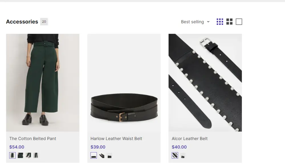
Then, you will see about 10 premade Bundles – it’s your wide choice to see the products, again! For example, I will go on with the “Accessories” bundle, and you will see many products inside. This might bring more related goods to the customers, and they tend to buy things that share the same categories or simply the same places.
Right To Left (RTL) Support
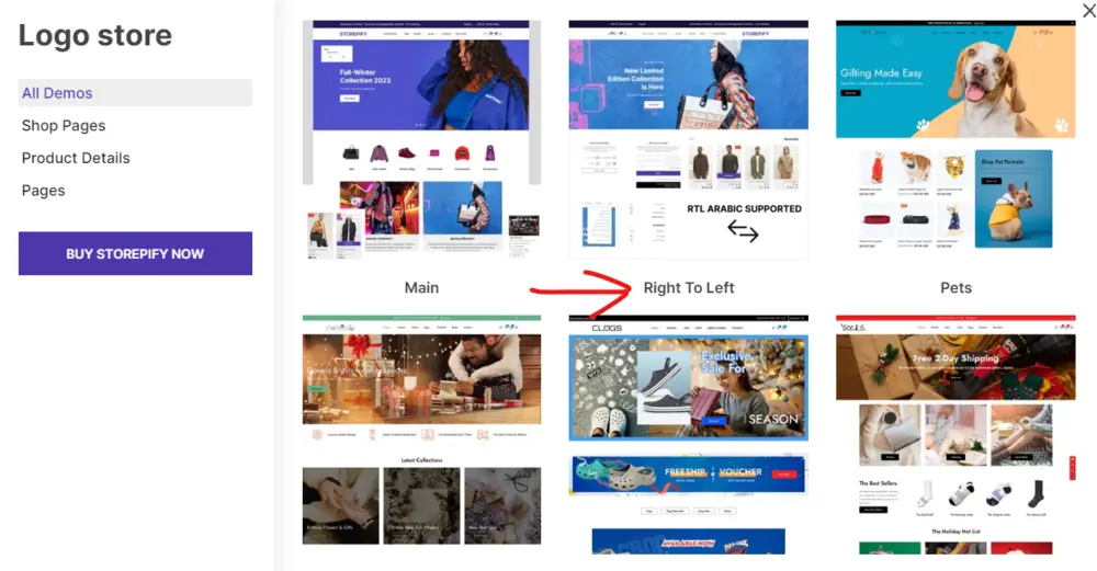
We usually go from left to right, like 95% of everything, right? What about the remaining 5%, will you just gotta leave ’em there? Nah, we have a solution for you: Right to Left option. To view this demo in Storepify v2.0, in our store demo, you will click on “Demos” and choose “Right to Left”.
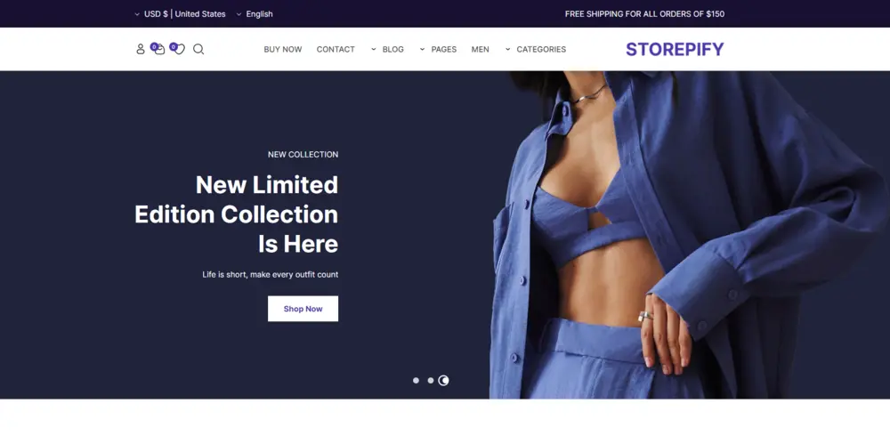
Then, the interface will become RTL instead of LTR, like this:
Menu Labeling
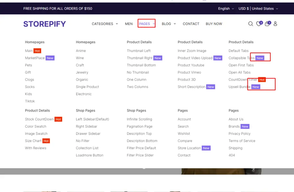
To enhance your site’s accessibility & usability, we will present you with the feature “Menu Labeling” in Storepify v2.0. Now, you can label your menus which helps the audience find the wanted locations or categories. Those results will be shown in a more reasonable & smoother way.
Short Descriptions for Product Details
A well-presented product will require many factors such as a nice product image, an attractive name, price, and some widgets. Hence, let us help you with the feature “Short descriptions for product details” in Storepify v2.0. After enabling the option, you can add a short description of each product to provide your customers a precise and informative short snippets about the product itself. Then, the customers can preview the main features of the product without clicking it, saving them tons of time and effort.
Conclusion
That should be all for the latest version of Storepify – Storepify v2.0. In case you need some help or love to find out more about this product, you can find us or our documentation to solve your problems. I hope you will enjoy a walkthrough of our new features & improvements in Storepify v2.0.
ThimPress Development Team
Contact US | ThimPress:
Website: https://thimpress.com/
Fanpage: https://www.facebook.com/ThimPress
YouTube: https://www.youtube.com/c/ThimPressDesign
Twitter (X): https://x.com/thimpress_com
