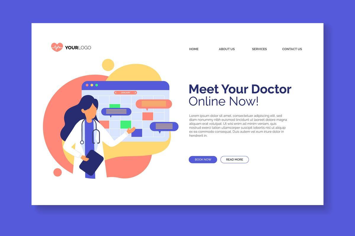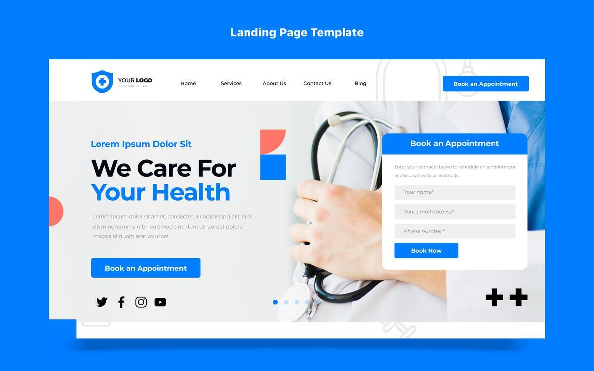
A mother with chronic back pain finds your chiropractic clinic online late at night. She scrolls for answers but leaves within seconds because your website feels cluttered, and the booking button is hard to find. That lost click could have been a new patient.
This happens more often than you think. Nearly 90% of people check providers online before scheduling, and with over 35 million Americans seeking chiropractic care each year, your site is often the first and only chance to earn trust. A professional design isn’t just decoration; it’s what guides visitors toward scheduling an appointment.
The question is whether your website makes that journey effortless, or if it drives patients away before they ever meet you.
6 Website Design Ideas to Turn Clicks Into Appointments
1. Simplify Navigation to Guide Patients Quickly

A visitor should never have to think twice about where to click next. Simple menus with options like “About,” “Services,” “Book Now,” and “Contact” create a clear path, while long dropdowns only slow people down. Patients are often looking for fast answers, and when they can’t find them, they leave.
Even small details, like a search bar or a visible appointment button, can make the difference between booking and bouncing, and ChiroMatrix notes that practices with cleaner navigation tend to see more patients book online because the process feels natural and easy to follow.
2. Optimize for Mobile and Speed
Most people looking for a chiropractor are searching on their phones, which means your site has to work flawlessly on small screens. Responsive design with tap-to-call buttons and mobile-friendly booking forms ensures patients can act right away. The mobile version should carry the same look and feel as your desktop site, so your brand identity stays consistent no matter the device.
Speed matters just as much as layout. Research shows that half of visitors will leave if a page takes more than 6 seconds to load, and Google ranks slower sites lower in search results. Compressing images, trimming excess code, and cutting down on redirects can all keep your pages fast, helping you earn patient trust before the first appointment is even scheduled.
3. Highlight Patient Testimonials and Success Stories
Patient testimonials are one of the strongest trust signals you can add to a chiropractic website. When people read about real experiences, they feel more confident about booking their own appointment.
Stories that walk through a patient’s challenge and recovery create an emotional connection that plain facts rarely achieve. Marketing research has found that information tied to a story is 22 times more likely to stay in memory, which explains why these narratives are so effective for clinics.
Placing testimonials on your homepage and service pages provides proof of results, while video clips or before-and-after visuals add even greater impact. Always keep HIPAA compliance in mind so patient stories build trust without putting privacy at risk.
4. Add Clear and Persistent Booking Buttons

Nothing frustrates a patient more than wanting to schedule an appointment but not finding where to click. A clear “Book Now” button should be visible at the top of your homepage, on service pages, and even in the footer, so it’s never out of reach. Using a contrasting color helps it stand out while still fitting your brand’s style.
The path from button to booking page should be direct, without extra clicks or generic contact forms. Adding secondary options, like a “Learn More” link, can guide visitors who are still exploring before they commit. This layered approach works well because it supports both patients who are ready to book immediately and those who want reassurance first.
5. Streamline Online Forms for Easy Conversions
Online booking should feel quick, not like filling out paperwork at the doctor’s office. Patients are far less likely to finish a form that asks for too many details, which is why collecting only essentials such as name, contact information, and preferred time works best. Cutting the clutter makes the path to booking simple.
Once the form is submitted, a confirmation email adds reassurance by showing the appointment is secure while also reminding patients of key details like date, location, and preparation instructions. Form design also plays a role. Mobile-friendly fields that are large enough to tap comfortably reduce errors and frustration.
6. Showcase Chiropractic Services with Engaging Visuals
Words can explain what you do, but patients often connect faster when they can see it. Photos of your team, the clinic interior, and even real treatment spaces give visitors a clear picture of what to expect. This sense of familiarity makes the first visit feel less intimidating.
A short clip showing how spinal adjustments are performed or how a wellness program works can turn something that feels uncertain into something approachable. Many practices use video because it helps explain care while also showing the human side of the clinic.
To make visuals work behind the scenes, add descriptive alt text to images. It improves accessibility and supports search visibility, helping more people discover your chiropractic website while also staying engaged long enough to book.
Conclusion
A chiropractic website should make every step simple. Clear navigation, mobile-friendly design, patient stories, visible booking buttons, short forms, and strong visuals all work together to guide visitors toward scheduling. Each choice matters because patients leave quickly if the process feels confusing.
Your site is often the first interaction people have with your practice. When it feels welcoming and easy to use, they are more likely to schedule. Smart design does more than create a polished look. It builds trust, turns interest into confirmed appointments, and helps your practice grow in a consistent, lasting way.
Read more: Discover the Stunning New UI of the Eduma Mega Menu
Contact US | ThimPress:
Website: https://thimpress.com/
Fanpage: https://www.facebook.com/ThimPress
YouTube: https://www.youtube.com/c/ThimPressDesign
Twitter (X): https://x.com/thimpress_com
