Have you ever looked at a design and felt it just works? That feeling isn’t accidental. It’s the result of fundamental principles that guide every great visual composition.
These core graphic design principles—like contrast, balance, hierarchy, and repetition—are the essential building blocks for creating work that is both beautiful and effective. They are the rules that help you turn your ideas into clear, compelling visuals.
In this guide, we’ll walk you through each of the 12 key principles of graphic design. We won’t just define them; we’ll show you how to use them with practical tips and clear examples.
Whether you are just starting your design journey or looking to refine your skills, understanding these basics will completely transform your work. Let’s begin.
Eduma – Education WordPress Theme
We provide an amazing WordPress theme with fast and responsive designs. Let’s find out!
What Are the Principles of Graphic Design?
The principles of graphic design are the rules and techniques designers use to arrange visual elements in a way that communicates clearly and looks professional. These principles work together with the elements of design, such as line, shape, color, texture, and space.
In simple terms, the elements are the building blocks, while the principles are the rules for arranging those building blocks effectively.
Why Graphic Design Principles Matter
Understanding graphic design principles helps you:
- create more visually appealing layouts
- improve readability and usability
- guide the viewer’s eye to important information
- maintain consistency across designs
- strengthen brand identity
- make your content more effective
Strong design is not only about looking good. It is about helping people understand a message quickly and easily.
Contrast: Creating Visual Interest
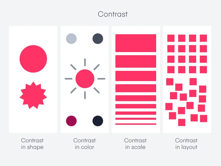
Contrast is one of the famous principles of graphic design.
It’s the use of opposing elements to create visual distinction and draw attention.
It can be achieved through:
- Color: Use light and dark colors, complementary hues, or contrasting shades to make elements stand out.
- Size: Vary the size of elements to create emphasis. Larger elements naturally dominate the viewer’s attention.
- Shape: Combine different shapes (geometric vs. organic) to create visual intrigue.
- Texture: Use smooth textures alongside rough or patterned ones to add depth and interest.
- Typeface: Pair contrasting fonts (serif and sans-serif, bold and light) to enhance readability and create visual hierarchy.
How to Use this Graphic Design Principle:
- Highlight key information: Use contrast to emphasize important text, headlines, or call-to-action buttons.
- Guide the viewer’s eye: Lead the viewer through your design by strategically contrasting elements to create a visual path.
- Add visual appeal: Even subtle contrasts can make a design more dynamic and engaging.
Balance: Achieving Visual Harmony
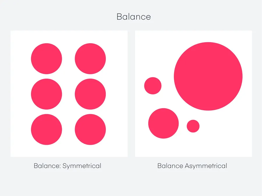
Balance refers to the distribution of visual weight in a design.
It creates a sense of stability and harmony.
There are two primary types:
- Symmetrical Balance: Elements are mirrored on either side of a central axis, creating a formal, ordered look.
- Asymmetrical Balance: Elements are distributed unevenly but still achieve a sense of equilibrium through careful placement and visual weight adjustments.
How to Use this Graphic Design Principle:
- Create a sense of order: Symmetrical balance is ideal for designs that need to feel stable, traditional, or elegant.
- Add visual interest: Asymmetrical balance can be more dynamic and modern, creating a sense of movement and energy.
- Experiment with both: Don’t be afraid to combine symmetrical and asymmetrical elements to create unique and visually compelling compositions.
Emphasis: Directing the Viewer’s Attention
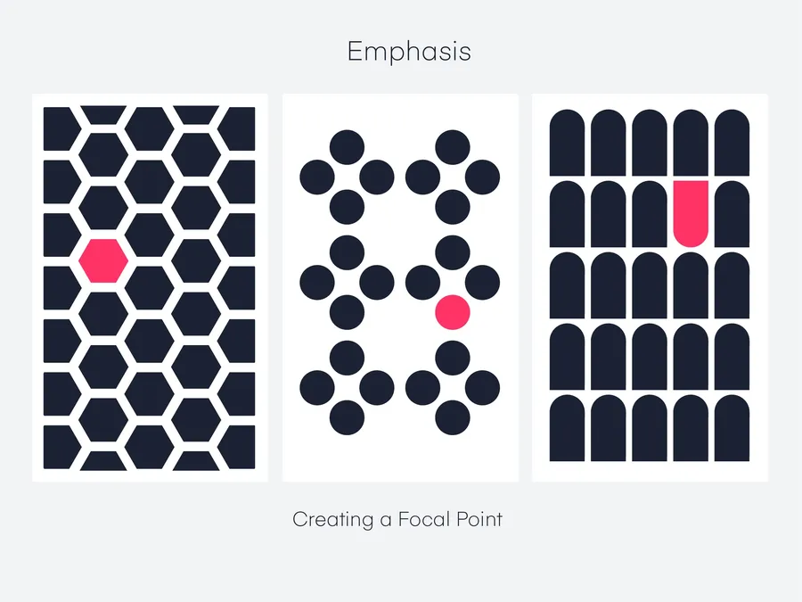
Emphasis is the technique of making certain elements stand out as focal points within a design.
It draws the viewer’s eye to the most important information.
- Size: Larger elements naturally attract more attention.
- Color: Bold or contrasting colors can highlight key elements.
- Isolation: Placing an element in an otherwise space makes it pop.
- Placement: Elements at the top or center of a design tend to be noticed first.
How to Use this Graphic Design Principle:
- Clear communication: Emphasis ensures that your main message doesn’t get lost.
- Visual hierarchy: Combine emphasis with the principles of hierarchy to create a clear visual order.
- Call to action: Emphasize buttons, links, or other interactive elements to encourage user engagement.
Hierarchy: Guiding the Viewer’s Focus
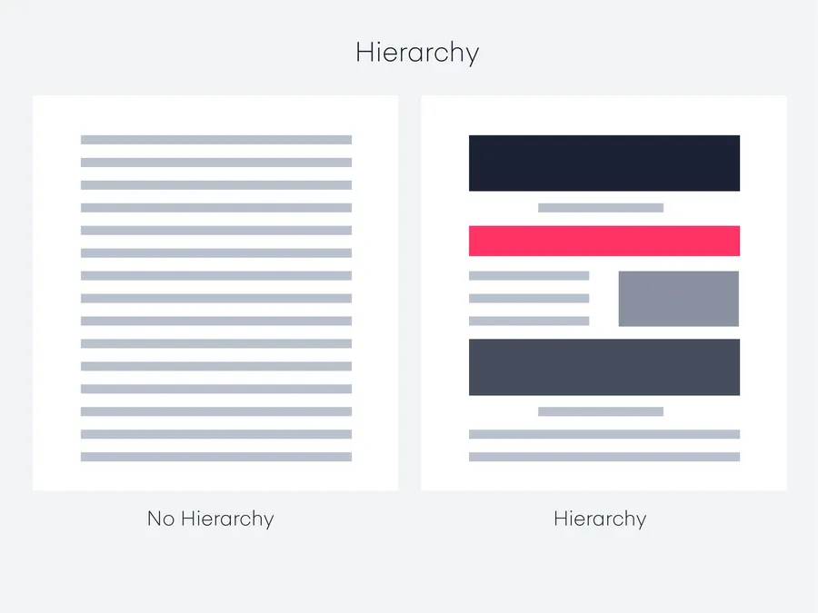
Hierarchy is the arrangement of elements to indicate their relative importance.
It helps the viewer understand the order in which information should be consumed.
- Size and Scale: Larger elements naturally command more attention, so use size to establish the most important elements.
- Placement: Elements at the top of a design or in the center tend to be noticed first.
- Color and Contrast: Use bold colors or high contrast to draw the eye to key elements.
- Typography: Choose different font sizes, weights, and styles to create a clear hierarchy within the text.
How to Use this Graphic Design Principle:
- Organize information: Use hierarchy to structure complex information so that it’s easy for the viewer to digest.
- Create a visual flow: Guide the viewer’s eye through your design by strategically placing elements in a hierarchical order.
- Ensure clarity: Make sure your most important message is the most prominent element in your design.
Repetition: Creating Unity and Rhythm
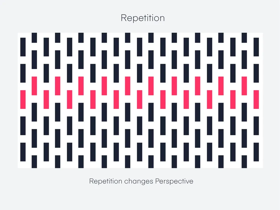
Repetition involves the intentional reuse of visual elements—colors, shapes, lines, textures, or even typographic styles—throughout a design.
This technique serves several vital purposes:
- Unity: Repeating elements create a sense of cohesion and connection, tying disparate parts of a design together.
- Recognition: Repetition helps viewers quickly identify and associate with a brand or concept.
- Rhythm: The recurrence of elements establishes a visual cadence, guiding the eye and adding energy to a design.
- Emphasis: Selective repetition can highlight specific elements, making them stand out.
How to Use this Graphic Design Principle:
- Brand consistency: Use repetition to reinforce brand identity through consistent use of logos, colors, and fonts.
- Visual interest: Repeating patterns or motifs can create engaging backgrounds or decorative elements.
- Navigation: Repeated icons or visual cues can guide users through a website or app.
- Emphasis: Repeat key elements (like call-to-action buttons) to draw attention.
Alignment: Establishing Order and Structure
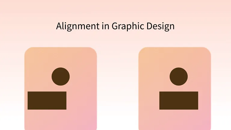
Alignment refers to the precise positioning of elements along invisible lines or grids.
It creates a sense of order, organization, and visual harmony.
- Grids: A grid is a framework of horizontal and vertical lines that help designers align elements consistently.
- Edges: Aligning elements to their edges (left, right, top, bottom) creates a clean, structured look.
- Centers: Center alignment can be used for emphasis or to create a formal, balanced aesthetic.
How to Use this Graphic Design Principle:
- Professionalism: Alignment gives designs a polished, intentional appearance.
- Readability: Aligning text blocks improves readability and makes content easier to scan.
- Visual flow: Alignment guides the viewer’s eye through a design, creating a clear path.
White Space: Breathing Room for Impact
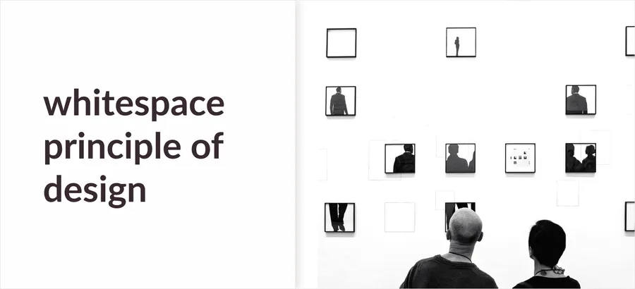
White space, also known as negative space, refers to the empty areas within a design.
It’s not merely blank space; it’s a powerful tool that can:
- Improve readability: Ample white space around text makes it easier to read and comprehend.
- Create focus: White space around key elements draws attention to them, making them stand out.
- Enhance elegance: Generous use of white space can create a sophisticated, minimalist aesthetic.
- Balance visual elements: White space counteracts busy areas of a design, creating visual harmony.
How to Use this Graphic Design Principle:
- Margins and padding: Utilize generous margins around the edges of your design and padding between elements.
- Line spacing: Increase the space between lines of text to improve readability.
- Visual breaks: Insert white space between sections of content to create visual separation.
- Emphasis: Surround important elements with white space to highlight them.
Proportion: Achieving Visual Harmony Through Scale
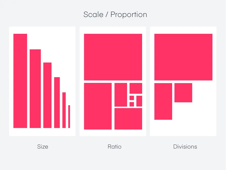
Proportion is another graphic design principle.
It’s the relative size and scale of elements within a design.
It creates visual relationships that can be:
- Harmonious: Well-proportioned elements feel balanced and pleasing to the eye.
- Dramatic: Exaggerated proportions can create a sense of drama or emphasis.
- Hierarchical: Varying proportions can establish a visual hierarchy, indicating the relative importance of elements.
How to Use this Graphic Design Principle:
- The Golden Ratio: Consider using the Golden Ratio (approximately 1:1.618) as a guide for harmonious proportions.
- Rule of Thirds: Divide your design into thirds both horizontally and vertically, and place key elements at the intersections.
- Scale: Experiment with different sizes and scales to create visual interest and hierarchy.
Proximity: Guiding Relationships Through Placement
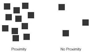
Proximity is the principle of grouping related elements close together.
It helps to:
- Organize information: Elements placed nearby are perceived as belonging together.
- Create visual unity: Groups of related elements create a sense of cohesion within a design.
- Guide the eye: Proximity helps the viewer’s eye move smoothly from one group of elements to the next.
- Reduce clutter: Grouping related elements can make a design feel less cluttered and more organized.
How to Use this Graphic Design Principle:
- Grouping: Place related elements close together, leaving ample space between unrelated groups.
- Visual hierarchy: Use proximity to group secondary elements around a primary element to create hierarchy.
- White space: Combine proximity with white space to create clear visual distinctions between groups of elements.
- Mood: Choose colors that align with the desired emotional tone of your design. Warm colors (red, orange, yellow) can evoke energy and excitement, while cool colors (blue, green, purple) can create a sense of calm or tranquility.
- Contrast: Use contrasting colors to make elements stand out and create visual interest.
- Hierarchy: Use color to establish hierarchy and guide the viewer’s attention.
- Branding: Consistent use of specific colors can reinforce brand identity.
Rhythm: Creating Flow and Harmony
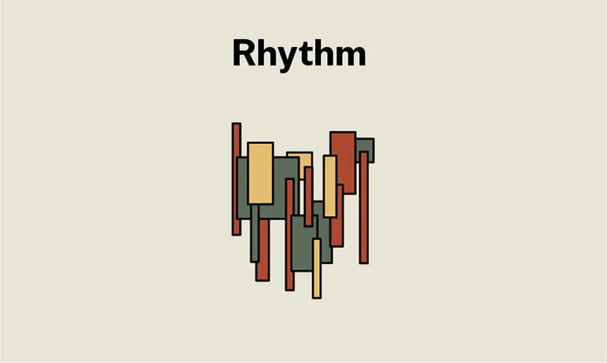
Rhythm in design is similar to rhythm in music.
It’s the repetition or alternation of elements to create a visual beat or flow.
- Repetition: Repeating shapes, lines, or colors at regular intervals establishes a rhythm.
- Alternation: Alternating between different elements (e.g., big and small, light and dark) creates a more complex rhythm.
- Progression: Gradually changing the size, color, or spacing of elements can create a sense of movement and progression.
How to Use this Graphic Design Principle:
- Visual interest: Rhythm adds visual appeal and prevents monotony in a design.
- Unity: Rhythm can help to tie together different elements and create a cohesive whole.
- Guiding the eye: Use rhythm to lead the viewer’s eye through a design and create a sense of flow.
Quick Summary Table
| Principle | Main Purpose | Best Use Case |
|---|---|---|
| Contrast | Create visual distinction | Headlines, buttons, key messages |
| Balance | Build stability | Page layouts, posters, ads |
| Emphasis | Highlight focal points | CTAs, offers, important text |
| Hierarchy | Show importance order | Websites, articles, presentations |
| Repetition | Create consistency | Branding, UI elements |
| Alignment | Organize content | Grids, text blocks, layouts |
| White Space | Improve clarity | Clean layouts, readable content |
| Proportion | Control visual relationships | Images, typography, composition |
| Proximity | Group related elements | Forms, menus, content sections |
| Color | Set mood and identity | Branding, themes, campaigns |
| Rhythm | Create flow | Cards, patterns, visual sequences |
| Unity | Make everything feel connected | Full brand systems, page design |
Conclusion of Graphic Design Principles
Mastering graphic design principles empowers you to create visuals that not only look beautiful but also communicate effectively.
As you experiment and apply these principles, you’ll develop your unique style and create designs that captivate and inspire.
FAQs: Graphic Design Principles
Start with balance, contrast, and emphasis. These three will significantly impact your designs.
Take online courses, read design books, and study examples of great design.
Overcrowding your designs, ignoring hierarchy, and using too many fonts are common pitfalls.
They guide the user’s eye, make information easier to digest, and create a positive emotional response.
Read More: 7+ Basic Elements of Graphic Design You Should Know (And More)
Contact US | ThimPress:
Website: https://thimpress.com/
Fanpage: https://www.facebook.com/ThimPress
YouTube: https://www.youtube.com/c/ThimPressDesign
Twitter (X): https://x.com/thimpress_com


