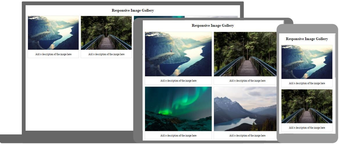
The digital nomads will agree that a website with a responsive design is the essential trend in the latest times. In fact, it is a compulsory trend to be followed if website owners really want to do their best. As per a statistic established towards the end of the year 2016, 70% of mobile searches lead to an action within the hour. This fact, standalone testifies to the importance of a Responsive Web Design.
For people who are not aware of the term ‘responsive design, it is the design format that is adaptive to the environment or the platform around it. Irrespective of the device, the design is being viewed, and the web design gracefully interacts with the user. Now that you know what responsive web design is, we are pretty sure that you know why it is considered so important and impactful for visitors and traffic. So, if you are setting up a new website, posts like these can be highly useful for you.
There are many benefits of employing a responsive design on your WordPress website. But some key issues also co-exist and they must be addressed. These factors will affect your choice and you must be prepared to knock them down. Once you identify them and tackle them well, you will be able to experience the magic of responsive design in its true glory. In this blog post, we will discuss the common issues that exist in the dimension of a responsive web design and how you can tackle them for the best.
Web Design: Less Space and More Content

The prime segment of users who benefit from this kind of Web Design is mobile and Smartphone users. It is a little lame to say that the audience benefits through this because ultimately it is the fortune of a website owner. To quote a stat, 40% of people will choose a different search result if the first one is not mobile-friendly. Now imagine people putting off your website for another one, only because it wasn’t mobile-friendly.
There is an obvious problem, too. A mobile’s view is constricted and only a little amount of scrollable information (number of scrolls that a viewer can spare) is available. The website admin must make sure that only the most important information is displayed such as the contact detail, home page content, and subscription pages along with a few others. One must completely eliminate unnecessary widgets and pages from the design. Remember to target the most vital content.
Uneasy Website Navigation on Web Design

This is the biggest drawback of responsive design. The span of a website on a desktop view is better than that on a tablet or a Smartphone. The design on the latter tends to confuse the audience who are looking for a set of specific information.
A typically responsive web design must aim to enhance navigation for its viewers so that they do not get confused and are able to find the information without putting in much effort.
Web Design: The ‘Cost’ Element

Well, adopting the responsive design can be a costly affair for your small or medium-scale business. As a website owner, you will have to hire technical designer help to establish this change. Instructing the designer to bring the task to justice will require your money as well as valuable efforts. So, if you are not in that frame of commitment, don’t do it. The only solution to this problem is coming to terms with a time when you and your business are ready for a responsive design for its website.
Web Design: Images Can Be Troublesome

Images need a larger chunk of changes when you are adopting a responsive design because they will scale differently across several platforms. The different mobile browsers will add up to your woes. Well, you can’t include all the viewing devices in your parameters. So, your designer will need to catch a nerve with the types of devices mostly used to access the websites. You can redesign your website for better viewership on these. After all, resizing an image to look similar on a desktop as well as on a 5-inch Smartphone can be quite a task. Do not forget to consider the right quality of images so that they are pleasant to view across all platforms.
Web Design: The Page Load Time

Responsive designs make your website slower and that is partially true. The statement is partially true because the speed of your website on a mobile device will largely depend on the speed of the connection used along with the processing. So, you will be required to be as resourceful as you can while dealing with the page loading speed of your new responsive web design. Adding more and more lines of code can be an alternative, though.
Bonus Tips: Here are some bonus tips that can help you pep up your responsive design game.
Responsive design isn’t experimental. Do not do it for the sake of periodic testing. Bring it on board only when you are completely ready.
Strategize well in order to seek conversion through the mobile platform. Because, as per an estimate, 60% of all Internet access is mostly mobile. Now, you would not want to miss out on your marketing campaign here.
Whenever you add new content to your website, make sure to test it on your mobile site also. Don’t wait up for the audience to send you a complaint in mail.
Fonts are really crucial for the health of your mobile website because zooming too much will apparently irritate the user. So, if you don’t want users to walk off from your site, choose your font wisely.
Always and always, design for at least 3 layouts that correspond to different browser widths. This will ensure that you cover most of the ground.
Web Design: Summing up
A responsive design for your WordPress website gives you an edge over the ones without it. You get to address a larger amount of audience and chances of conversions increase. The most important change that is brought in through the usage of a responsive design is ‘constant engagement’ by the audience. They might be away from their large screens, but will be able to access your responsive website on their devices and either casually surf through it or just seek relevant information as per their interest.
This trend is challenging website owners throughout the global industry. So, you need not rush into a half-prepared decision. Make sure that you do your research well because the Internet is free and do not put off seeking professional help because expert advice is the best. We hope that this post will be a stepping stone toward your decision of adopting a responsive design for your valuable WordPress website. If you have a suggestion to make or just general feedback, kindly tell us through a comment below.
Read more: How to prevent spam comments and bot registrations in WordPress


