Optimizing a website for a better user experience isn’t a cakewalk, mostly because the necessary tools and/or the coding knowledge don’t come for dime a dozen. But when the website is made on a platform that’s practically known and loved for its user-friendliness, UXO (user experience optimization) is significantly less of a pain.
There are thousands of tools available on WordPress, a lot of them even for free, that help you understand your audience better (tracking and analytics), improve performance (caching and image optimization plugins), and test-and-improve (A/B testing software like Nelio, OptimizePress, etc.). This guide isn’t about them.
This guide details some of the more easily overlooked aspects of usability in a WordPress website and the best ways to fix those oversights. We’ll start with:
Carousels
Every department in every business wants carousels/sliders, simply because it is a beautiful Golden Mean. Everyone gets their product/campaign/message placed in a single most highly visible space on the page: Above the fold.
This is why most desirable WordPress themes pack at least one slider plugin (typically the Revolution Slider). Let’s see the pros and cons of that approach:
Pros:
- Shows the most significant messages in a single spot.
- Messages can be prioritized (most important gets the first slide)
- Supposed to appeal to all segments of visitors (“something for everyone”)
Cons:
- Users generally don’t wait for slides to rotate and will skip over the carousel after a glance at the currently visible frame.
- Slides’ content isn’t easily crawled by search bots, which is bad news for SEO.
There are ways to work around those cons and improve carousel UX:
- Keep the number of slides/frames no more than 5.
- Give carousel navigation control to users
- Do NOT auto-forward.
Sometimes, the simplest solution is the best. Instead of relying on fancy premium slider plugins, you can use lightweight JavaScript (jQuery) plugins like Slick to create user-friendly carousels on WordPress.
Advanced Navigation

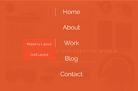
A main menu in header combined with a secondary navigation in a sidebar is near-foolproof way to ensure your navigation is complete and usable. But when it comes to huge websites (especially eCommerce or large, content-heavy blogs) with thousands of pages, a secondary navigation alone won’t cut it.
This is why we need Mega Menus. But there are two sides to this coin too.
Pros:
Uniform Visibility: Content/pages on lower levels get included in the mega menu
Saves an extra step: Users can get to the more remote/obscure content faster.
Cons:
- Have been known to cause problems with performance when UI elements like graphics/icons are added.
- More-or-less ineffective on a website with bad content hierarchy
- Making mega menus perfectly responsive can be a challenge
Before you debate the pros and cons (and whether you even need a mega menu on your website or not), you need to get your content thoroughly categorized. WordPress taxonomy is there for a reason. Use it.
Once you have your content hierarchy sufficiently tamed and organized, you can use WordPress plugins like Max Mega Menu, uberMenu, etc. to add a mega drop-down menu to the website. WooCommerce extensions like Ajax Layered Navigation add a filtering interface to the store.
Performance

No matter what you’d LIKE to believe: You are NOT exclusive.
Users don’t want to wait for content, so don’t make them wait for content or they’ll go looking for it elsewhere. Even your ranks suffer from slow websites. That’s the sum total of the need for performance optimization in user experience.
Optimize your WordPress website for performance with:
CDN: A viable option for websites that receive a global audience and have medium-to-high traffic. MaxCDN and W3 Total Cache plugin is a match made in quick-loading heaven.
Cache: As mentioned above, W3 Total Cache is the only caching plugin you need (even without the CDN support). Also ask your developers about server-side solutions like Redis and Memcached
Front-end Optimization: Plugins like EWWW Image Optimizer compress images (without compromising quality). Also ensure that there’s as little inline CSS and JS in your theme files as possible. Compress and minify stylesheets and JavaScript files too.
Reduce external dependencies, use CSS sprites, and be extremely picky while downloading plugins (the less, the better). You can even contact your web hosting provider and ask for help. Sometimes, your web host does create performance-related issues.
Modal Pop-Ups
Don’t be obnoxious in the name of interactivity and conversions.
Yes, modal pop-up (interruption marketing) is a great conversion tool. There are literally thousands of plugins out there (most social media plugins have this feature now) that let you stick a message to the users, ‘politely’ reminding them to share/follow/like the content on social media, subscribe or sign up, avail a discount, et al.
There are so many things wrong with it… but we’ll get to that in a moment.
Pros:
- Proven to improve conversion rates
Cons:
- Distracting: Visitor is here for content and the popup is in the way.
- Popups are treated as White Noise (like so many ads) unless it fits in properly with user journey.
- BAD for accessibility
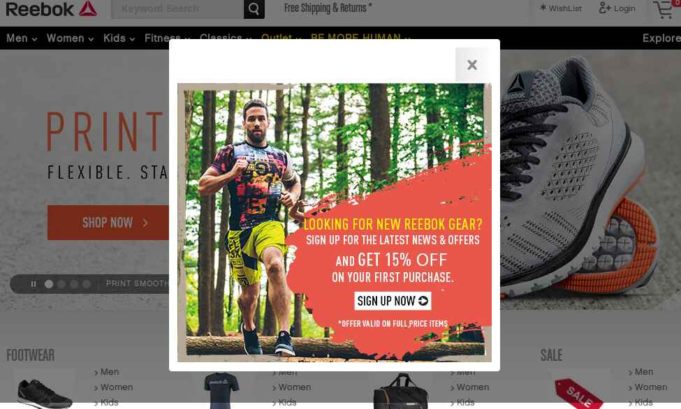
There are examples of popups being used nicely in context. BrainPickings.org understands its audience and promotes their ‘donate’ link only when the user has accessed the site repetitively and when they are finished reading the content. Reebok Crossfit popup has bad timing but makes up slightly for it with a discount on subscription on products page.

Source: REEBOK
Time and trigger delays are fine, but it’s also necessary to focus on the bigger picture and tie a popup in a way that will be relevant to users who want it.
So far, the conversion increase is more due to plain blunt force, but the quality of conversions and subsequent leads can be increased when you do it smartly. Asking a first-time visitor to subscribe to a website won’t get you quality leads 99/100 times.
Try using WordPress plugins intelligently for popups. There are some (like Popups by Supsystic) which are good. Work with those instead of focusing only on interaction on a single page.
Endnote
To improve user experience, hope that you make sure to take this advice with a grain of salt and test everything (Use Google Analytics or Nelio A/B testing, or any other tool: it’s up to you).
And promise yourself to keep improving.
Read more WordPress Plugins | 5 Quick Fixes for Your WordPress Site


