People in today’s environment depend significantly on their mobile devices to keep connected because they are continuously on the move. For organizations and people, it is now more crucial than ever to optimize their emails for mobile devices.
There are a few crucial principles that may make all the difference when designing emails for mobile devices as opposed to desktops.
This post will go through the six top mobile email design recommendations so you can make sure your communications are successful and aesthetically pleasing no matter where your audience is accessing them.
Use A Single Column When Designing Emails for Mobile
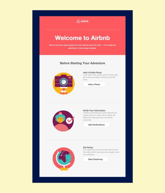
It’s important to think about the layout while developing an email, including the number of columns, font size, graphics, and text content. A user-friendly and aesthetically pleasing email that engages the receiver and effectively conveys the message depends heavily on the layout.
The number of columns utilized in the email layout is one of the design factors. Emails can be created for desktops or laptops with numerous columns, which provides greater room for organizing the text and displaying more data. When dealing with lengthy emails or when it’s necessary to incorporate a lot of information in one email, this structure is helpful.

Mobile devices might not be able to handle the same layout. Due to the limited size of mobile phones, presenting emails in many columns may make them challenging to read and use.
It might be annoying and time-consuming for users to have to scroll horizontally, zoom in, or pinch the screen in order to see the content. Therefore, when developing emails for mobile devices, it is preferable to utilize a single-column style.
Use Buttons Instead Of Text Links When Designing Emails for Mobile
Due to the small size of their screens, choosing text links might be one of the most challenging tasks for mobile users.
Users may become frustrated and give up on the work completed when they are unable to choose a text link. This might be especially challenging if the assignment requires carrying out a vital action or clicking on a crucial link.
Use descriptive wording that clearly communicates the activity that will take place when a button is chosen when creating your buttons. Users will benefit from a clear understanding of the button’s function thanks to this.
Additionally, it’s advised to choose eye-catching hues that draw readers in and help your buttons stand out from the rest of the text.
Increase The Size Of Your Texts When Designing Emails for Mobile
The overall look may be made or broken by the text’s size. It’s always advisable to err on the side of caution even though many email programs with mobile versions will automatically adapt text size to match the screen.
It’s crucial to experiment with various font sizes and do tests to determine the ideal size for your specific email design if you want to make sure your content is readable and aesthetically beautiful.
Body text typically starts off with a font size of 14, however, this might change based on the typeface you’re using. 22 or bigger might be the optimum size for headings, especially when using unique designs or colors. However, subtitles must be at least 18 pixels wide.
Change The Dimensions Of The Images When Designing Emails for Mobile
The size of the image is one of the most important aspects to take into account. Users may need to take additional steps, such as zooming in, to obtain a closer look at images that are too big for mobile phones.

Every picture must be completely visible on the mobile screen without requiring users to choose it or take any other actions to enlarge it in order to prevent this issue.
It’s a good idea to check your choices for altering the picture size of your files and the platform’s handling of responsive design when sending mail if you use an email marketing provider like MailChimp.
By doing this, you can ensure that your emails display beautifully on all devices and that your photos are optimized for mobile viewing.
Increase Spacing When Designing Emails for Mobile
The distance between your text blocks’ components and lines is one of the crucial factors to take into account when designing for mobile users.
The readability and accessibility of your material can be substantially impacted by how you use space. It’s crucial to thoroughly assess and utilize the areas to guarantee a great customer experience.
Thus, while designing for mobile users, it is imperative to consider the importance of spacing and white space. You may make your material easier to understand and provide a more user-friendly experience by carefully utilizing these design components.
Use Short Titles When Designing Emails for Mobile
It’s crucial to take your audience’s potential screen size into account when coming up with titles or subject lines. Longer titles may seem even more lengthy on mobile devices, maybe missing the effect you were going for.
It’s critical to consider the message you want to deliver and make an effort to say as little as possible in order to fight this.
It’s crucial to select your words carefully and strive for conciseness while yet creating a strong effect if you want to make an impression. Though the subject line’s character count varies between mobile devices, a basic rule of thumb is to keep it between 25 and 30 characters.
Use HTML Template When Designing Emails for Mobile
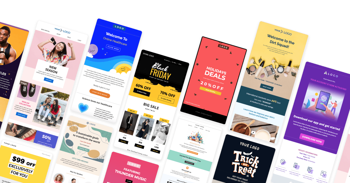
HTML templates for email offer numerous benefits for email design. They enable responsive design, allowing emails to automatically adjust to various screen sizes such as desktop, tablet, and mobile, ensuring a great look and easy readability on any device.
Templates also help maintain consistent branding, reinforcing your brand identity across all email communications. Additionally, they save time, as you can simply insert your content into the template without needing to code each email from scratch. Well-coded HTML templates improve deliverability by reducing the likelihood of triggering spam filters.
When choosing a template, opt for a mobile-responsive one that aligns with your brand style, many of which are available from email marketing platforms and template providers.
Conclusion
Although there is no surefire way to guarantee that the recipients of your emails will open them, read them, and engage with the content, there are some things you can do to greatly increase the chances of that happening, especially if they are being read on mobile devices.
Read More: A Mobile App Startup: Entrepreneurs Are Developing Their Best
Contact US | ThimPress:
Website: https://thimpress.com/
Fanpage: https://www.facebook.com/ThimPress
YouTube: https://www.youtube.com/c/ThimPressDesign
Twitter (X): https://x.com/thimpress_com


