Are you struggling to capture and hold visitors’ attention on your website?
Your website is often the first impression potential customers or clients have of your brand. A well-designed website isn’t just about looking good; it’s about creating an engaging experience that keeps visitors on your site and encourages them to take action.
In this post, we will share with you the top 5 website design tips that can significantly improve your online presence and help you achieve your goals.
We’ll cover everything from clear navigation and mobile responsiveness to eye-catching visuals and fast loading times – all the essential elements that make a website truly stand out.
Let’s get ready!
Eduma – Education WordPress Theme
We provide an amazing WordPress theme with fast and responsive designs. Let’s find out!
5+ Website Design Tips to Enhance Your Online Presence
Tip 1: Designing a Simple and Clean Homepage

Your website’s homepage should quickly show what your site is about.
People don’t read all the words on a website, they look for important information. So, use images and simple words that make people feel something instead of lots of words.
A modern website design with concise, well-structured content caters to decreasing attention spans and encourages users to take desired actions.
Key website design tips for an effective homepage include:
- Above-the-fold content: Ensure visitors grasp your website’s purpose immediately upon landing.
- Whitespace utilization: Create a visually appealing and balanced layout using empty space between elements.
- Incorporating visuals: Enhance communication and break up text with high-quality images or icons.
- Call-to-action button: Prompt users to take the desired action, such as making a purchase or signing up.
Tip 2: Mastering Visual Hierarchy in Web Design

Hierarchy is a design tool that helps organize your content. By using hierarchy, you can guide your visitors’ eyes to the most important parts of your website first.
There are a few website design tips to create a hierarchy:
- Size and weight: Make the most important things bigger and bolder. People usually look at large, bold titles before reading smaller text.
- Element placement: Use a layout that directs attention. For example, put important buttons in the center or your logo at the top.
When you use hierarchy well, visitors will naturally follow your visual cues. You can also use color, contrast, and spacing to emphasize certain elements.
Here are some tools to help you create a hierarchy:
- Grid layouts: These can help you clearly organize your content.
- Website templates: You can find many templates that already use hierarchy effectively.
Tip 3: Making Your Website Easy to Read
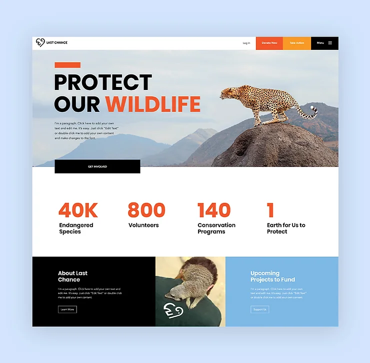
“Readability” means how easy it is for people to read your website.
When your site is easy to read, people can skim through it quickly and understand your information.
Here are some website design tips to make your website easier to read:
- Use enough contrast: Make sure the colors of your text and background are different enough so people can read your text easily. You can use an online tool to check this.
- Make your letters big enough: Most people have trouble reading small fonts. A good starting point is to use a font size of at least 16pt for your main text.
- Choose the right fonts: Sans serif fonts (fonts without little lines on the ends of letters) are usually the best choice for long online texts. You can also mix different types of fonts but don’t use too many different ones.
- Don’t use too many fonts: Stick to three different fonts at most for your whole website.
- Use different text sizes and styles: Make your titles bigger and bolder than your subheadings, and make your subheadings bigger than your regular text. This will help guide readers’ eyes through your website.
Tip 4: Keeping Website Navigation Simple And Familiar
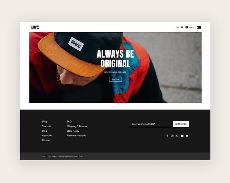
Website navigation should be simple and familiar to users, helping them find what they need quickly. Good navigation also helps search engines understand your website, improving its visibility in search results.
Here are some website design tips for effective website navigation:
- Link your logo to the homepage: This is a common practice that users expect, making it easier for them to return to the main page.
- Make your menu clear and easy to find: Whether it’s a horizontal list or a hamburger menu, ensure it’s visible and organized by the importance of each section.
- Use vertical navigation for long-scrolling sites: Anchor menus or “Back to Top” buttons can help users navigate quickly on longer pages.
- Include important links in your footer: Contact information, social media icons, and a simplified menu are often found in footers, providing essential information to users.
Tip 5: Ensuring Mobile Responsiveness
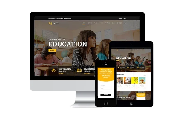
Every visitor should have a great experience on your website, whether they’re on a computer, tablet, or phone.
Take a look at your site’s mobile version and try using it like a visitor would. Click on everything and make sure it works.
Your mobile website should be simple and easy to use. You might need to remove some items or make things smaller, like the menu. There are also special features you can use to make your mobile site even better.
Essential Web Design Requirements for Success: Website Design Best Practices
Website design requirements are the guidelines that shape a website’s look, functionality, and user experience.
They act as a blueprint for web designers and developers to ensure the site aligns with the business’s goals, target audience, and technical limits.
Key components of website design requirements:
- Objectives and goals: What is the website’s purpose? Who is the audience? What outcomes are desired?
- User personas: Detailed profiles representing different user types, their needs, and preferences.
- Functional requirements: Specific features the website must have (e.g., user registration, eCommerce).
- Non-functional requirements: Performance, usability, accessibility, and security standards.
- Content requirements: The type, format, and amount of content (text, images, videos, etc.).
- Visual design requirements: Color scheme, typography, imagery, and layout guidelines for a cohesive look.
- Technical requirements: Infrastructure, programming languages, and compatibility considerations.
- Testing and deployment plan: Procedures and schedule for testing and launching the website.
- Maintenance and updates: Ongoing plan for updates, bug fixes, and security patches.
- Performance metrics: Key indicators to measure the website’s effectiveness.
Common Web Design Mistakes
Web design mistakes can make it hard for people to use a website, which hurts its reputation and keeps it from doing what it’s supposed to do.
Here are some common mistakes to avoid:
- Bad user experience: Websites should be easy to use and look good.
- Too much stuff: Don’t overwhelm visitors with too much text or images.
- The design doesn’t match: Colors, fonts, and layout should be consistent.
- Doesn’t work well on phones: Make sure the website looks good on all devices.
- Slow loading: People won’t wait for slow websites.
- Unclear instructions: Tell visitors what you want them to do (sign up, buy, etc.).
- Errors: Make sure errors are clear and easy to fix.
- Hard for some people to use: Consider people with disabilities.
- Annoying ads: Don’t overdo it with ads.
- Not paying attention to data: Use data to learn how people use your website and make it better.
Read More: 10+ Top Websites for Designing That Will Inspire You
Contact US | ThimPress:
Website: https://thimpress.com/
Fanpage: https://www.facebook.com/ThimPress
YouTube: https://www.youtube.com/c/ThimPressDesign
Twitter (X): https://x.com/thimpress_com

