Have you ever scrolled down a website, reached the very bottom, and seen a helpful section with links and information? That’s the website footer – a part of the website!
It’s like a handy toolbox full of resources to navigate the site smoothly. But a great footer does more than just point the way. It can boost your website’s user-friendliness and brand credibility even encourage visitors to stick around.
In this blog post, we’ll showcase some of the best website footer examples out there to inspire your own design choices. So, scroll down and get ready to step up your footer game!
Need some ideas? Check out these HTML footer templates to get inspired!
What Is A Footer And Why Is It Important For A Website?
A website footer is the section at the very bottom of every page on a website. It’s often visually distinct from the rest of the page, serving as a kind of foundation or closing element. But beyond just looks, footers play several crucial roles for users and website owners.
- Offers important links to key pages like About Us, Contact, Sitemap, etc., even when users are deep within the website.
- Houses legal information like copyright notices, privacy policies, and terms of service, building user trust.
- Can contain relevant keywords and backlinks, aiding search engine crawling and potentially improving website ranking.
- Reinforces brand identity with logos and consistent design elements across pages.
- House calls to action (CTAs) for subscribing, following social media, or contacting the business.
- Provides alternative contact methods or accessibility options for users with disabilities.
Eduma – Education WordPress Theme
We provide an amazing WordPress theme with fast and responsive designs. Let’s find out!
What To Include In A Footer?
Content in a footer varies depending on the website’s goals and audience. Here are some essential elements to consider, including:
- Copyright Notice: This tells others your website content belongs to you. Think of it like a “No Copying” sign.
- Privacy Policy Link: If you collect personal information (like emails), you legally need this. It explains what you do with that information.
- Sitemap: This helps visitors or search engines find important pages on your site. Think of it like a map.
- Contact Info: Make it easy for people to reach you, whether it’s an email address, phone number, or contact form.
Besides, there are some optional elements you should include:
- Logo: Remind visitors who you are and what you do.
- Social Media Icons: Make it easy for people to follow you on social media.
- Email Sign-up Form: Grow your email list by offering something valuable in exchange for your email address.
Please make sure everything is easy to understand, and don’t overload the footer with too much information. Also, it should be visually consistent with the rest of your site and optimized for all devices.
7+ Types of Website Footer Design
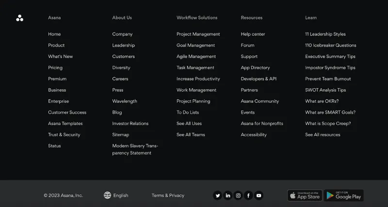
Fat Footer
Fat footer includes most website links, categorized for easy browsing. It is ideal for websites with many pages or complex structures.
Example: Asana with links to company, product, solution, and resource pages.
Narrow Footer
Narrow footer contains essential information like contact details and social links. Moreover, it’s less overwhelming than a fat footer.
Example: Brown University website with links to visit page, map, news, and events.

No Footer
No footer is suitable for minimalistic websites or single-page layouts. It includes copyright and legal information even without a footer.
Example: Artistic website with only copyright and social links at the bottom.

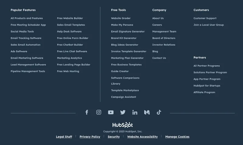
Product Footer
Product footer prioritizes links to product features and benefits. It’s useful for businesses selling specific products.
Example: HubSpot footer with features listed first, followed by company links.
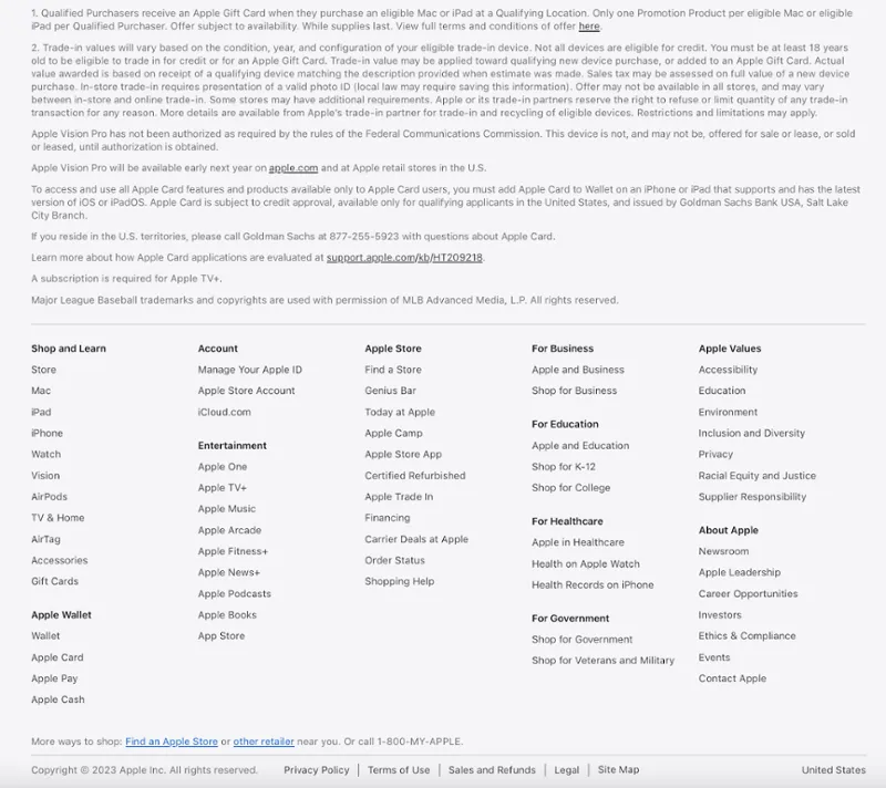
Legalese Footer
Legalese footer displays legal information like terms of use and privacy policy. It can be combined with other footer types, like narrow or fat footers.
Example: Apple website with extensive legal disclaimers.
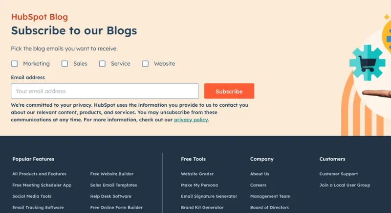
CTA Footer
CTA footer encourages action with contact forms, email sign-up, or call-to-action buttons. It is useful for converting visitors about to leave the website.
Example: HubSpot Blog’s footer with an email subscription form.
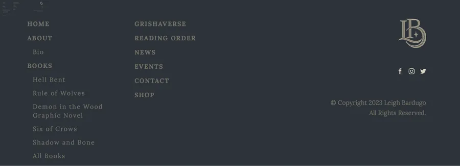
Site Index Footer
Site index footer lists all website links, making it ideal for small websites with limited pages. It improves the user experience by providing alternative navigation.
Example: Leigh Bardugo website footer with a complete sitemap.
5+ Best Website Footer Examples
Don’t worry about a “perfect” footer, just make it match your brand and what your visitors need. Let’s see some cool examples!
ThimPress – Best Website Footer Examples
Learn MoreThimPress is a website that offers premium WordPress themes, premium WordPress plugins, and WordPress services for various purposes and niches. The footer of ThimPress is a simple and elegant section that contains some useful information and links for visitors. Moreover, it has a dark background color that contrasts with the white text and links, creating a clear and professional look. The footer is responsive and adapts to different screen sizes and devices, ensuring a good user experience.
Lorelei Londres – Best Website Footer Examples
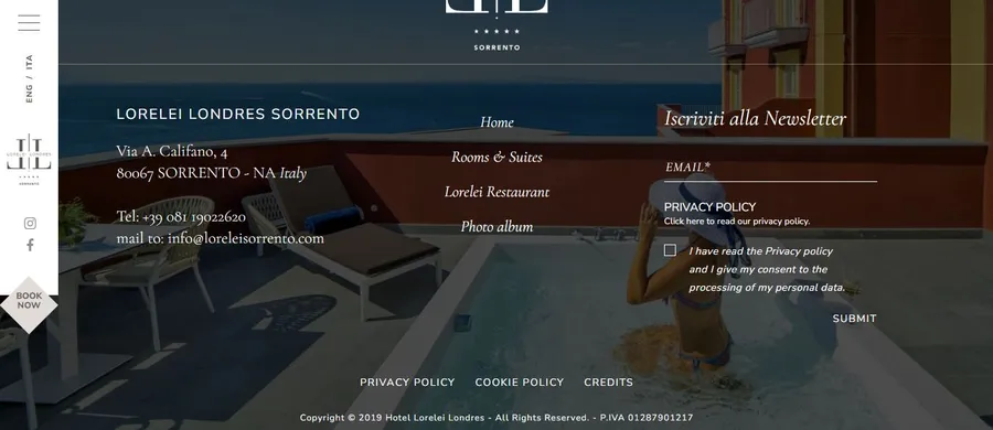
Lorelei Londres website footer includes contact information, navigation links, and a newsletter opt-in form. It also has links to the privacy policy, cookie policy, and website creator, as well as a copyright notice. The background image is of someone in a pool on a balcony overlooking a beach.
Spline Group – Best Website Footer Examples
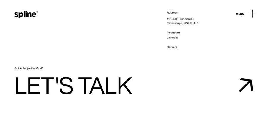
Spline Group is a company that values communication and simplicity. Its footer has black text on a white background with an address and links to social media platforms. The largest text is a contact link that says, “Let’s talk”.
gOOOders – Best Website Footer Examples
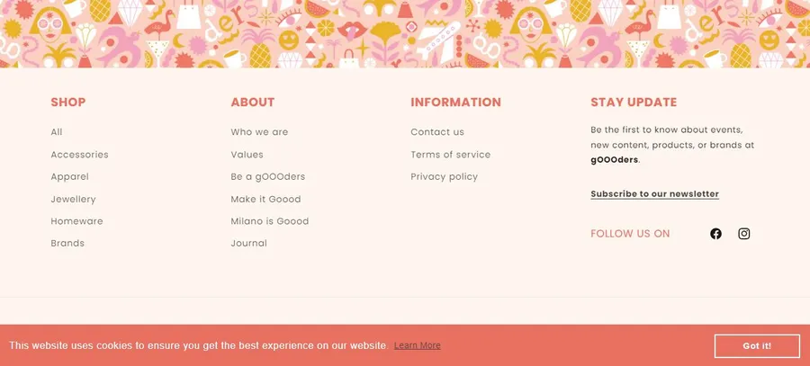
gOOOders sells eco-friendly products online and in hotels, aiming to help people be more conscious consumers. Their website footer encourages people to sign up for updates with a colorful form, while also including legal information and social media links. This design is a good example of a website that wants people to take action.
Hideout Space – Best Website Footer Examples
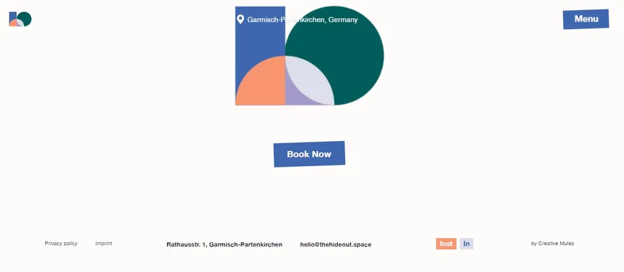
Hideout Space offers work retreats for small teams where they can work and explore nature near Garmisch-Partenkirchen. Their website aims to convince visitors to book their services. One way they do this is by placing a big, eye-catching “Book Now” button at the page bottom. This button uses animation, color, and size to stand out and encourage clicks.
Final Thoughts
The website footer is like a handy toolbox! It’s where people and search engines go for important information they missed. Make sure it’s clear and easy to use, with links to key pages and contact details. It’s like leaving a friendly map to keep visitors exploring instead of clicking away.
Read More: Best WordPress Website Examples & Themes
Contact US | ThimPress:
Website: https://thimpress.com/
Fanpage: https://www.facebook.com/ThimPress
YouTube: https://www.youtube.com/c/ThimPressDesign
Twitter (X): https://x.com/thimpress_com
