It is the dream of every entrepreneur to build a website that compels visitors to become customers and drives sales. The moment when your lead converts into a consumer is called the conversion. But it’s not easy to achieve that without some web design tips.
Most of businesses face the issue that their sites have enough traffic but few conversions. This problem can be fixed by getting in touch with professional web design companies who can guide you in developing an intuitive design for your website that has the power to encourage visitors to make buying decisions.
This makes us recall a famous statement made by the American writer Jared Spool: “Intuitive design is how we give the user new superpowers.” But the real challenge is how to develop that intuitive design.
Let’s look at the ten crucial web design tips that are powerful enough to increase conversions.
High-Quality Videos
Videos related to products are extremely helpful in increasing sales. Also, it is beneficial for service-based or Business-to-business (B2B) companies to incorporate videos through which they can share their stories or talk about the unique factors of their brand.
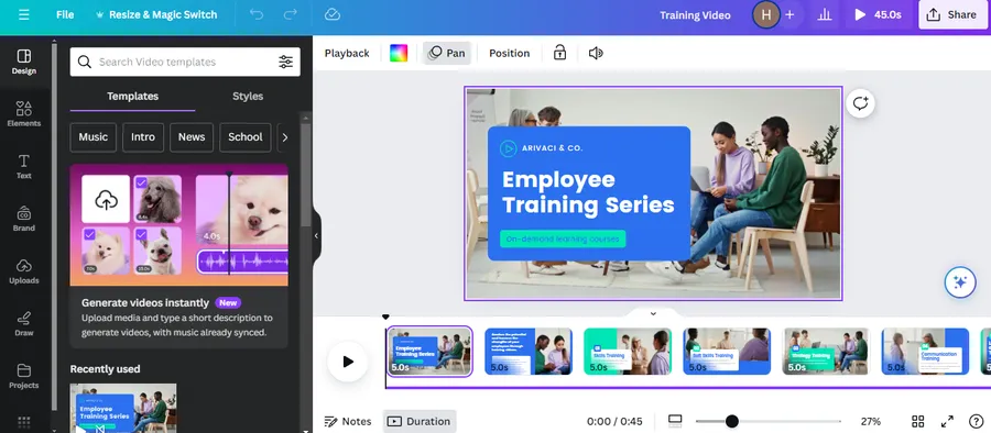
In addition, a study proved that the visitor who watches the product videos is up to 144% more likely to include that product in his cart or to purchase it in comparison to a consumer who views no video.
So, this is one of the first web design tips for your own site. You can embed videos from YouTube or embed videos from Vimeo.
For free design software to make high-quality video, check out Free Graphic Design Software: Top 9 and Supported Platforms.
Clearly Define Your Unique Value Proposition
In order to make your site influential, it is mandatory for you to determine what is your unique value proposition (UVP). Make your UVP explicitly visible to the visitors so that they can get a clear idea. Also, make them think should I choose your brand?
It is also a good idea to highlight the unique features of your business on your website. It will make visitors excited and curious about your products and they will be motivated to buy them.
Incorporate Relevant Colors
Design your website with beautiful colors. The colors that you choose to incorporate in your website should be aligned with your brand and its vision. It’s not a good practice to stick to two common colors that are red and green You can try out different colors and they might grab users’ attention.
For instance, Ript Apparel changed the color of its call-to-action button (CTA) from green to yellow, and it experienced an increase in conversions by 6.3%. Similarly, Performable experienced an increase in conversions by 21% by changing the color of the CTA button from green to red.
In addition, you can choose the colors in accordance with the preferences of your target audience. For example, if you are targeting women, you can use blue, purple, and green. And in the case of men, you can focus on blue, black, and green.
Read more about Incorporate Relevant Colors at Web Color Schemes.
Easy & Straightforward Navigation
You should develop the navigation of your website in such a way that the visitors can easily browse through it and find the information they want without any difficulty.
They should not be forced to scroll unnecessarily and hunt for what they are searching for. It should be intuitive so that they can walk through the entire site effortlessly.
Proper Use Of White Space
Putting too many elements on your webpage can confuse the visitors. Also, it will look overcrowded and cluttered. Therefore, you should make intelligent use of white space so that the users don’t get frustrated and run away.
Keep It Short & Sweet
It’s not a good idea to make users feed all their details such as their city, state, last name, and pet’s name just in order to score that free download. Keep it as short and simple as possible. You can make them fill in their names, email addresses, and zip codes which is more than enough.
In addition, if you are using a captcha test, try to turn it off and see what’s the difference in response rate but only if it is not increasing your spam.
Use Trust Symbols Like Badges Or Customers’ Testimonials
Remember, it’s good to use trust badges from review sites like Yelp or PayPal’s certification logo on your website to increase its credibility. Also, you can incorporate a security seal or any other industry-related symbols that are powerful enough to win users’ loyalty.
In addition, you can also incorporate testimonials from past customers which have their positive feedback that can trigger the users to get involved with your business. The sole motive should be to encourage the visitors to trust you completely to provide them with a quality product.
Relevant Headlines
Use headlines that solve particular pain points for your users. The potential consumers may have concerns related to anything such as timing, process, results, etc. Make sure to highlight the solutions with bold headlines so that the users can easily notice them and get their issues fixed.
Virtual Chat Alternative
Most users today prefer to have a quick online chat while they browse a particular website. They don’t feel it easy to pick up the phone and deal with complex menu options. Just assure them that the chat option exists. It can help you in gaining their trust.
Make Free Offers Apparent To The Visitors
Last but not least, our web design tips are to make free offers apparent to the visitor. If you are offering a free item, make sure that it’s easily noticeable to the visitors.
Design your website in such a way that it explains your efficiency in solving customers’ issues and dedication to fulfilling their specific requirements.
The most important point to note here is that don’t make several changes in your web design at the same time. Tweak it slightly such as experimenting with the colors of the button, text, or placement of elements.
Then, observe the traffic your website gets for a few weeks. Analyze the data carefully and depending upon the results decide whether to keep those changes or return back to the previous layout.
Conclusion About Web Design Tips
In conclusion, effective web design can make a significant difference in converting visitors into customers.
By implementing the 10 tips outlined in this article, such as using high-quality videos, clearly defining your unique value proposition, and incorporating relevant colors, you can create a website that is easy to navigate, visually appealing and instills trust in your visitors.
Additionally, by utilizing features like virtual chat alternatives and showcasing free offers, you can further improve the user experience and encourage visitors to become customers.
Ultimately, taking the time to prioritize web design can help your business stand out from the competition and achieve greater success online.
Read More: How to Tackle Common Issues with Responsive Web Design in WordPress
Contact US | ThimPress:
Website: https://thimpress.com/
Fanpage: https://www.facebook.com/ThimPress
YouTube: https://www.youtube.com/c/ThimPressDesign
Twitter (X): https://x.com/thimpress_com

