Landing Page Templates are the most effective type of registration feature for turning website visitors into leads, with a conversion rate of 23% on average.
An effective landing page often provides visitors to your website with a resource. For example, content, in return for contact information. Sharing or hyperlinking to the URL of a landing page rather than the homepage enhances the possibility of converting traffic.
While Website Landing Page Templates Free is important for lead creation, they don’t have to be sophisticated. In fact, rather than being complicated and overpowering, you should strive for a website that is straightforward and appealing.
Rather than just putting a strict contact form on a website, it might be more effective to tease a fascinating offer or a free resource in return for a modest quantity of information.
Even if you know what you’re going to offer and what information you want from a visitor. The prospect of building a landing page might be intimidating.
If you don’t have the time to develop a page from scratch, don’t know how to use design tools, or don’t have the funds to employ a designer. Utilizing a pre-designed Responsive Landing Page template WordPress may be the most efficient approach to launching a professional-looking page in a very short time.
Royce – The Event Landing Page Templates That Bring the Art Appearance

Royce seems to be a member of the Landing Page Templates specializing in event bookings. There is no navigation bar, but the layout includes a changeable background picture, a headline, and an “RSVP” call-to-action button.
Visitors may fill out the form and reserve a space by clicking the RSVP button. Another way is scrolling down below the fold to see a static reservation form. This is an intriguing template in many Landing Page Templates Free Bootstrap. Because it emphasizes aesthetics while keeping the layout basic and offers visitors two options to convert.
Zillow – Leads The Minimalism Of The Landing Page Templates WordPress Army
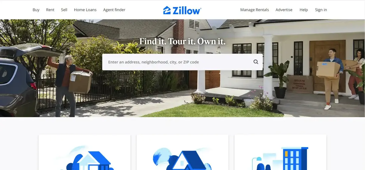
With their homepage, Zillow attempted something quite comparable to Bills.com. It begins with a basic form that requests “your home address” (which sounds weird but don’t worry. This form is positioned in the center of a heroine picture of a charming home at sunset, which is followed by a helpful FAQ section.
Of course, the address alone will not provide a genuine assessment value for a house. It just describes the area around the house. You may determine the worth of nearby properties and then enter a location to determine how close you came. If you want to find out more about a property, Zillow will invite you to join in order to proceed.
Once you provide your email address, you will have access to more information such as comparable properties in the neighborhood, mortgage tools, and predicted net earnings if you decide to sell.
Games are enjoyable, so every time you can make filling out a form enjoyable is a win.
This template sets Topic Authority. With access to so much property and local data, it’s no surprise that Zillow is one of the top house search sites in the country.
Native Poppy – A Masterpiece of The Landing Templates Contemporary Art
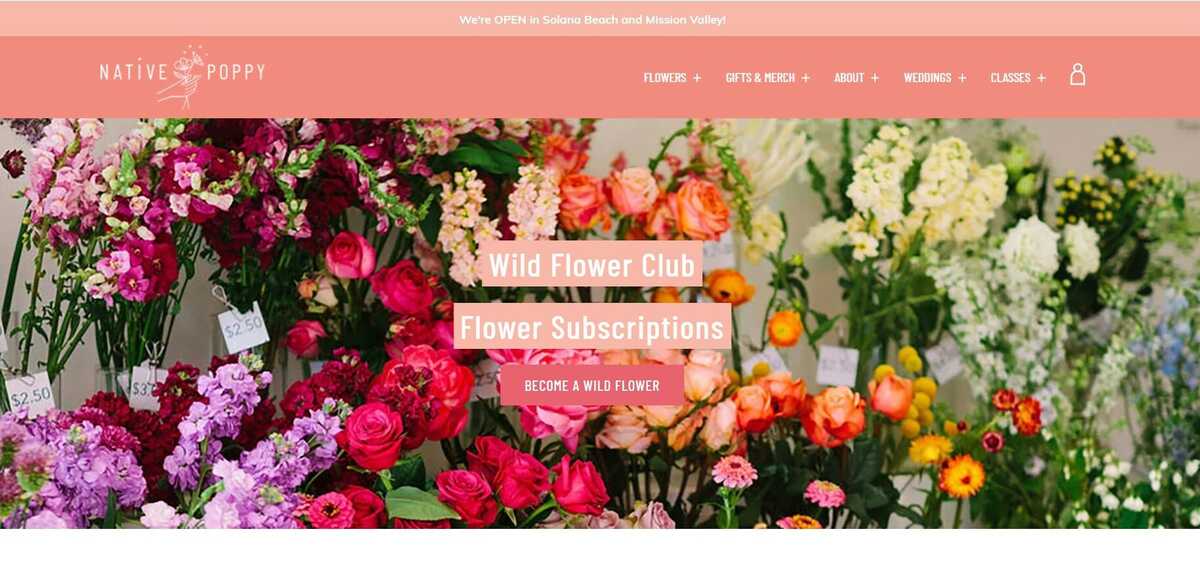
Sometimes you simply have to pause and enjoy a stunning landing page. Native Poppy‘s home page is visually appealing, thanks to high-resolution images and plenty of white space.
Aside from its loveliness, the website contains numerous excellent aspects, like a clear and pleasantly pink CTA, an instructive “How It Works” section and a FAQ at the bottom.
The best part is that it toys with words, replacing the phrase “become a subscriber” with “become a wildflower.” I’m not sure about you, but I’d rather be a “wildflower” than a subscription. In regards to Captures Brand Voice, the design of Wild Poppy reflects the brand’s whimsical feel.
Everything works together, from the photographs to the font selection and the “wildflower” subscription. This template is convincing. Because emphasizing all of the benefits and incentives of being a participant in the subscription program entices people to join.
While there are numerous CTAs, it might have been wonderful to have the required fields on the screen for a speedier symbol, or as a start popping up after selecting, rather than having to click the CTA and then be brought to another set of prompts.
Vibrant
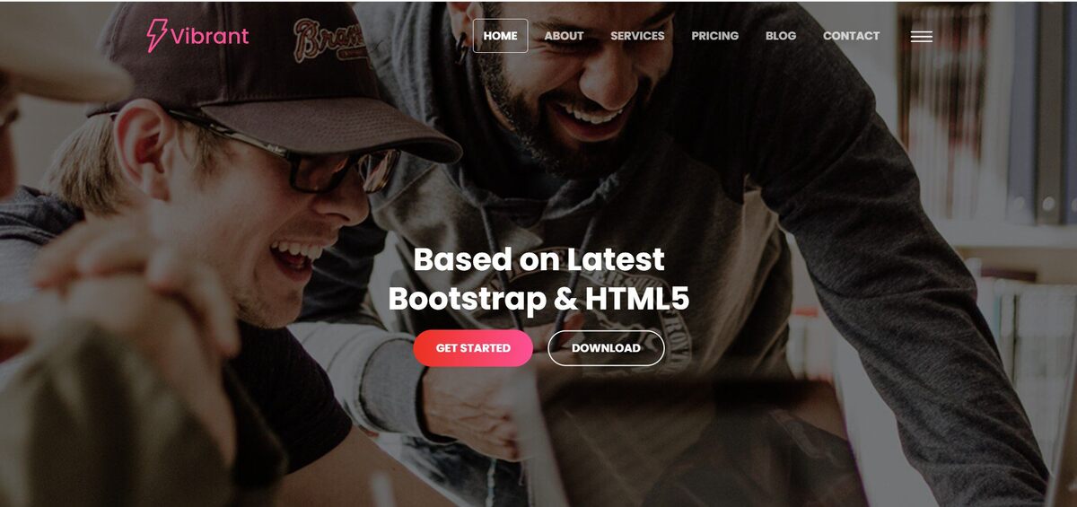
Assume you don’t want your conversion components to be at the top of the page and instead want a longer-form sales page. Vibrant is a clean, modern template in the ocean of Landing Page Templates that can be personalized with your own sales content. Combining each part with an eye-catching image is a terrific way to start developing a user experience that prospects will like.
Gradient
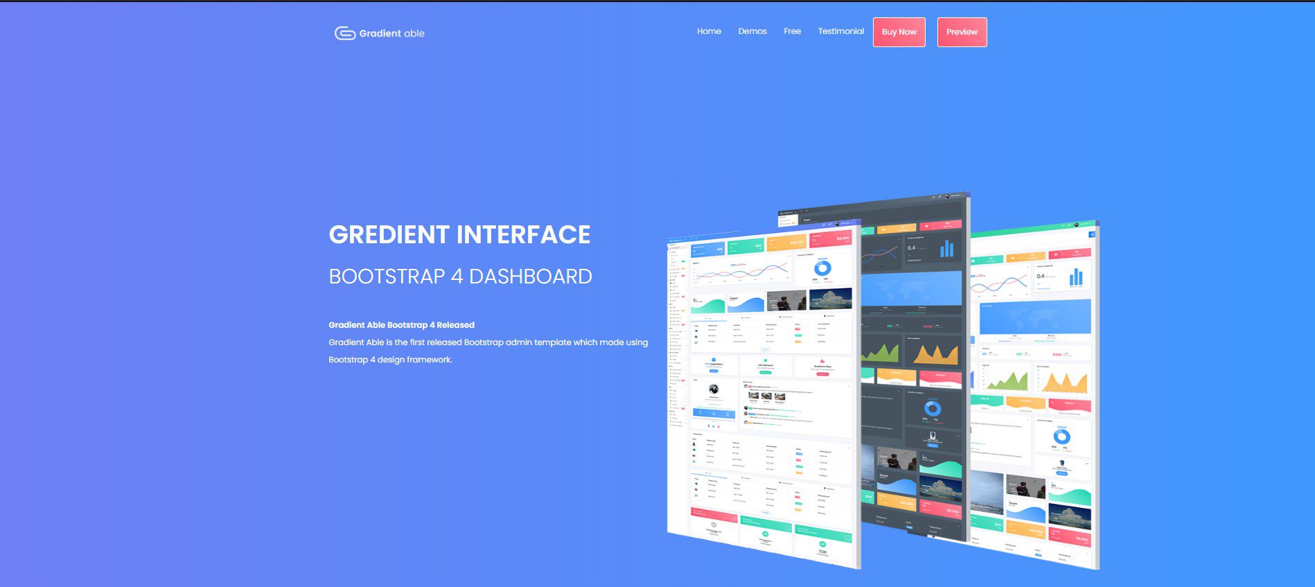
Outstanding out of the Website Landing Page Templates Free, Gradient is a sleek design for a content-based service. It features a simple design with a registration, headline, descriptive text, logo, and photo, yet it follows the trend of no navigation.
Users may attach a picture or product shot, a background image that shows behind a gradient color, and descriptive text, much like the other HubSpot templates. These Landing Page Templates can also modify or change the color of the gradient backdrop.
University – Academic Event Landing Page Templates

Be specific from many Landing Page Templates Free Bootstrap, this design may be beneficial for individuals looking for offers for an educational seminar, course, or other comparable services. Although the form is more complex, the layout allows for more images and text. A headline, supporting graphics, and a form are visible above the fold. Continue scrolling to see further areas where more additable content and graphics.
Skyline
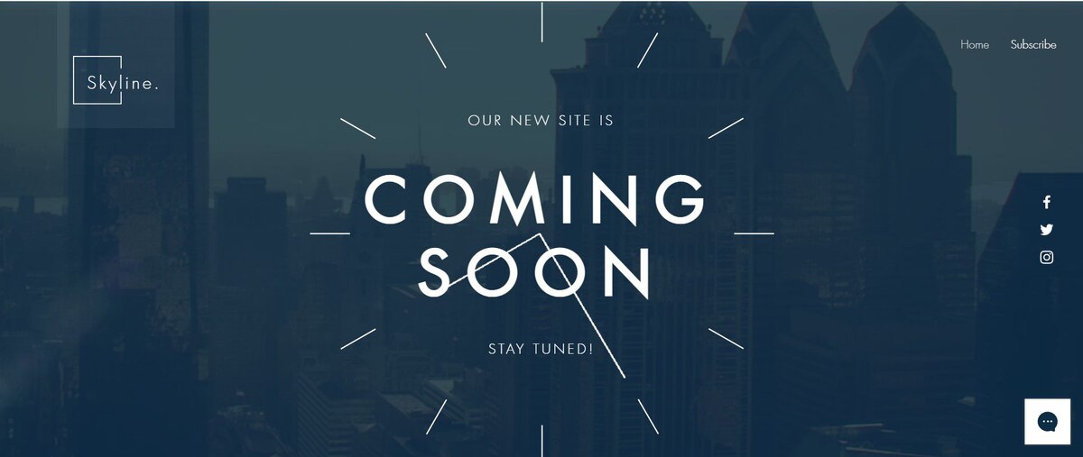
Skyline, like many other Landing Page Templates, may be useful for a firm or individual that has not yet established a website or product but wants to get early leads in the meanwhile. Above the fold, there’s a big headline section with the words “Coming Soon” emblazoned on it.
As you scroll down, you’ll notice a simple explanation of the firm and a space where visitors may enter their email addresses. Users can also customize the backdrop with a photo or video.
Rally – The Elite One in Many Website Landing Page Templates Free
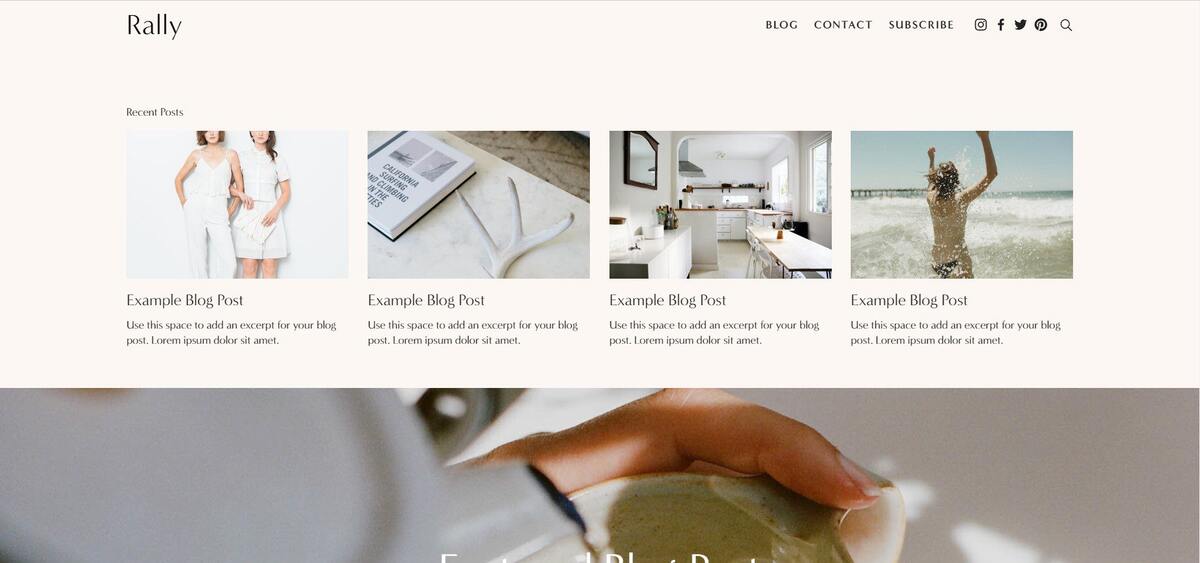
Rally creates a three-column structure at the top of the page to assist ebooks website visitors to perceive the offer, absorb what it’s about, and convert above the fold. Additional modules are addable to further encourage people to opt-in if they want more information, such as if you’re presenting an in-depth white paper or study.
Similar to other Responsive Landing Page Templates Free, this design also helps that the form design is excellent, providing a space to build a meaningful value proposition that communicates what they would get from the information.
Bandmates – The Elegant One To Locate Your Business Position
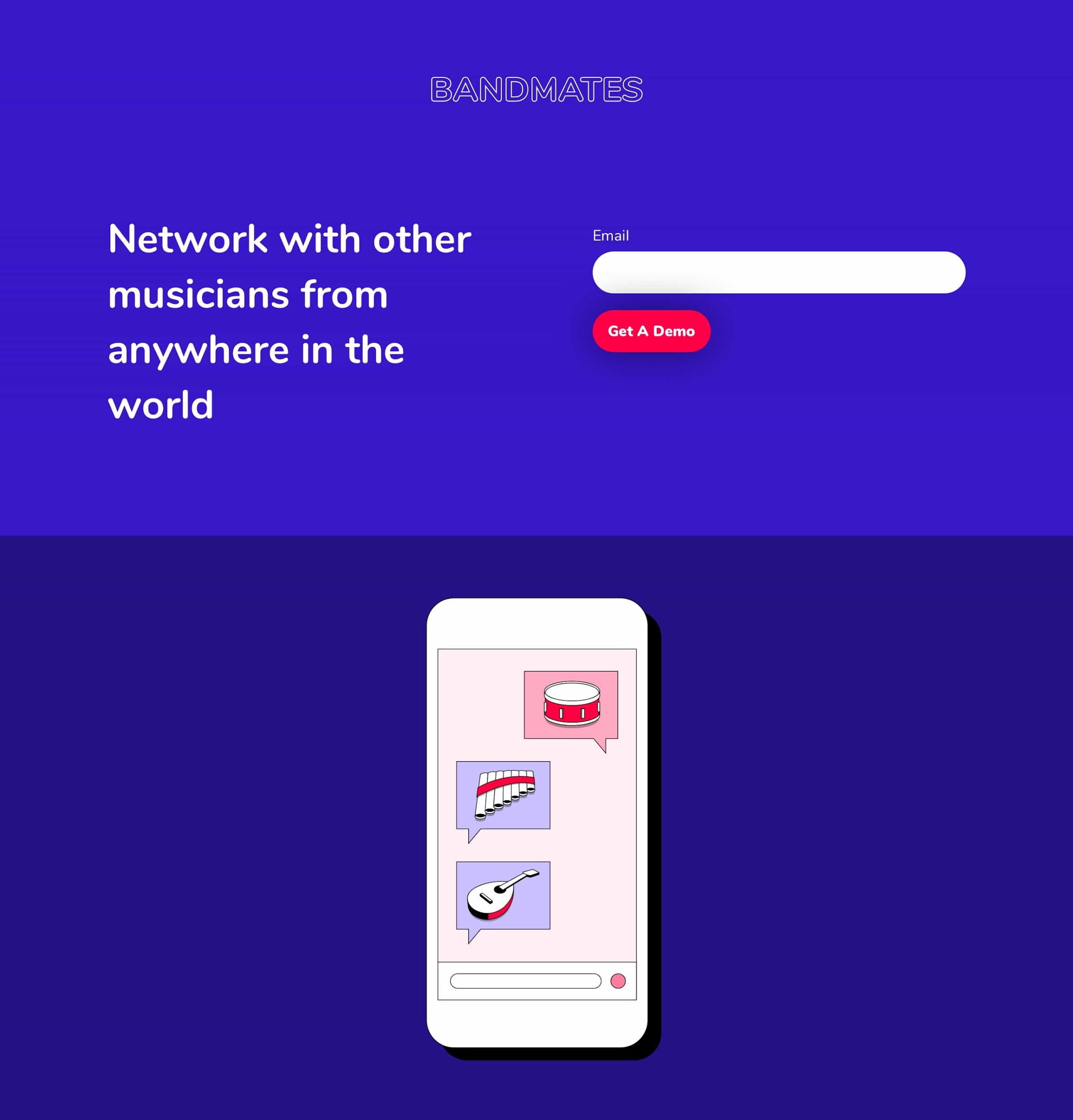
Similar to many Landing Page Templates, this design is also rather simple, with plenty of potential for personalization. The Landing Page Templates Free Bootstrap also eliminates navigation while keeping the firm logo, text description, and subscription form above the fold.
Users may also add extra components to the design, such as text or form boxes. Users can submit a product photo or another image just below the form. The blue backdrop makes the form and call-to-action button stand out, but these colors are flexible to match your brand.
O-Book – A Simple and Effective Combatant
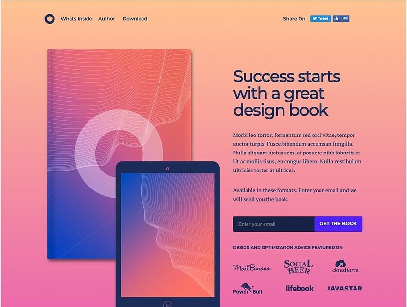
Unbounce layouts are only available with a subscription, but here is one of several Responsive Landing Pages Free Bootstrap you can test out for free for 14 days. This template appears to generate book-specific leads. Headlines, a product image, extensive description language, and a form section are all clearly marked.
The top navigation is simple, yet it includes social network icons. Because like many Landing Page Templates, this design has a style that is only for a short period of time, it may be a better option for a firm that has previously generated income from landing pages and wants to test out a more complex, but cheap design.
Proland – A Superstar on the Responsive Page Templates Free Stage
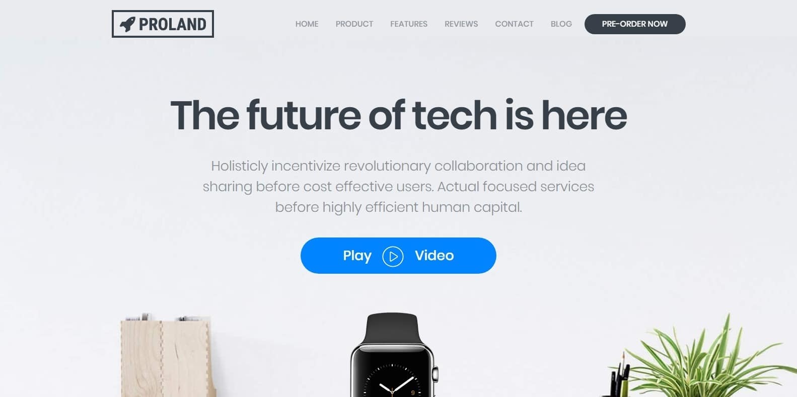
Proland is a member of the smart Landing Page Templates designed for promoting gadgets and futuristic technology at all phases of development. This Responsive Landing Page Template Free works with PayPal and Mailchimp just as smoothly as it does with Kickstarter and Indiegogo, whether you’re still working with drawings and prototypes or scouting out production lines with a clipboard tucked under your arm. What’s more, it can be ready for use in just an hour, so what are you waiting for?
Muzzle – A close friend for busy people
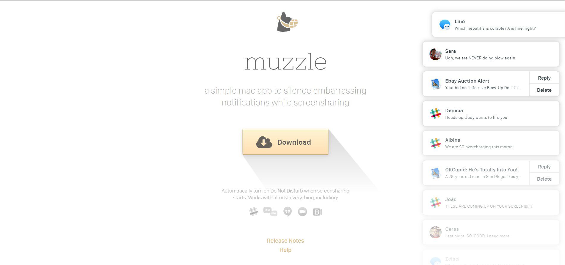
On their otherwise simple Landing Page Templates, Muzzle, a Mac program that mutes on-screen alerts, completely supports this show really shouldn’t tell attitude. Website Landing Page Templates Free let users evaluate whether your service or product is worth their time and effort. What better approach to plainly and simply express your value proposition than to present visitors with the problem that your software solves?
Visitors to the page are met by a barrage of humiliating alerts in the upper left corner of the screen. Not only is the animation funny, but this Landing Page Template also effectively conveys the app’s use without relying on long explanations. In terms of Cohesive Visual Experience, even the text on the website is a subdued gray hue, reflecting the product’s role.
However, while the light gray writing on the white backdrop perfectly replicates the product’s function, it may be difficult for some to read.
Wise
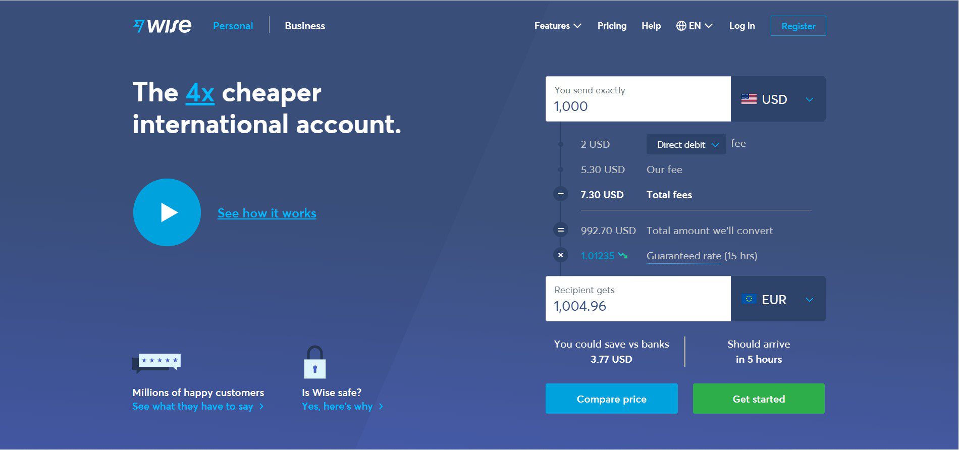
Wise lets you send and receive money in a variety of currencies and regions. And its main page categorizes clients as either Business or Personal. Therefore, you’re not confused by options that don’t relate to you. Before using the service, visitors can watch a brief film that explains how the Landing Page Templates work.
Because they are working with money, it is critical that they get the client experience right the first time. In terms of Highlights Safety, the security information prominently popups on this page. It also any concerns a potential client may have. And it can assure them that Wise is a secure service to use to send and receive money.
In terms of the Highlighted Value, Wise emphasizes it numerous times on the page, in both text and video. Therefore, it is less expensive than sending money through a regular bank. While this Landing Page Template is excellent that clients have access to a plethora of information about the service. There is a lot going on. There’s video, scrolling menus, and many buttons – all at the top half of the page.
Talkspace – The Best Landing Page Templates
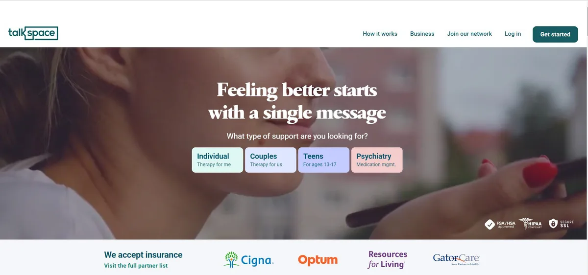
Similar to many Landing Page Templates, Talkspace, an online counseling service, emphasize credibility. This page’s material stresses that clients will have access to licensed therapists and underlines that the service is secure and confidential. It’s an excellent method to reassure folks who are apprehensive to take part. A brilliant concept is also the utilization of forms. Because pages are frequently cluttered with squares and boxes.
Moreover, they place the CTA within a huge circle quickly draws the visitor in. Overall, the design as a member of the Landing Page Templates is simple, appealing, and instructive. The emphasis on consumer security benefits them, especially because they are HIPPA compliant. Furthermore, in addition to explaining how Talkspace works, this website includes a number of mental health resources and articles. This portal has an excellent user interface and is an excellent beginning point for finding mental health information.
Nauto
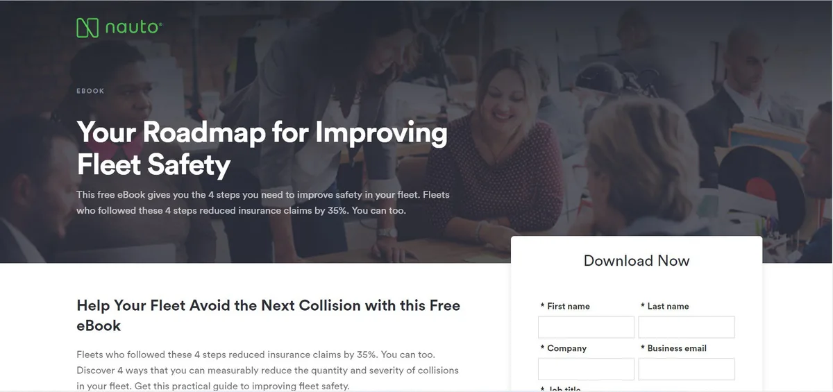
Nauto, a self-driving car data platform, assists firms that manage networks of personality vehicles in making autonomous driving safer. Naturally, its clients would want a wide range of information in order to sell them on this platform.
Nauto has it, packed in an amazing ebook with many Landing Page Templates. This design contains a small contact form as well as some sample figures to demonstrate why this material is so valuable.
A warm shot of a car outside, displayed above, embraces the push form at the center of the page. Perhaps the green button “Download Now” was intended to be there.
Scroll down to view another “Get the eBook” CTA to remind consumers what’s available. In addition, three startling data regarding automobile accidents will appear to attract viewers to learn more. Look it up below.
Conclusion on Landing Page Templates
The Landing Page Templates mentioned above already adhere to a variety of landing page quality standards. Many of them, for example, do not have a navigation bar, which may divert attention or clicks away from the offer on the page. Most Landing Page Templates WordPress also includes space for a picture or video. While images are wonderful for teasing a product, videos have been proven to increase conversions by 86%.
Read more: WordPress Landing Page Template: 20 New Masterpieces
Contact US | ThimPress:
Website: https://thimpress.com/
Fanpage: https://www.facebook.com/ThimPress
YouTube: https://www.youtube.com/c/ThimPressDesign
Twitter (X): https://x.com/thimpress_com

