As the global eLearning market continues to grow—with a projected market size of $645 billion by 2030—educators are looking for solutions that go beyond traditional learning management systems (source: StraitsResearch – E-Learning Market Report).
Eduma Online Learning is certainly the optimal solution to keep up with this wave. We wanted to provide our customers with information about recent updates to Eduma, including new layouts, enhanced course detail pages, pricing plan options, and integrates with more LearnPress add-ons, equipping eLearning creators with everything they need to build an engaging, effective, and flexible LMS platform.
Let’s take a detailed look at the new UI/UX updates, new LearnPress add-ons, and new features of Eduma Online Learning in this article.
Eduma – Education WordPress Theme
We provide an amazing WordPress theme with fast and responsive designs. Let’s find out!
New Features in Eduma Online Learning
Offline Course Detail Page & Its Features
With the need to provide not only online but also offline courses, we have provided prebuilds for Offline Course Landing Page and now Offline Course Detail Page!
The Offline Course Layout are designed to help you promote and manage offline courses, even if they are not set up with LearnPress. With Offline Course Detail Pages, you have the flexibility to promote and sell a variety of courses, whether they are live courses, online courses via platforms like Zoom or Google Meet, or any other format.
Similar to your online courses, our layout offers a simple checkout process right on your website. Plus, you can use this page to promote and provide information about your courses. Flexible calls to action allow you to personalize and include multiple links, whether to a phone number, a registration form, or other external websites.
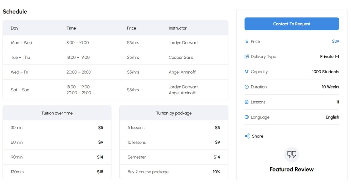
This new layout can help you reach the right audience effectively thanks to its SEO-friendly code, SEO Structure (with Schema Markup), and streamlined course registration process.
Bonus LearnPress Add-ons Included with Eduma
We’re excited to inform our customers that two new LearnPress add-ons—the Upsell Add-on and the Assignment Add-on—are now included with Eduma purchases.
Upsell Add-on for LearnPress
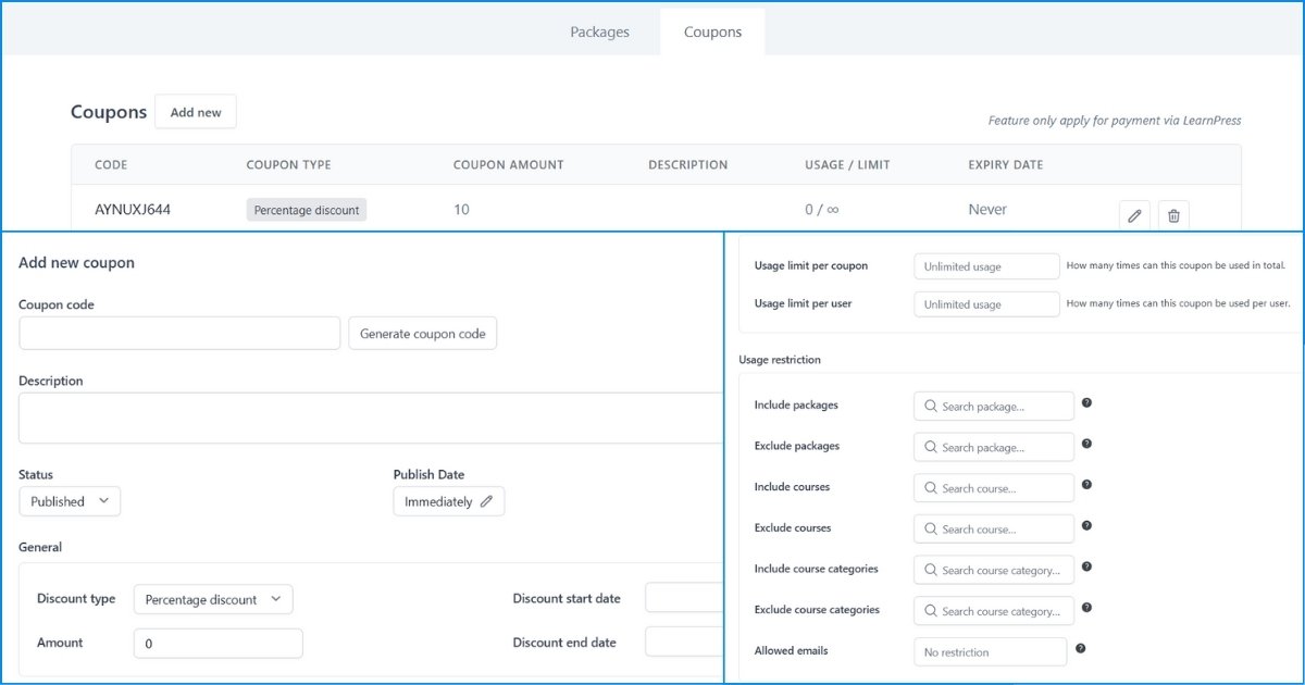
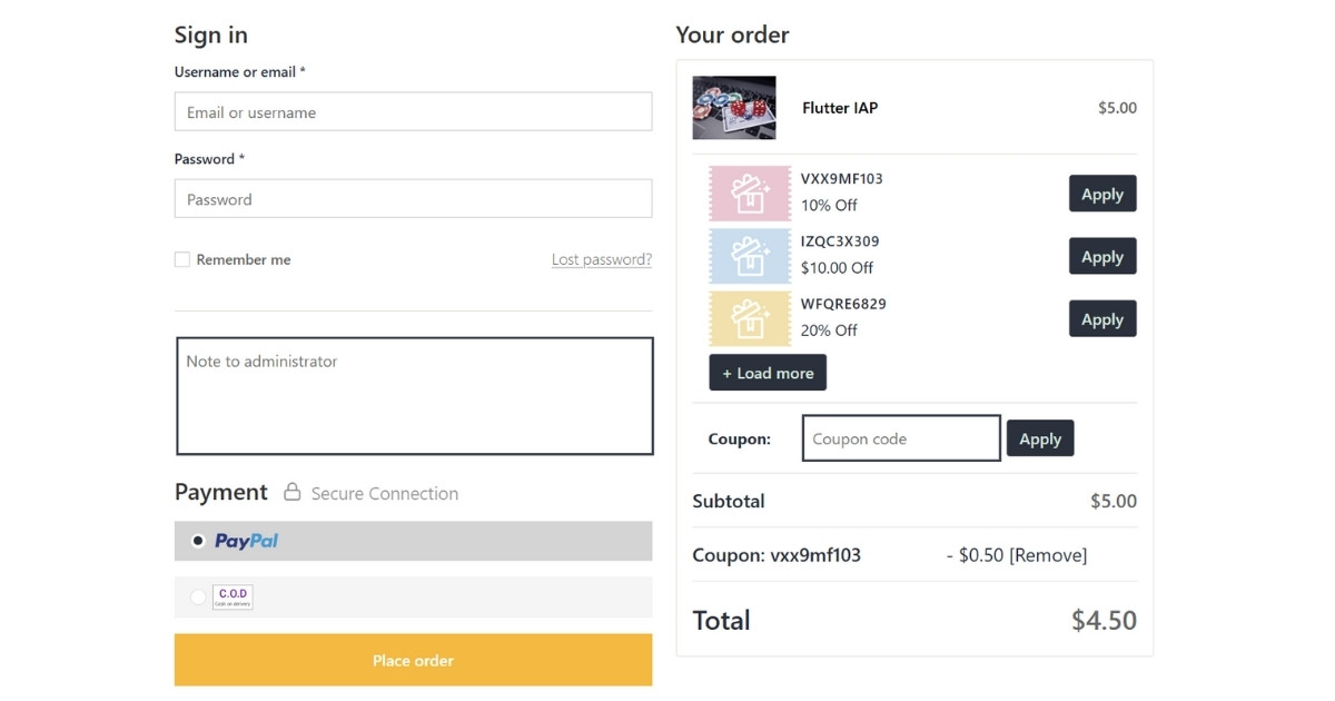
Upsell Add-on for LearnPress helps you strategically monetize your courses. With this add-on, students can easily discover related courses or customize their own learning paths.
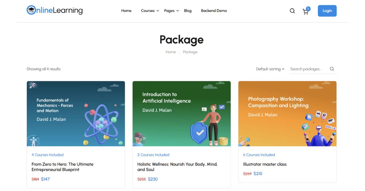
You can also create and manage coupons for students to apply. The updated interface, featuring attractive and informative design elements with strong CTAs, enhances user engagement.
Note: For more detailed information about UpSell Add-on, please refer to the article New Eduma Perks: Bonus Upsell Add-on with New Layouts.
Assignment Add-on for LearnPress
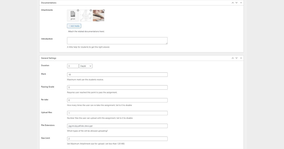
Assignment Add-on for LearnPress will help you create more learning activities for your students. This add-on is designed to support effective student learning by allowing you to provide assignment introductions and attachments right from the start.
You can fully customize assignments to align with your course objectives, adjusting options including duration, points, passing grades, retakes, file upload limits, allowed file types, size limits, and more.
Additionally, we’ve optimized the code for these two add-ons to improve performance, making it easier to use Eduma for course creation with fewer errors and minimal effort. You can read installation instructions and user guides for these add-ons at Upsell Add-on Documentation and Assignment Add-on Documentation.
Note: You can also check out the other add-ons that come with Eduma when you purchase Eduma at Eduma’s official page on ThemeForest.
New LearnPress Profile Layout
With the latest Eduma Online Learning update, we’ve implemented several improvements to the LearnPress profile.
The profile layout has been redesigned with a fresh, modern look to enhance both usability and user experience. We’ve also optimized the underlying code, minimizing and streamlining it to ensure faster load times and smoother performance on all major browsers.
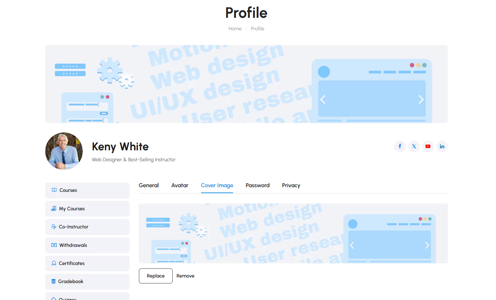
Additionally, new features have been added: both you and your students can now easily customize profile cover photos, with options to change or remove them entirely for a more personalized experience.
New Prebuilt Designs & Enhanced UX in Eduma
New Course Item Layouts
We’re excited to introduce our New Course Item Layouts, designed to cater to a variety of courses and display essential course information effectively.
Course Grid Layout 1
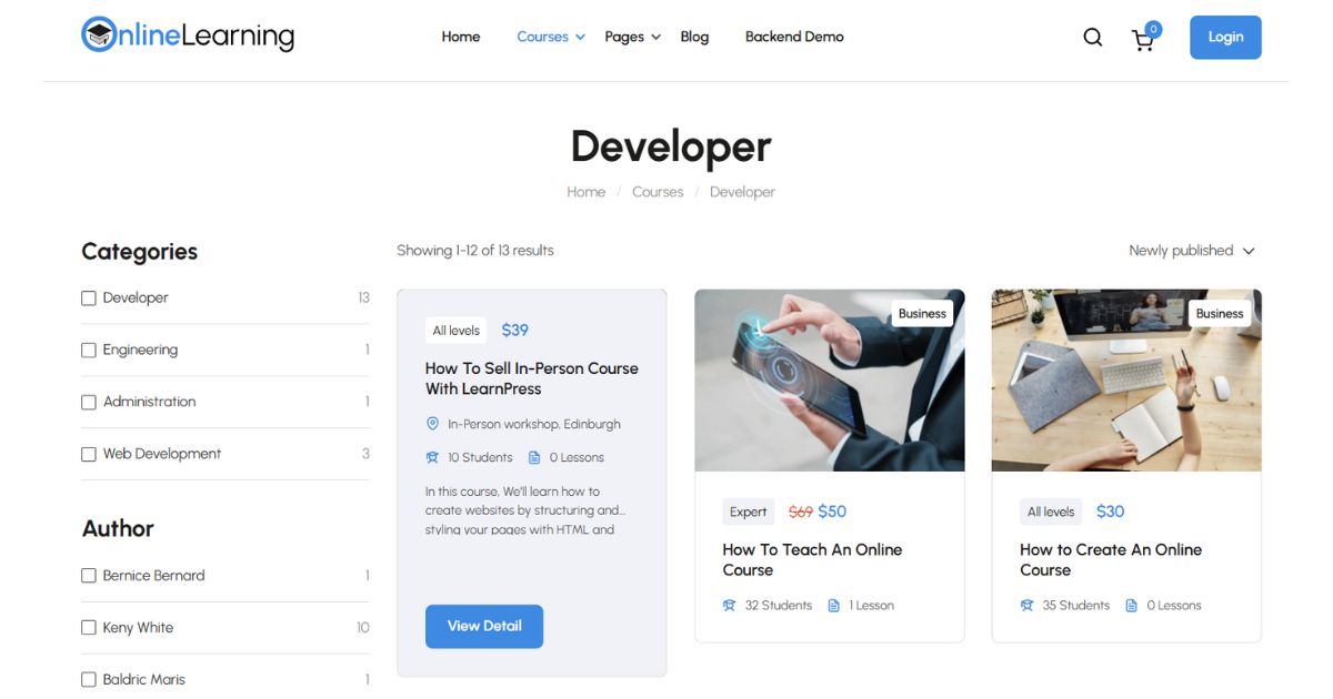
The goal of Course Grid Layout 1 is to improve user experience by providing a smooth method of perusing a large selection of course offerings. The built-in filtering tool in this layout is one of its best features; it allows users to narrow their search by category, skill level, and course type, among other criteria simply by hovering their mouse over the course.
In addition to its user-friendly filtering, Course Grid Layout 1 highlights the significance of presenting information in an understandable and succinct manner. A brief explanation is shown prominently for each course item, providing prospective students with an overview of what to expect from the course.
Course Grid Layout 2
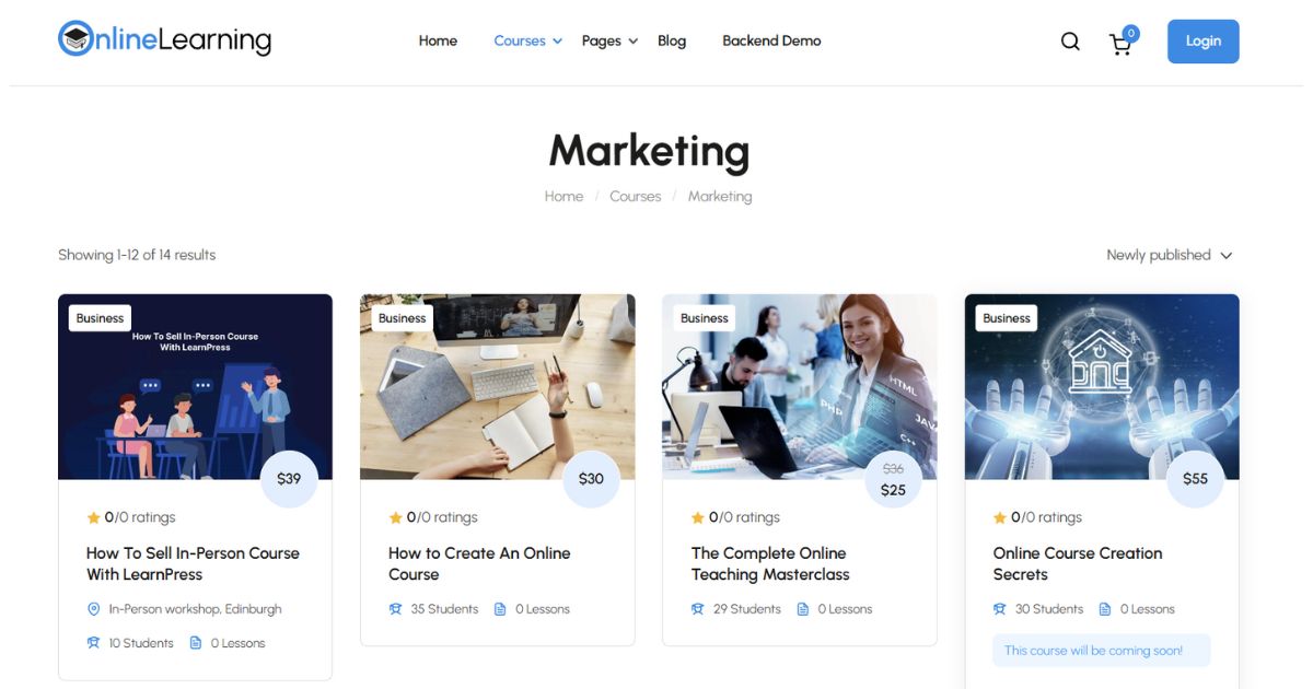
Course Grid Layout 2 is specifically designed for sites with a small number of courses. The removal of the sidebar in this layout creates a simple, clean interface that draws users’ attention to the courses. Users can browse options easily because of the simple design, allowing them to do so without feeling overwhelmed.
Course Grid Layout 2 clearly displays important information such as ratings and course categories. This layout is especially effective for premium courses that need more space to display. Additional course descriptions, instructor expertise, and unique selling points can be easily included in the design, providing potential students with all the information they need to support their investment.
Course Grid Layout 3
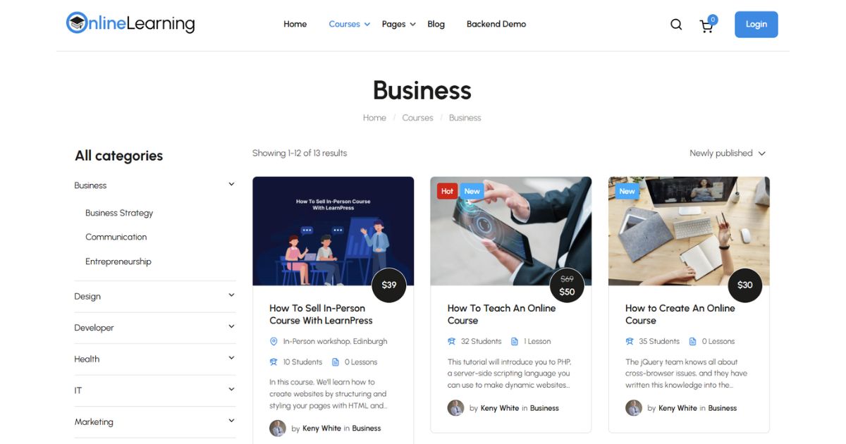
To provide an engaging user experience, Course Grid Layout 3 highlights important course information.
New students can easily understand what each course has to offer thanks to this structure, which cleverly highlights important course elements including but not limited to course categories, instructor information, and short descriptions.
Additionally, this arrangement can be changed to reflect the nature of your company (e.g. adjust the sidebar layout, filter to the right instead of the default left), ensuring that the entire design fits the theme of your LearnPress website.
New Course Detail Layouts
To enhance user experience and engagement, we have developed New Course Detail Layouts that focus on improving both user interface (UI) and search engine optimization (SEO). Each layout is meticulously designed to meet diverse user needs and boost your online course offerings.
Single Course Layout Default
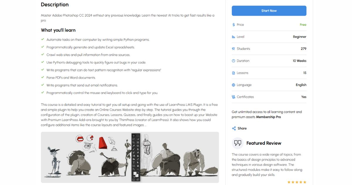
The Single Course Layout Default emphasizes a user-friendly interface and overall user experience. It presents course information in a clean, visually appealing format that encourages exploration.
Key features include:
- Clear Hierarchy: Information is organized logically, with course titles, descriptions, and key details prominently displayed.
- Visual Elements: Engaging images and icons enhance the aesthetic appeal and break up text, making it easier for users to digest information.
- Responsive Design: The layout adapts seamlessly to different devices, ensuring that students can access course details easily, on all devices.
Single Course Layout Tabs
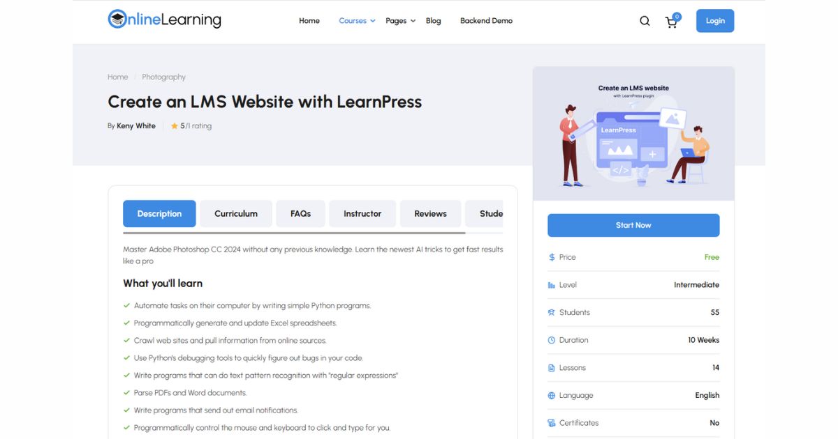
The Single Course Layout Tabs is specifically designed with SEO in mind. This layout organizes course details into tabs, making it easy for search engines to index information while providing users with a streamlined navigation experience.
Key features include:
- SEO Optimization: By segmenting information into tabs including Description Curriculum, FAQs, Instructor Reviews, and Students List. Search engines can better understand and index your course content, potentially boosting your visibility in SERPs.
- User-Friendly Navigation: Users can quickly switch between tabs to find specific information without having to scroll through lengthy descriptions. This keeps their attention focused and encourages deeper exploration of your offerings.
- Interactive Elements: Incorporating interactive features, like collapsible sections within each tab, allows users to engage with the content actively and efficiently.
Single Course Layout Offline
The Single Course Layout Offline is tailored for offline courses, making it ideal for attracting students interested in in-person or live online classes. This is not only a layout but also a new feature that we introduced at the beginning of the article.
New Pricing Plan Page
To help you make the most of your revenue potential, we are excited to introduce our New Pricing Plan Page. This feature lets you show different pricing options in a clear and easy-to-understand way, helping students see the value of what you offer.
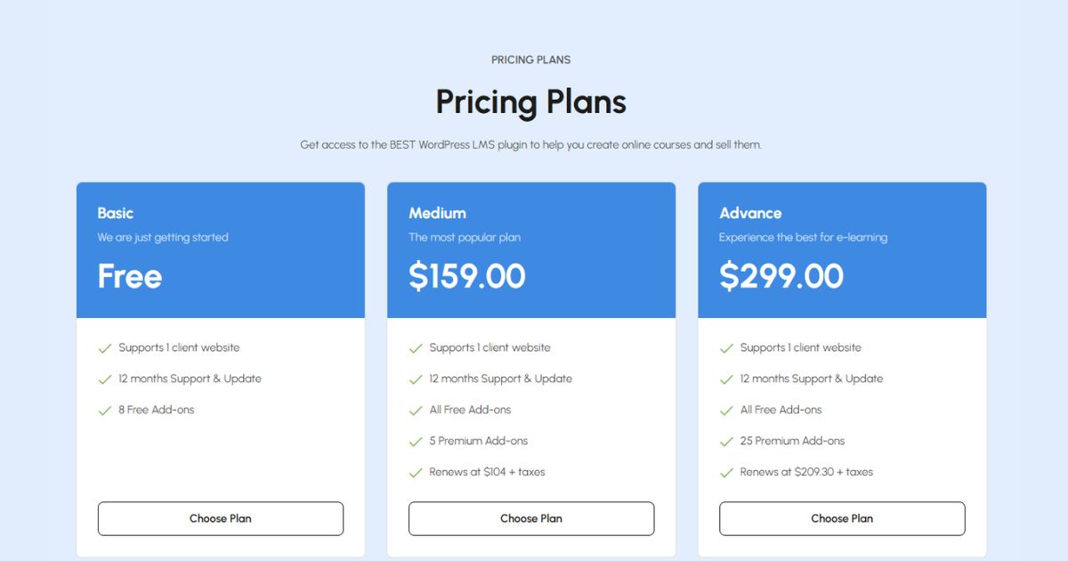
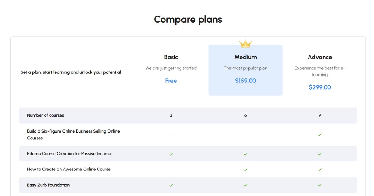
With customizable plans and different pricing tiers, you can meet the needs of various users and encourage them to sign up with appealing packages. The Compare plans display will also help direct students to the plans you want to sell most, benefiting both you and your students.
We’ve also added an email newsletter subscription to our Pricing Plan Page, ensuring that potential customers interested in your offers stay in the loop. This feature makes it easy for users to sign up and receive updates, so they won’t miss out on any future deals or course announcements.
Why Eduma is Perfect for Your eLearning Website?
Integrates Seamlessly with LearnPress
Eduma is built to work seamlessly with LearnPress, one of the most powerful LMS plugins available for WordPress, and with Eduma Online Learning, this perfection is further enhanced by the improved layout of the LearnPress Add-ons.
This seamless integration makes it easy to create, manage, and sell courses, providing a smoother experience for both instructors and learners than any other education WordPress theme on the market when used with LearnPress.
This exceptional compatibility and ease of use are also why Eduma consistently ranks as the #1 education WordPress theme on ThemeForest.
Dedicated Support Staff
We know that managing an eLearning platform can bring unique challenges, especially if you’re not familiar with coding. That’s why Eduma provides a dedicated support team to assist you at every stage.
Our team is here to answer questions and solve issues quickly, making sure your platform runs smoothly and provides the user experience you envision. You can get help from us at Help Center or ThimPress official Facebook anytime you need.
With fast, reliable support rated 4.85/5 by over 40,000 customers, you can focus on what matters most: delivering quality education to your students.

Contact US | ThimPress:
Website: https://thimpress.com/
Fanpage: https://www.facebook.com/ThimPress
YouTube: https://www.youtube.com/c/ThimPressDesign
Twitter (X): https://x.com/thimpress_com

