Problems You Will Face Without a Landing Page
If you are a teacher or an online course creator, you will probably know that before teaching anything, you need to spend several years and take a lot of trials to learn and plan the content for your courses. After taking time and effort to create courses, you’re proud of your content and confident that there will be students enrolling in your course.
However, successfully creating an online course doesn’t mean that all students can come to you and sign up for it. Besides, the courses are online which means that your students can come from anywhere in the world if they have an internet connection.
Therefore, you couldn’t meet each targeted audience to introduce them to how amazing your course is, why they should learn with your course, and convince them to sign up for it. Even if you could find someone you can talk with, I am pretty sure that you don’t want to spend too much time on it. Tele-sale is also a hardly good method to sell your course. But, you are a teacher, your strength is teaching, not selling.
So, “What should you do now to sell your course without spending your precious time persuading the audience to enroll in your courses?”
The answer is: “Creating a Landing Page to drive the audience to sign up for your courses”.
Why Landing Page is Important?
A landing page is increasingly playing an important role in introducing products, events, and media campaigns and creating a first impression with potential customers. But creating a beautiful landing page that runs well is not simple. In this article, I will show you what you want to know when building a landing page for your online courses.
Would you sell a course the same way as selling a dress? Of course not.
They are definitely two different types of products with different benefits. On the landing page, you need to use vocabulary that can emphasize the benefits, and characteristics of the object you want to sell.
Specifically, an online course sales page (landing page for online courses) should show the description of your courses, benefits that students can get, length, tutor, learning outcome, etc., and other information. But the most important thing is that the content can drive and motivate the audience to sign up for it. This is the page that your future students will visit before making any decision to enroll in your online courses or not.
In this article, it’s not important to know how the audience can find your courses’ landing pages. Maybe they can unexpectedly hear the course from others or click on an advertisement somewhere on the Internet. Maybe they come from your email newsletter or an article on a blog post. The major thing is, what they do when they get to your landing page and how they can become your students.
The purpose of a landing page is to persuade the audience to sign up for your online courses (even if the course is free). Therefore, on the sale page, you should use different sentences and words to motivate them to download. However, it’s important to use the words carefully. Every word should contribute to achieving the goal of selling courses. The user’s experience will decide their decision to click escape or stay on the page.
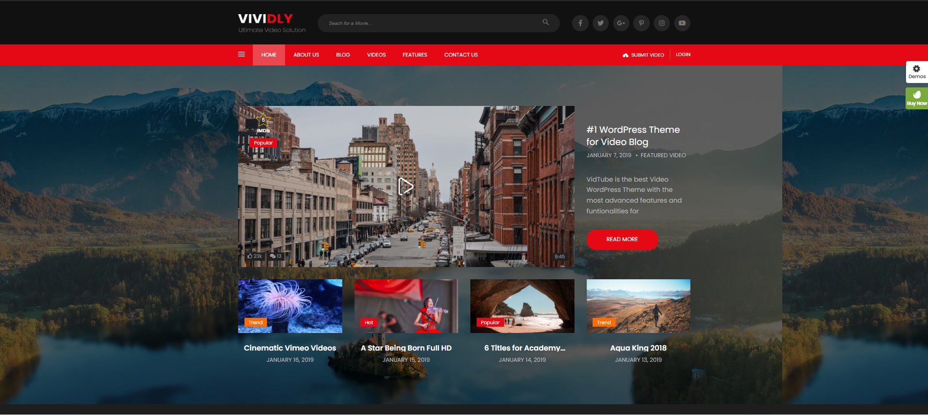
Nobody Wants to Read The Whole Wall of Text
It’s the truth that no user can have the patience to capture every single word that you wrote on a wall of text. Instead, they will scan the paragraphs and pick out individual words and sentences that they are impressed with. These words might help them determine whether your offer is worth it or not. Therefore, before writing the content, remember to outline how to make your page skimmable.
Not all the words on your landing page have the same importance as others. Each part will bring different purposes to the readers. For example, the headline will be the first impression to the audience while the benefits part will help them know how the course make their lives better or call-to-action to know how to claim resource.
These elements will be displayed as text on your landing page. However, they should be illustrated to get users’ attention and appeared friendly to readers. Normally, people always enter a page through the headline, then scan for bold and italicized words and save the rest for last.
The Following Should Be Included on the Landing Page
If you search with keywords: “how to build a landing page” on the Google website, you definitely got thousands of results for the answer. Each one will recommend you a specific structure for a sale page. However, to conclude all of them, here are important things that you need to include on your landing page for online courses:
- A headline
- A storytelling paragraph
- Bullet points
- Offer/Bonus
- Testimonials/Reviews
- Credit
- FAQ
- Pricing plan
- Risk Reversal (optional)
The order of these elements may be different with each course, but in most cases, the creators need to include all of them on a sales page. They are basic content that users always want to know on a landing page.
Headline
The purpose of a headline is to attract the audience’s attention and keep them around your landing page. It’s supposed to be the most important thing which decides whether the visitor can stick with your work or not. With the headline, you don’t need to mention your course. Instead, try to think of how you can keep the audience to read the rest of your content.
Qualify your audience with the headline. Make it obvious who the headline is for which gives them a chance to determine if your courses are relevant to them. I highly recommend starting a headline with a bold line of letters at the top of the landing page. You can refer to why your offer is better than competitors, what is the biggest benefit of students of these courses, etc.
Opening introduction
The next mission after getting the audience’s attention is presenting the problem regarding the courses. In this section, you should focus on showing the reader that you totally understand their difficulty or problem. It will help you build sympathy and trust with your customers.
If you ever have experienced the same problem before creating the courses, don’t forget to share it with your readers. The audience will gradually trust you and feel that you will help you figure out their problems which will create motivation for them to keep around to the next sections and buy your courses.
Remember that they not only buy your course but also buy the transformation. Help them to determine the transformation before you actually introduce your courses to them.
Benefits of your courses (Bullet Points)
A landing page for selling courses should indicate the features of your courses, and the main benefits that the audience can get if taking the courses. It would be better if you list about 5 to 10 major things in the list.
Due to the habit of skimming the sales page before actually reading of readers, it is recommended to make this section easier for skimmers to find out what you want to talk about. Therefore, you can start with bullet points instead of hiding important words in long paragraphs. Be careful, think of what you need to show to the readers, and carefully stylize your text. I highly recommend the bold style, don’t use underline or italics.
The online courses (Call-to-action)
In this section, you can show your course details and all information included in the courses. It can be modules or videos that tell the reader about the content of the module/lesson. Remember to concentrate on the content with specific benefits.
At the end of this section, try to put the call to action to encourage readers to sign up. This part will be a short phrase that is an incredibly important part of your landing page. Some businesses have remarkable changes in conversions rate by simply adjusting one word. In the call-to-action, you can consider emphasizing the benefits that they can get.

Bonuses/Offers (optional)
Besides providing the above information, you can present some bonus materials coming along with the online courses. Maybe this is exclusive from this landing page which will convince the audience to sign up through it.
- Here are some examples of offers/bonuses:
- Free downloadable PDF/ebook/worksheets/videos
- Discounts or promotions on the online courses
- Discounts or promotions on other products/services
- Access to a private group of students
Attaching bonuses with online courses will add much value to the courses. The readers will find out that online courses are more valuable than the amount of money they need to change. Therefore, this will be a motivation that drives them to learn with you.
Testimonials
Introducing testimonials from previous students will be remarkable evidence for the readers that your online courses are excellent as you describe. This part is from the third party, not from your words. By experiencing the above section, the audience will generate awareness about your online courses. The testimonials are third-party validation of what you offer to be on its promise.
Remember that never use fake testimonials. If you don’t have any testimonials yet, you should consider giving free access/trial for others in a group.
Credibility
With each online course, an important piece of information the readers would like to know is the instructor’s biography. You should answer these questions: who are the instructors and why should a student need to learn from you? In this section, try to give all proof of your achievement in previous teaching experience. It’s necessary to prove to the audience that you have knowledge and experience in teaching about this topic.
Summary
To sum up, an efficient landing page is necessary for marketing and selling online courses. It acts as the initial impression and gives you the chance to showcase the special advantages of your courses, convince prospective students to sign up and establish trust with the help of student reviews and instructor biographies.
You can draw visitors and turn them into eager students by building a landing page that is easy to skim and compelling.
Learn more: 6 Best Free AI Logo Generators to Boost Your Branding
Contact US | ThimPress:
Website: https://thimpress.com/
Fanpage: https://www.facebook.com/ThimPress
YouTube: https://www.youtube.com/c/ThimPressDesign
Twitter (X): https://x.com/thimpress_com

