A strong design becomes easier to understand when its basic parts are clear. So, what are design elements? They are the visual building blocks used to organize information, guide attention, create mood, and communicate a message. Every poster, website, logo, package, advertisement, presentation, or illustration uses some combination of these parts.
There is no single list used in every design field. Many courses teach seven core elements: line, color, shape, texture, space, form, and value. Graphic design and communication design may also include typography and framing because both strongly affect readability and structure.
These elements are simple when viewed separately, but they become more useful when combined. A designer may use color to attract attention, space to improve clarity, typography to create hierarchy, and shape to organize content within the same composition. This guide explains nine useful design elements, their meanings, how they work together, and how to apply them in practice.
Eduma – Education WordPress Theme
We provide an amazing WordPress theme with fast and responsive designs. Let’s find out!
Key Takeaways: What Are Design Elements? 9 Basics Every Designer Needs
- Design elements are the basic visual parts used to create a composition.
- Seven commonly taught elements are line, color, shape, texture, space, form, and value.
- Typography and framing are often added in graphic design because they affect communication and layout.
- Each element has a different role, but effective design depends on how several elements work together.
- Design elements are different from design principles. Elements are the tools, while principles guide how those tools are arranged.
- Understanding what are design elements helps beginners make clearer visual choices and evaluate designs more effectively.
First Of All, What Are Design Elements?
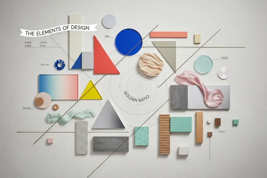
The simplest elements of design meaning is that they are the visual parts a designer can control within a composition.
A designer can change the direction of a line, the size of a shape, the intensity of a color, the amount of empty space, the weight of a typeface, or the contrast between light and dark. Each choice affects how a viewer sees, reads, and understands the design.
To explain the elements of design simply, think of them as visual vocabulary. A sentence is built from words, while a design is built from visual components. These components may seem basic on their own, but together they create order, movement, hierarchy, depth, and emphasis.
The elements also make design feedback more specific. Instead of saying that a layout “does not look right,” it is possible to identify that the spacing is too tight, the value contrast is weak, the typography has no clear hierarchy, or too many shapes are competing for attention.
Understanding what are design elements is therefore useful beyond professional graphic design. Marketers, students, business owners, and content creators can use the same concepts to review advertisements, social graphics, presentations, and websites.
The same element can behave differently depending on the medium. Space on a mobile screen must be managed differently from space on a large poster, while color can appear different in print and on a digital display. This is why understanding the elements is more useful than memorizing a fixed style. The principles stay relevant even when the format, platform, or visual trend changes.
The 9 Elements of Design (Every Designer Needs)
1. Line
A line connects points, creates edges, separates areas, and guides the eye. It can be straight, curved, thick, thin, solid, broken, horizontal, vertical, diagonal, or implied.
Different lines can create different effects. Horizontal lines often feel stable, vertical lines can suggest strength, diagonal lines create movement, and curved lines may feel softer or more natural.
Lines can divide sections, underline information, form shapes, create borders, or lead attention toward a headline or image. Designers also use implied lines. Several objects arranged in a row, for example, can guide the viewer’s eye even when no visible line connects them.
Line can also influence tone. A precise thin line may feel technical or elegant, while a rough line can feel informal or expressive. Because of this flexibility, line can quietly organize a layout or become a strong visual feature.
2. Color
Color can quickly change the mood and focus of a composition. Designers use it to attract attention, separate information, create contrast, support visual identity, and make content easier to understand.
Three basic qualities are useful to know: hue is the color itself, saturation describes how vivid or muted it appears, and brightness describes how light or dark it is.
Color combinations also matter. Complementary colors can create strong contrast, while colors positioned closer together on the color wheel often feel more harmonious. A limited color palette can also make a design feel more controlled than using many unrelated colors.
Color meanings are not universal. Culture, audience, industry, and context can change how a color is understood. Designers should therefore avoid using color as the only way to communicate important information.
3. Shape
A shape is a two-dimensional area created by an outline, color, contrast, or boundary. Common examples include circles, squares, rectangles, and triangles, but shapes can also be organic or abstract.
Shapes are often grouped into three types:
- Geometric shapes: Regular forms such as circles, squares, and triangles.
- Organic shapes: Irregular forms that often resemble objects found in nature.
- Abstract shapes: Simplified or symbolic versions of familiar objects or ideas.
Shapes help organize information. Buttons, cards, icons, text boxes, logo symbols, and background blocks can all function as shapes within a layout.
Designers can repeat, overlap, resize, align, or layer shapes to create hierarchy and rhythm. Rounded forms may feel softer, while sharp angles may appear more energetic. When used carefully, shapes make complex layouts easier to scan and understand.
4. Texture
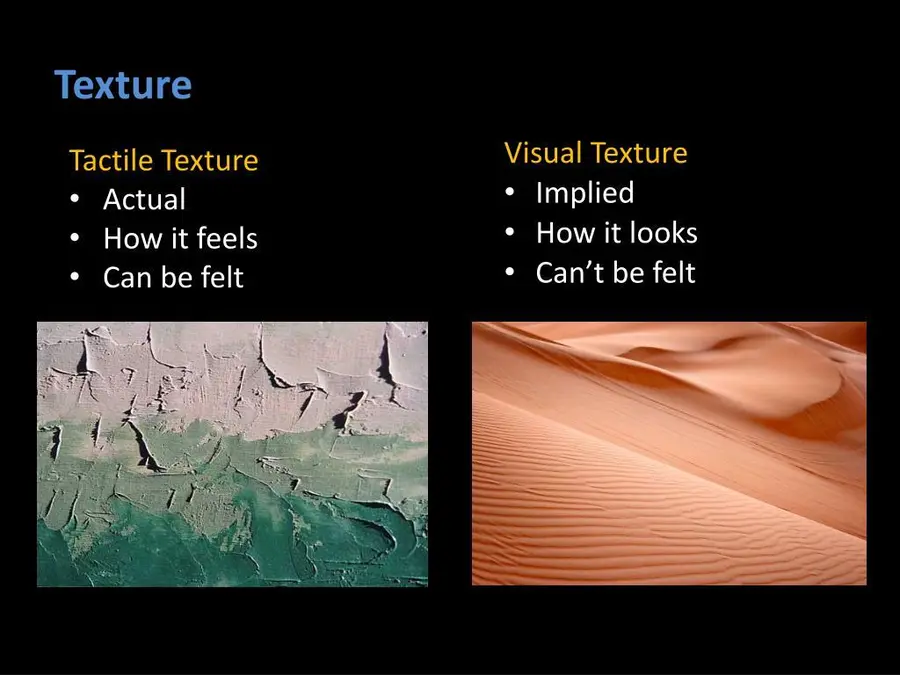
Texture describes how a surface feels or appears to feel. In physical design, texture can be experienced through touch. In digital work, texture usually creates the visual impression of a material or surface.
Examples include rough paper, smooth glass, fabric, wood grain, stone, brushed metal, grainy photography, and subtle digital noise.
Texture can add depth, character, realism, and mood. A light paper texture may make a layout feel warmer, while a rough concrete texture can create a heavier or more industrial feeling.
However, texture can become distracting when it is too strong. A busy background may compete with text or images and make a design harder to read. Good texture supports the message instead of becoming decoration without a clear purpose.
5. Space
Space is the area around, between, and inside visual elements. Positive space contains the main content, while negative space, also called white space, refers to open areas around that content.
Good use of space can improve readability, separate information, create balance, reduce clutter, and help important content stand out. Objects placed close together usually appear related, while larger gaps suggest that groups are separate.
Space also affects emphasis. A small object surrounded by a large amount of empty space can attract more attention than a larger object inside a crowded area.
Empty space should not be treated as wasted space. For anyone asking what are design elements, space is especially important because it directly affects clarity, hierarchy, balance, and readability.
6. Form
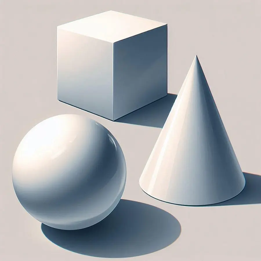
Form refers to three-dimensional objects or the illusion of three dimensions. A cube, sphere, bottle, chair, or package has form because it has width, height, and depth.
On a flat surface, designers can create the appearance of form through light, shadow, perspective, gradients, highlights, contours, and changes in value. A flat circle, for example, can appear to become a sphere when shading creates the illusion of volume.
Form is especially important in product design, packaging, illustration, architecture, 3D graphics, and digital mockups.
Shape and form are closely connected, but they are not the same. Shape is mainly two-dimensional, while form adds depth and volume. A circle is a shape; a sphere is a form. This distinction is useful when studying elements of design and definitions.
7. Value
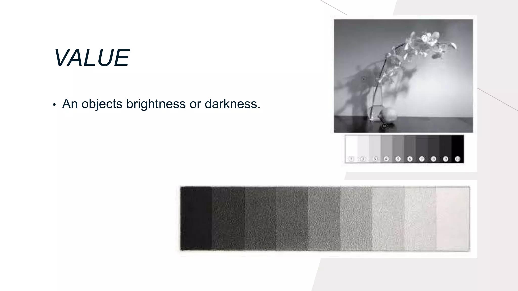
Value refers to the lightness or darkness of a color or tone. It helps create contrast, hierarchy, depth, and separation.
Strong value differences make important information easier to notice. Dark text on a light background is a simple example. Shadows can make objects appear deeper, while highlights can make parts of an object appear closer or more dimensional.
Value also affects readability. Two colors may have different hues but similar brightness, which can still create weak contrast.
One simple way to check value is to view a design in grayscale. If the main information remains easy to identify, the design probably has a clear value structure. Value is related to color, but it focuses specifically on how light or dark something appears.
8. Typography
Typography is not always included in the traditional seven-element model, but it is essential in graphic and communication design. Text is not only information; it is also a visual element.
Typography includes typeface, font size, weight, letter spacing, line spacing, alignment, and line length. Large, bold text can create a focal point, while smaller text can support secondary information.
Good typography gives priority to readability. Too many fonts, weak contrast, tight spacing, or unclear hierarchy can make useful information difficult to scan.
Typography also affects tone. A serif typeface can create a different impression from a clean sans serif or expressive display font. It works closely with visual hierarchy, helping readers understand what to read first, second, and third.
9. Framing
Framing creates boundaries around content or defines groups within a layout. A frame can be visible, such as a border or box, or invisible, created through alignment, background contrast, and spacing.
Designers use framing to highlight important information, separate sections, group related items, organize images, and define focal areas. A quote inside a box or a website card separated by spacing are simple examples.
Framing can also come from cropping or surrounding empty space. It does not always require a visible border.
Too many frames can make a layout feel heavy or fragmented. In clean designs, alignment and negative space may provide enough structure. Although not every framework lists framing as a core element, it remains useful in graphic, digital, advertising, and editorial design.
How Design Elements Work Together
Understanding individual elements is only the first step. Strong visual communication depends on how they interact.
Consider a promotional poster. Large typography may establish the main focal point. A bright color can draw attention to a call to action. Shapes can divide information into clear groups. Value contrast can improve readability, while negative space prevents the composition from becoming crowded. A subtle texture may add character without becoming the main feature.
Changing one element can also affect another. A bright color becomes stronger when surrounded by neutral space. Large typography loses impact when too many objects compete for attention. Texture may add depth but reduce readability when contrast is weak. Form often depends on value because light and shadow help create volume.
Every element changes the visual context around the others. A red circle does not have the same impact on a white background as it does inside a group of red objects. Large text may feel dominant in one layout but ordinary in another where everything is large.
This is why the elements of design should not become a checklist where every element must be equally strong. Effective design usually depends on hierarchy. Some elements lead while others quietly support the message.
Elements of Design vs. Principles of Design
A common source of confusion is the difference between design elements and design principles.
Elements are the visual parts used to build a composition. Principles describe how those parts are arranged. Common principles include balance, contrast, emphasis, movement, rhythm, proportion, pattern, hierarchy, and unity.
For example, color is an element. Using one bright color against several muted colors to create a focal point applies contrast and emphasis. Shape is an element, while arranging several shapes so a composition feels stable applies balance.
Line is an element, but repeating lines to create a visual beat involves rhythm. Typography is an element in many graphic design frameworks, while changing heading and body text sizes to show importance applies hierarchy.
Some users search for elements and principals of design. The correct term is elements and principles of design. “Principles” refers to guidelines or methods, while “principals” usually refers to people in leadership roles.
In short, elements are what a design is made from, while principles describe how those parts are organized. Understanding both makes it easier to explain why a design works and what may need improvement.
How to Apply Design Elements in Practice
Once what are design elements is clear, the next step is applying them with purpose rather than simply adding visual details.
1. Define the main message. Decide what the viewer should notice, understand, or do. Visual choices should support that goal.
2. Create a clear focal point. Use size, color, value, typography, shape, or position to make the most important information easy to find.
3. Organize the layout. Use lines, shapes, framing, and space to group related information and separate different sections.
4. Check readability. Text needs enough size, spacing, and contrast for its intended format. A design may look attractive but still fail if the information is hard to read.
5. Use color and texture with purpose. These elements should support the message or mood. Avoid adding effects simply because empty areas remain.
6. Review visual hierarchy. Look at what attracts attention first, second, and third. If everything appears equally important, stronger hierarchy may be needed.
7. Check how elements interact. A color may work alone but fail over a textured background. A font may look good at large size but become difficult to read when reduced.
8. Remove unnecessary details. Good design does not require every available visual tool. Removing extra details can make the main message stronger.
Several common mistakes can reduce effectiveness. Using too many colors, textures, shadows, shapes, or borders can make the message harder to find. Ignoring negative space can make a layout feel crowded. Weak contrast can reduce readability, while inconsistent styles can make a design feel disconnected.
Depending on color alone can also cause problems. Position, labels, shape, typography, and value should provide additional visual signals. Finally, confusing elements with principles makes design decisions harder to explain.
A simple review can help: check whether the main message is obvious, whether the text is readable, whether the layout feels crowded, and whether any visual element attracts attention without a clear reason.
It is also useful to compare a design before and after one change at a time. Increase the spacing, reduce the number of colors, strengthen the contrast, or simplify the framing, then check whether the message becomes easier to understand. Small controlled changes make it easier to see which element is improving or weakening the composition.
FAQs About the Elements of Design
1. What are design elements in simple terms?
What are design elements? They are the basic visual parts used to create a composition. Common examples include line, color, shape, texture, space, form, and value. Typography and framing are also often included in graphic design. These elements help control structure, mood, focus, depth, and readability.
2. How many elements of design are there?
There is no single list used in every design field. Seven are commonly taught: line, color, shape, texture, space, form, and value. Some graphic design approaches also include typography and framing, creating a list of nine. The exact number matters less than understanding the role each element plays.
3. Can you explain the elements of design for beginners?
To explain the elements of design simply, line guides attention, color creates mood and contrast, shape organizes content, texture adds surface quality, space creates breathing room, form adds depth, value controls light and dark, typography communicates text, and framing groups information. Beginners can practice by identifying these parts in posters, websites, or advertisements.
4. What is the difference between the elements and principles of design?
The elements are the visual building blocks of a composition, while principles describe how those blocks are arranged. For example, color is an element, while contrast is a principle. Shape is an element, while balance is a principle. Elements provide the materials; principles guide how those materials are combined.
5. Why are design elements important?
Design elements help control clarity, focus, mood, readability, depth, and organization. They also make feedback more specific because a problem can be discussed in terms of spacing, color, value, typography, shape, or another visual component. Understanding them makes it easier to recognize why one design feels clear and another feels confusing.
Conclusion
So, what are design elements? They are the basic visual tools used to build and organize a composition. Line, color, shape, texture, space, form, and value form the traditional core, while typography and framing are useful additions in many areas of graphic and communication design.
Learning the elements of design is not mainly about memorizing a fixed list. Different design fields may group or describe them differently. The more useful goal is understanding what each visual choice does and how several choices work together.
A strong design usually depends on relationships rather than isolated decisions. Color becomes more effective when supported by value and space. Typography becomes clearer when hierarchy and contrast are controlled. Shapes become easier to understand when spacing and framing show how they are grouped.
A practical way to improve is to study everyday designs and ask a few simple questions. Where does the eye go first? Is there enough space? Does the color support the message? Is the contrast strong enough? Are shapes organized clearly? Does the typography make the reading order easy to understand?
Once these questions become familiar, design theory becomes easier to apply. Understanding the basic elements makes it easier to create visual work that is purposeful, balanced, readable, and clear for its intended audience.
Read more: 15 Practical Ways to Use AI at Work More Effectively
Contact US | ThimPress:
Website: https://thimpress.com/
Fanpage: https://www.facebook.com/ThimPress
YouTube: https://www.youtube.com/c/ThimPressDesign
Twitter (X): https://x.com/thimpress_com