Website aesthetics have a strong impact on a site’s perception and usability for its visitors. With a well-designed site and careful consideration of background, fonts, and other graphical elements, usability can be maximized, use can be increased and a lasting impression can be made.
Regardless of whether a site will be for individual use, commercial use, or use in an electronic marketplace, familiarity with these factors can mean a forgetful web page versus an immensely successful web presence. With decreasing web surfers’ attention spans, a site must make a positive, immediate impression through a pleasing website aesthetic. This article will analyze important aesthetic web design options and how these contribute to usability, branding, and overall success.
Why Aesthetics Matter in Website Design
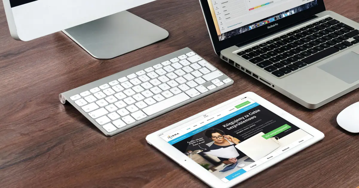
The visual beauty of a website is first seen and first impressions in seconds can make them. An outmoded, cluttered, and unreaderly site can run visitors off in seconds, but a modern, tidy, and pleasing one will draw them in. Not only will good looks make a site pleasing to view, but a site that looks polished and professionally designed will make visitors trust them and explore deeper. Color, typography, and arrangement all have a part in getting it right in terms of tone. By having an awareness of design, your site can both be lovely and useful and, most importantly, deliver the message it is intended to deliver.
Choosing a Good Background
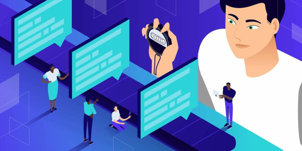
Backgrounds can set the tone for your website and greatly affect readability with solid colors, patterns, gradients, and images to choose from, selecting a background makes your information readable and accessible.
A popular option is the Squarespace gradient background which provides a smooth, aesthetically pleasing transition between colors, and a website that feels more dynamic. Gradients can add depth and texture but not overwhelm visitors and with a complementary text color, can have a significant effect in terms of legibility and engagement. Selecting a background can even elicit emotions and make a website a joy to interact with soft pastels, for instance, have a calming effect and high contrast, and bold colors make information jump out at visitors.
The Psychology of Font
Fonts do not merely convey text, they convey emotion, personality and branding and Serif fonts, for example, such as Times New Roman, have a traditional, formal atmosphere and sans-serif fonts, such as Arial or Helvetica, have a modern, clean one.
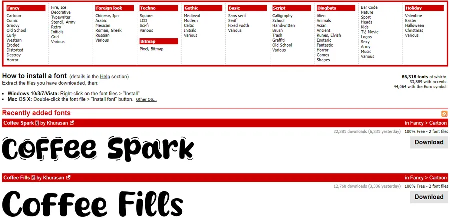
Font use can stimulate behavior and trust factors in a website visitor, for example, a legal practice can utilize a traditional serif for a professional atmosphere and a technology startup can utilize a futuristic, sans-serif for a really cutting-edge one. Script or decorative fonts, even when pleasing to one’s eyes, must not dominate a site for readability’s sake.
Font use harmonious with your site’s purpose is paramount for projecting the proper atmosphere and uniformity in all web pages and reinforces a site’s branding.
Contrast and Accessibility Through Design
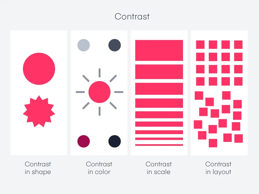
High contrast between background and text will make your content readable for all, including visitors with a visual impairment. Website compliance with standards, including the Web Content Accessibility Guidelines (WCAG), will ensure contrast ratios are high enough. Black and white is a traditional and most prevalent combination, but darker grays and lighter grays can make a modern and readable format. To go beyond color contrast and ensure your site meets WCAG 2.2 and Section 508, partner with accessibility specialists who can audit templates, remediate components, and verify fixes with assistive-technology testing. Teams like American Eagle provide end-to-end accessibility services—consultation, code-level remediation, and ongoing monitoring—so typography, backgrounds, and interactive UI all meet compliance while staying on brand. An expert audit can identify low-contrast states, insufficient focus indicators, or ARIA issues that visual design alone may miss, helping you deliver an inclusive experience without sacrificing aesthetics.
Minimalism vs Flashy Designs
Minimalist design really focuses on essentials through simple styles that put important elements first while bold design uses bright colors and bold typefaces with attention-grabbing graphics.
Your ideal aesthetic comes from matching the needs of your audience with your message. A minimal layout helps financial planning websites look reliable while images full of life work better on creative sites such as music and clothing. For a great viewing experience without going too far your site should use both design styles together. The user will enjoy their experience better when you use easy navigation and let your main content be the focus.
The Role of White Space
White space refers to empty spaces that surround design elements and website designers put white space into action to improve how users see and understand information and enhance professionalism.
Heavy disorganization in design confuses website visitors and makes the platform hard to use so you should instead opt for a strategic arrangement of open areas which helps visitors understand the content better while organizing a website effectively: well-spaced sections, texts, and photos in a website make for increased visitor activity and interaction. A well-placed use of white space helps users find important content faster plus lets them avoid unnecessary distractions during their visit.
How to Ensure Consistency in Font and Backgrounds
Consistency in design brings a brand together and forms a website that is harmonious in its overall look and feel. Having similar fonts, colors, and background colors for all web pages aids in your visitors’ recall and recognizability of your brand and in the case of a company whose logo happens to be a specific blue, for example, having similar tints in background and typography can contribute to a harmonious view.
Consistency extends to your website and must extend to any other assets of your brand, such as social profiles, ads, and business cards. Consistent use of photographs and motifs in your design will make visitors comfortable, knowing what to expect, and will make them repeat visitors to your site.
Dark Mode and Light Mode
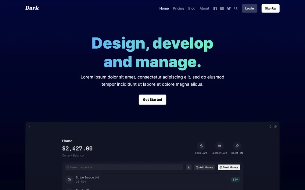
Dark mode gained prominence as an accessible feature that reduces eye strain, especially in dim environments, and dark-mode switch websites allow visitors to customize reading comfort, with easier information consumption. Dark mode can lend a modern and sophisticated appearance, but isn’t best for all websites—most prominently, for ones with a high-color, high-energy aesthetic.
Having dark mode as well as the regular and familiar light mode as an option can enhance happiness for visitors and also having a switch between both options ensures visitors with different preferences and sensitivities can use the site comfortably.
Mobile Responsiveness
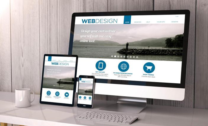
With the majority of visitors accessing websites through mobile, mobile responsiveness is critical. Font sizes have to resize, background colors have to not cover over text and white spaces have to respond to altering screen dimensions.
A site optimized for a mobile environment will enable visitors to navigate a site with ease regardless of device use. Most website platforms, including Squarespace and WordPress, include mobile-responsive themes that will respond with design elements for smaller screens out of the box. Responsive web design will even enhance SEO positioning, with search engines favoring mobile-accessible websites and as such, it is a critical part of web development in modern times.
Trends in Web Design Appearance
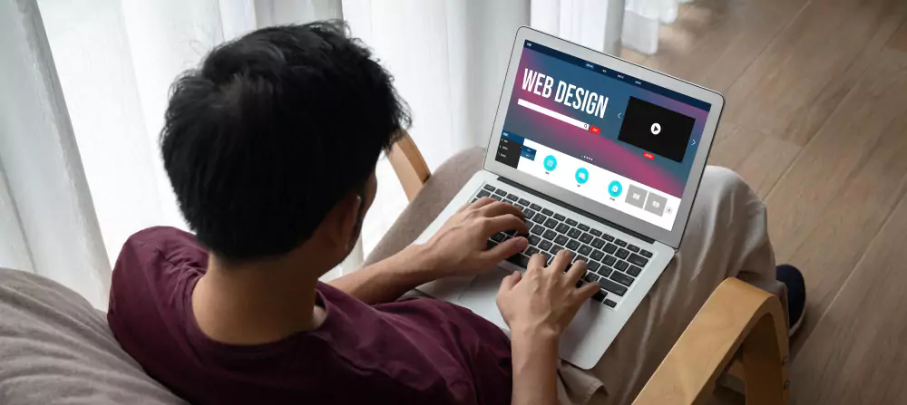
Web design trends don’t ever cease, but a few aesthetic fundamentals don’t ever go out of style, and simple layouts, monotonous colors, and flat designs have been trending for years and continue to dominate in cyberspace. Trends like bold typography, and 3D and interactive animations, however, become ever more dominant. As much as one wishes to adapt to trends, one must allow for usability and innovation in a website’s design.
A successful website must make usability a top concern but include current trends in a manner that complements and doesn’t overburden the visitor’s experience. Staying abreast of trends and holding onto usability fundamentals keeps a website both an eye’s pleasure and not at performance expense.
Enhancing User Engagement Through Movement And Animation
Modern web design tools use animations and micro-interactions to bring websites alive for users. The website gives direction to users by using small animations at button transitions and loading screens and the way this works is the system notifies users instantly through small interactions such as button icons changing at click and progress bars updating when scrolling.
Using animations in limited amounts makes them more effective because too many will create problems for users and slow down page loading but when used in appropriate areas they make the overall experience look more automatic and help visitors connect with the brand better while viewing content.
Read more: Steps To Build A WordPress Website, What Will You Need?
Contact US | ThimPress:
Website: https://thimpress.com/
Fanpage: https://www.facebook.com/ThimPress
YouTube: https://www.youtube.com/c/ThimPressDesign
Twitter (X): https://x.com/thimpress_com

