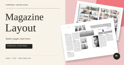
A magazine cover template gives you a starting structure for the publication name, main image, lead story, and supporting cover lines. The best choice matches your content before you change a single color. A portrait-based template, for example, will behave very differently from one designed around a landscape or a large typographic headline.
For an independent publisher, school, nonprofit, or business, a reusable cover system can reduce production time while keeping each issue recognizable. The challenge is making the template feel specific to your publication rather than leaving it looking like a stock preview.
This guide explains where to find editable cover templates, how to select one, and how to develop cover and article ideas that belong to the same magazine. It includes practical checks for print, PDF, and website promotion.
Eduma – Education WordPress Theme
We provide an amazing WordPress theme with fast and responsive designs. Let’s find out!
What Should a Magazine Cover Template Include?
A useful template establishes a clear relationship between the masthead, main visual, main cover line, and supporting information. The masthead is the publication’s nameplate. Issue date, edition information, price, and barcode space may also be needed depending on how the magazine is distributed.
These elements should have different levels of emphasis. The publication name establishes identity, the main visual attracts attention, and the lead cover line gives readers a specific reason to open the issue. Supporting lines should help rather than crowd that central message.
Look for editable text and image areas, not just a flattened preview. Check the design’s dimensions and whether its structure still works with your real publication name. A short sample masthead may conceal problems that appear when you replace it with a longer title.
ThimPress’s guide to design elements provides a useful foundation. A cover is a compact composition, so small changes to scale, contrast, and spacing can have a large effect on its hierarchy.
Where to Find Magazine Cover Templates
Start with the official libraries below. Both provide editable starting points, but the available templates, assets, and plan features can change. Review the selected design inside the editor before deciding that it meets your requirements.
1. Canva Magazine Cover Templates
Canva’s magazine cover template library includes designs for different editorial categories. It is a practical place to compare photo-led, minimalist, and typography-focused directions.

Choose a design based on its structure rather than its sample subject. A fashion preview may provide a useful framework for a founder profile if the image area, headline placement, and amount of supporting text match your story.
Check whether every chosen element is available under your account and intended usage. Replacing a premium photograph with your own image can also change the contrast and available text space, so review the whole cover afterward.
2. Adobe Express Magazine Cover Templates
Adobe Express offers a magazine cover template collection with customizable starting designs. Browse it to compare alternative compositions and test how your publication name and lead story fit.
Before building an issue around a template, export a sample and inspect it at the size you need. Check font availability, image quality, and output settings. An attractive editor preview does not establish that a file meets your printer’s production specifications.
Use the collection as a starting point for your own publication identity. Replace sample headlines with meaningful editorial promises and avoid retaining decorative elements that have no role in your issue.
Some readers search for “magazine covers templates” when comparing these libraries. Whatever phrase you use, distinguish a reusable editable design from a mockup that only places an existing cover onto a photographed magazine.
How to Choose the Right Cover Structure
| Your main asset | Suitable cover direction | What to check |
|---|---|---|
| One expressive portrait | Portrait-led editorial cover | Space around the face and masthead |
| Strong landscape photograph | Travel or place-focused cover | Readable text over the image |
| Limited photography | Typographic or illustrated cover | Originality and headline hierarchy |
| Several equally important stories | Controlled collage or modular cover | One clear focal point |
| Recurring branded publication | Consistent masthead and flexible image area | Recognition across multiple issues |
Make the decision with your actual lead story available. Selecting a template first and then forcing an unrelated photograph into it usually creates more work than choosing a suitable structure at the beginning.
Six Magazine Cover and Layout Ideas
These concepts are design directions you can build, not named downloadable products. Each Learn More button opens a related resource for developing the idea. Keep the same underlying publication identity as you explore different approaches.
1. A Portrait-Led Cover With Restrained Headlines
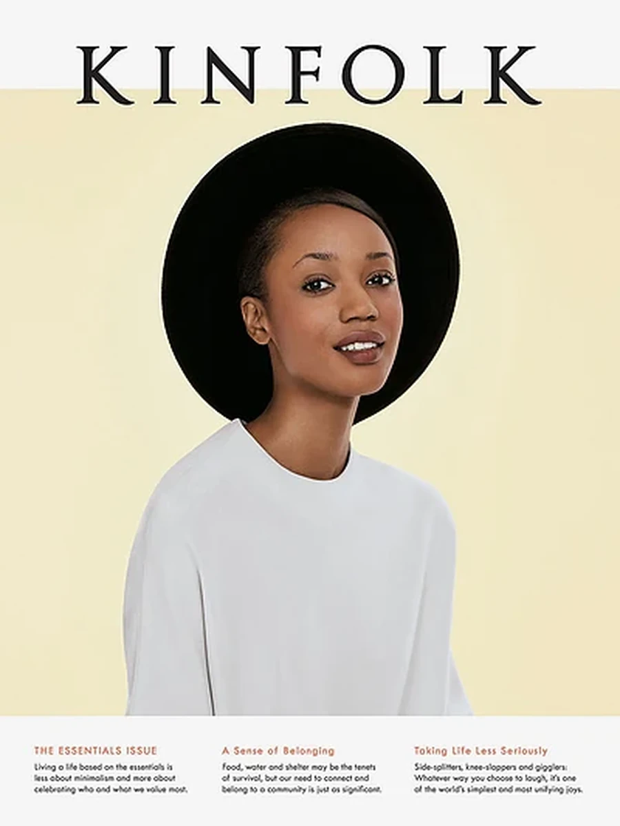
Use one person as the main visual and give the lead story a clear position beside or below the portrait. Keep supporting lines short enough that they do not cross important facial details or turn the image into a background texture.
This works for interviews, leadership profiles, fashion stories, and alumni publications. Select an expression and setting that fit the article. A thoughtful profile may benefit from a quieter photograph than a celebratory entertainment feature.
Test the image crop before writing every supporting line. If the subject fills the frame, you may need a different composition rather than progressively reducing the text size. ThimPress’s Canva photo editing guide provides background for preparing images.
2. A Typographic Cover Built Around One Statement
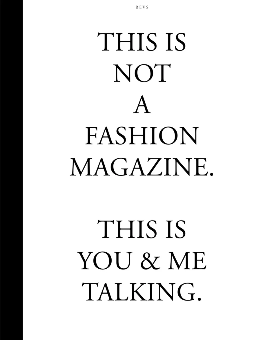
Make the lead idea the dominant visual. A large headline can work well when the issue has a compelling theme but lacks a suitable hero photograph. Use spacing, weight, and deliberate line breaks to create a recognizable composition.
Keep the wording specific. “The Future” offers less direction than a clear phrase identifying the issue’s actual subject. Let the publication name and issue information remain distinct from the main statement so readers can identify both quickly.
One supporting graphic or texture may be enough. Avoid adding several display fonts to create excitement. If you use custom typography, consult the guide to uploading fonts to Canva and check current feature access and font licensing.
3. A Travel Cover With a Clear Sense of Place
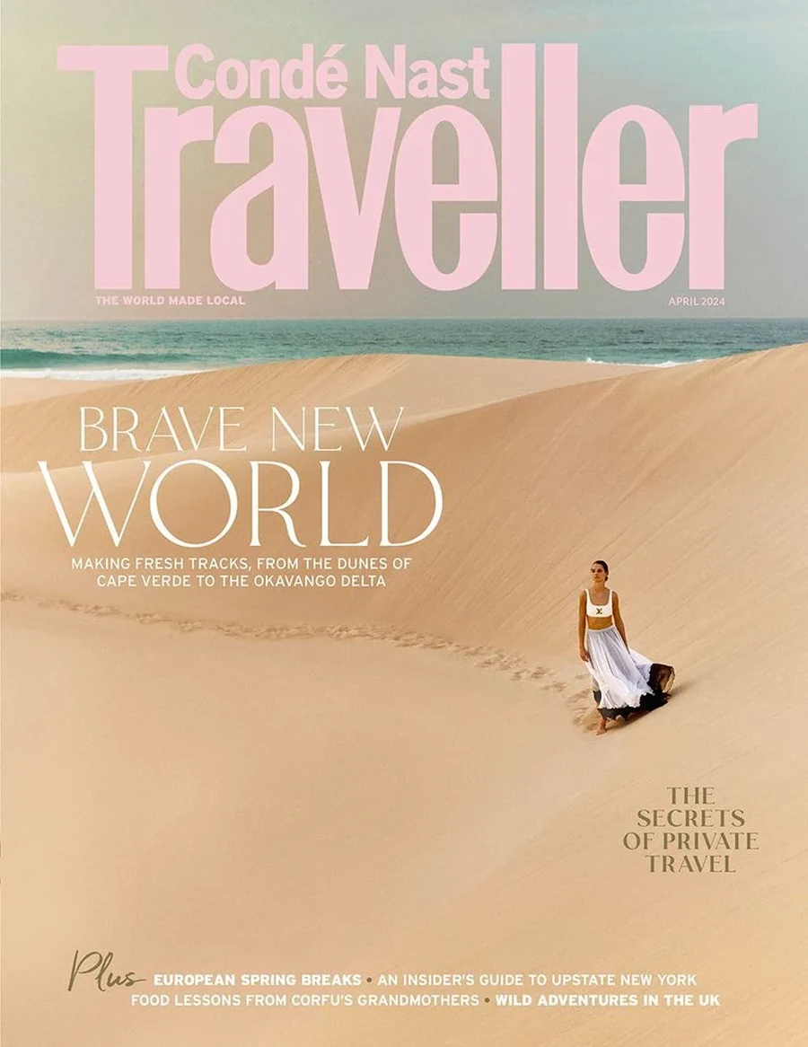
Choose a location image that communicates something distinctive about the destination. Architecture, terrain, food, or a human scene can work, provided the photograph supports the lead story rather than functioning as generic scenery.
Look for a composition with usable space for the masthead and main line. A busy cityscape may require a solid panel or a different crop. Do not assume a subtle shadow behind white text will solve every contrast problem.
Carry one or two colors from the photograph into supporting typography. For palette inspiration, ThimPress’s collection of modern color schemes can help you compare combinations without copying another publication’s entire visual identity.
4. A Minimalist Cover With Generous Space
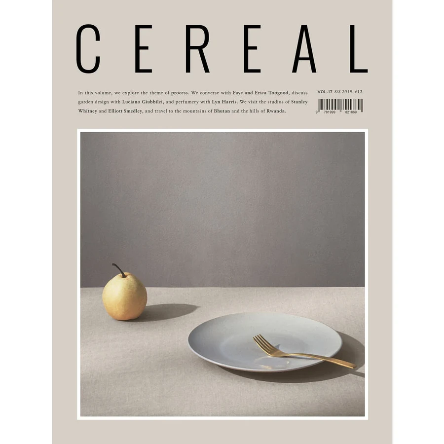
Place a carefully chosen image or illustration within a restrained composition. A clear masthead, one strong lead line, and limited supporting information can create a confident cover when the subject already carries visual interest.
Minimalism requires decisions, not simply fewer elements. Check whether the remaining image is compelling, whether the headline communicates value, and whether spacing feels intentional. An empty page with an unclear message will still feel unfinished.
This direction suits design journals, cultural publications, and selective brand magazines. Establish repeatable rules for typography and placement so the next issue belongs to the same family. ThimPress explains how these decisions contribute to brand identity design.
5. A Controlled Collage for a Multi-Topic Issue
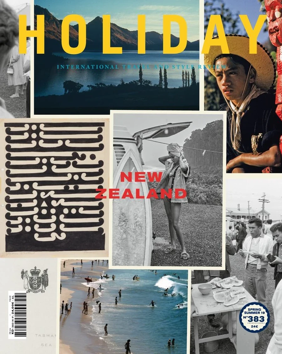
A collage can introduce several contributors, products, or themes, but it still needs a dominant focal point. Begin with one primary image or headline, then place the supporting material in a deliberate system around it.
Keep image treatment consistent through cropping, borders, or background handling. Mixing unrelated cutouts, photo styles, and decorative shapes without a shared rule can make the cover look like several unfinished concepts combined.
This approach can work for community magazines, seasonal guides, and creative issues. Limit the number of promoted stories to what readers can distinguish at a glance. ThimPress’s overview of graphic design principles and applications provides related context for organizing competing visual elements.
6. An Illustrated Cover With a Strong Editorial Idea
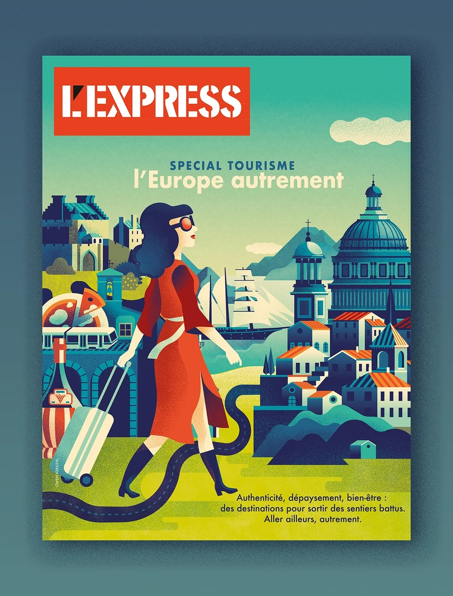
Illustration is useful when a story involves an abstract concept, a difficult-to-photograph situation, or a distinctive editorial viewpoint. Start with the idea you need to communicate, then decide whether a symbolic image, scene, or visual metaphor fits.
Keep the relationship between the illustration and headline clear. If readers need a long explanation to understand the connection, simplify the concept. Avoid adding decorative icons that dilute the central image.
Commission original artwork or choose properly licensed material that suits the publication. Confirm that its resolution and format support your output. ThimPress’s guide to free design resources offers starting places for researching assets, with individual usage terms still requiring review.
Customize a Magazine Cover Template in Seven Steps
Step 1: Write a short issue brief
Define the audience, issue theme, lead story, and distribution channels. Specify whether the cover must work on a printed magazine, a downloadable PDF, a sales page, and social media. Those formats may need coordinated versions rather than one crop.
Step 2: Confirm size and production requirements
Use the final trim size or digital dimensions before arranging the cover. For print, ask the provider about bleed, safe areas, color settings, and whether the cover should be supplied separately from interior pages. Do not assume every US magazine uses Letter size.
Step 3: Replace the masthead and establish hierarchy
Enter the real publication name and check its width, spacing, and visibility. Decide which elements should remain consistent across issues. Test whether the masthead is recognizable without letting it overwhelm the lead story.
Step 4: Add the lead image or illustration
Choose the image based on editorial meaning and usable composition. Inspect the crop at final size and retain enough flexibility for promotional versions. Make sure any retouching preserves the intended meaning of the photograph.
If the image needs substantial adjustment, compare your workflow options in ThimPress’s Canva versus Photoshop guide. A template editor and a detailed image editor can serve different roles in the same project.
Step 5: Write and prioritize cover lines
Lead with a specific story promise and support it with a few useful secondary lines. Edit for clarity before adjusting typography. Shorter copy often improves the composition more effectively than shrinking text until it fits.
Step 6: Apply your palette and check contrast
Use color to create emphasis and connect the cover to the publication. Check text against the actual image rather than against an empty template. ThimPress’s explanation of choosing a color scheme provides useful background for building a controlled palette.
Step 7: Review real-size and thumbnail versions
Print a proof or inspect the cover at its intended physical size, then reduce it to a small thumbnail. The full-size version reveals production problems, while the thumbnail reveals whether the masthead, image, and main story remain distinguishable.
Ask another person what they notice first and what they think the issue covers. Their answer can reveal a hierarchy problem that is difficult to see after several hours of editing.
Connect the Cover to a Modern Magazine Layout
A modern magazine layout feels intentional across the issue. Repeat selected typography, color accents, and image treatments inside, while allowing article pages to prioritize reading. The interior should fulfill the cover’s promise rather than repeat its promotional density.
Build a simple style guide covering headline levels, body text, captions, page numbers, and section labels. Include examples of a feature opener and continuation page. This gives contributors a practical reference instead of relying on a mood board alone.
For a digital publication, consider the entire reading journey. ThimPress explains user experience design, which can help frame navigation, article flow, and access to related stories.
Keep a record of what remains fixed and what changes each issue. A stable masthead with flexible imagery gives you recognition and variety without rebuilding the whole system.
Magazine Article Layout Ideas That Support the Cover Story
Turn a portrait cover into an interview feature
Open with a wider environmental portrait or a detail from the same session. Use a clear headline and short introduction, then settle into a readable question-and-answer structure. Carry one cover accent color into questions or section labels without coloring every paragraph.
Select supporting images that add context rather than reproducing the cover repeatedly. ThimPress’s guide to organizing a portfolio offers related ideas for choosing complementary visual material.
Turn a destination cover into a visual journey
Sequence an establishing scene, a human moment, and useful details. Place practical information in a consistent supporting panel. The main story should retain a clear path even when readers skip the travel tips or reference information.
Turn a themed cover into an explanatory feature
Introduce the central question, explain the context, and use a timeline or comparison where it helps. Keep labels and citations clear. A dramatic cover can lead into a calm, well-organized article without losing its identity.
For larger projects, a designer can develop those coordinated page types. ThimPress’s explanation of what a graphic designer does can help you define the scope of that collaboration.
Prepare Separate Versions for Print and Digital Promotion
A print cover needs the dimensions, bleed, color handling, and export settings your provider requests. Important text should stay within the agreed safe area, while artwork intended to reach the edge should extend appropriately beyond trim.
Adobe’s guidance on preparing print-ready PDFs provides a production reference. Request a proof when color, image detail, or placement is important, and inspect the exported file rather than only the editable source.
For your website, create an optimized image preview and keep the publication description as readable HTML text. A portrait cover may need a separate landscape promotional graphic instead of a crop that removes the masthead.
On WordPress, compare magazine theme options and blog theme structures when planning your publication’s home. Check the issue archive and article pages as well as the main landing page.
If a simple promotional site is enough, ThimPress also covers building a website with Canva. Choose the publishing platform around your ongoing editorial needs rather than the tool used to design the cover.
Common Magazine Cover Template Mistakes
- Keeping the sample’s hierarchy: your lead story may need more emphasis than the template’s original headline. Rebuild the order around your actual content instead of treating the placeholder layout as a fixed rule.
- Promoting too many stories: every additional line reduces the space available for the main image and lead promise. Remove the weakest secondary message before reducing the size of every element.
- Choosing an unsuitable image: a beautiful photograph can still leave no usable space for text. Change the composition or template rather than forcing an awkward overlap.
- Skipping final checks: proof publication names, dates, prices, credits, and issue numbers separately from the feature headlines. Familiar recurring details are easy to overlook during a visual review.
Example: Adapt One Cover Template Across Three Issues
Imagine a fictional independent magazine called Local Makers. Its cover system uses a fixed masthead position, a small issue label, one dominant photograph, and a lead line in the lower third. The team wants recognition without publishing the same-looking cover every month.
The first issue profiles a ceramic artist. An environmental portrait leaves a quiet area beside the subject, so the lead line sits there instead of covering the workbench. The second issue features a bakery, where an overhead image provides a different visual rhythm. The third uses a close-up of handmade furniture and a shorter, bolder headline.
The masthead, supporting type, and issue information remain consistent. Image cropping and lead-line placement change within defined limits. The team tests all three concepts before approving the system, discovering early that one photograph needs more space than the original template allowed.
The most useful magazine layout ideas create that balance between identity and flexibility. Your template should accommodate different stories while keeping the publication recognizable in an issue archive, subscriber email, or printed display.
A Simple Cover Review Before You Export
Ask a reviewer to identify the publication name, lead story, and intended audience without any explanation from you. If they interpret the subject differently from the editorial brief, revise the image and wording together. Changing the font alone may not solve the misunderstanding.
Next, review several covers side by side. Check whether the publication looks consistent, whether one issue appears unintentionally unrelated, and whether a repeated image treatment has become predictable. Keep the strongest shared rules and adjust the parts that restrict your stories.
Finally, inspect the exported cover on the channels where readers will encounter it. Review the PDF opening page, website thumbnail, and email preview separately. Confirm that compression has not damaged small text and that promotional crops do not remove the publication name or misrepresent the main story.
FAQs About Magazine Cover Templates
Can I find a magazine cover template for free?
Yes, official template libraries include free starting options. Check the selected template, individual assets, and export requirements before completing the design. Free access to an editor does not mean every item in its library is included.
What size should a magazine cover be?
Use the publication’s final trim size and the printer’s specifications. Digital promotions may need different dimensions. Confirm the requirements before customizing so you do not have to rebuild the composition later.
How many cover lines should I include?
Include one clear lead story and only as many secondary lines as the composition can support comfortably. The useful number depends on the image, publication style, and available space rather than a universal rule.
Can I use the same template every issue?
Yes. Keep recognizable elements consistent while changing the imagery and editorial emphasis. Test several different issues in the system so you know it can handle more than the original sample story.
Conclusion
The right magazine cover template gives your publication a clear identity and gives readers a specific reason to open it. Choose the structure around your lead story, customize it with real content, and connect its design to the article pages inside.
Review the result at full size and as a thumbnail, then prepare appropriate files for print and digital use. A repeatable cover system will make future issues easier to produce while leaving room for fresh editorial ideas.
Read More: Magazine Layout: Design Ideas, Examples & Free Templates
Contact US | ThimPress:
Website: https://thimpress.com/
Fanpage: https://www.facebook.com/ThimPress
YouTube: https://www.youtube.com/c/ThimPressDesign
Twitter (X): https://x.com/thimpress_com