A strong magazine layout helps readers understand a page before they read every word. The headline identifies the story, the image establishes its mood, and the text columns make the article comfortable to follow. Good editorial design brings those elements together without making them compete.
You do not need an elaborate design to achieve that result. A clear grid, readable typography, suitable images, and consistent spacing can give a small business publication or independent magazine a professional structure.
This guide explains the principles of magazine layout design, provides practical page examples, and shows how to choose and customize a template. It also covers the differences between a printed magazine, a downloadable PDF, and a WordPress publication.
Eduma – Education WordPress Theme
We provide an amazing WordPress theme with fast and responsive designs. Let’s find out!
What Is a Magazine Layout?
A magazine layout is the arrangement of text, images, headlines, captions, and supporting information across a page or spread. A spread consists of two facing pages considered together. Layout establishes reading order, creates emphasis, and connects individual articles to the publication’s identity.
A magazine layout template is a reusable starting structure. It may contain sample pages, predefined text styles, image frames, and placeholder copy. The template provides a framework, while the final layout responds to the real article and its visual material.
For example, an interview needs a different rhythm from a product roundup. An interview may alternate questions and answers around one portrait, while a roundup needs repeated product modules that readers can compare quickly.
For broader context, ThimPress explains what graphic design includes. Editorial layout applies those visual communication principles to a reading experience that continues across multiple pages.
The Building Blocks of Magazine Layout Design
A grid that supports different stories
A grid provides invisible alignment guides. Columns organize text, margins separate content from the page edge, and gutters create space between columns. Together, they give different pages a shared structure even when their images and headlines change.
Start with a flexible grid rather than designing every page independently. A six-column page, for instance, can support three text columns spanning two grid units each, a wide image, or a narrow sidebar. The grid creates options without requiring six tiny text columns.
Hierarchy that makes the reading order obvious
Readers should recognize the main headline, introduction, body text, and supporting material immediately. Create that order through size, weight, placement, and spacing. If the headline, quotation, and sidebar all receive equal emphasis, the page offers no clear starting point.
ThimPress’s guide to basic design elements provides useful background for organizing these relationships. In a magazine, apply emphasis selectively so each spread has one dominant idea.
Typography that remains comfortable at actual size
Choose body typography for sustained reading, then choose headline typography for personality. Two well-matched type families are often enough. Use styles for headlines, subheadings, body paragraphs, captions, and credits rather than formatting each text box separately.
Review a printed proof or an actual-size screen preview. A font that looks elegant while zoomed in may become tiring in a narrow column. Adjust line length, leading, and paragraph spacing together, and check awkward line breaks after every major edit.
White space, images, and controlled color
White space separates ideas and gives important material room to register. It does not have to be white; an uncluttered area of any background color can perform the same function. Avoid filling every opening with another label or decorative mark.
Choose images for their editorial role. A photograph can introduce a location, reveal a subject, explain a process, or supply evidence. Supporting images should add information rather than repeat the same composition at smaller sizes.
Connect these choices to your publication’s brand identity. For palette planning, compare ThimPress’s explanation of color schemes with its collection of modern color combinations, adapting the ideas to your editorial context.
Magazine Page Layout Examples: Six Practical Structures
The following magazine page layout examples are original planning scenarios, not downloadable template files. Each describes a structure you can build with your own copy and photography. The buttons open related resources that support the design approach.
1. The Image-Led Feature Opener
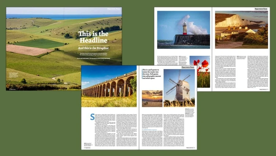
Use one large image to establish the story, then place a headline and short introduction where the photograph leaves enough quiet space. On a two-page spread, the image can occupy one page while the opening copy occupies the other.
This structure suits travel, architecture, food, and profile features. The image should carry a specific part of the story, such as the scale of a landscape or the atmosphere of a restaurant. A generic stock photo will weaken the opening even if the layout is polished.
Keep essential details away from the binding area. If text overlaps the photograph, test every line for contrast and choose a different crop when necessary. Carry the image’s visual tone into the next page so the opening feels connected to the article.
For practical cropping and image preparation, review ThimPress’s introduction to the Canva photo editor.
2. The Readable Long-Form Article
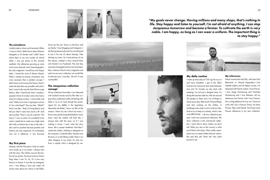
A text-focused magazine article layout gives readers a stable path through a substantial story. Begin with a headline, a short deck, and a byline, then use consistent columns and restrained subheadings to divide the narrative.
Add a photograph or meaningful quotation where it creates a useful pause. Avoid inserting a pull quote solely to fill a hole, especially if it interrupts the same paragraph across several disconnected text boxes. Reading continuity matters more than visual variety.
This format works for reported features, essays, and business analysis. Build the layout with realistic copy before approving it. A beautiful placeholder spread may fail once the real headline grows longer and the article includes names, numbers, and references.
Keep the type system repeatable so future issues retain the same voice. Designers using Canva can consult the guide to uploading fonts to Canva, checking current account eligibility and font permissions first.
3. The Portrait and Interview Layout
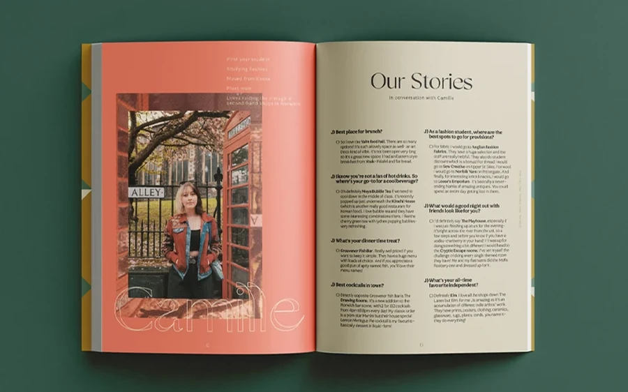
Pair one strong portrait with a clear question-and-answer structure. Give questions a consistent weight or color, and keep answers visually quieter. Readers should be able to distinguish the speaker without decoding a new formatting rule on every page.
Use the portrait to communicate context. An artist in a working studio tells a different story from the same person photographed against a plain wall. Include a caption when the setting or gesture contributes information that the article does not explain.
A small biography panel can hold background facts without interrupting the conversation. Keep its hierarchy subordinate to the interview itself. If several portraits appear, vary their scale intentionally rather than presenting a row of almost identical headshots.
This approach is useful for founder interviews, alumni magazines, and creator profiles. ThimPress’s portfolio presentation guide offers related ideas for selecting and organizing visual work.
4. The Modular Product or Resource Roundup
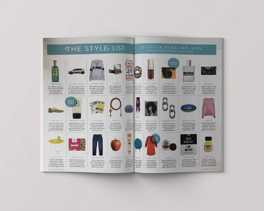
Build a repeated module containing an image, a name, a short description, and the most useful comparison detail. Align equivalent information across modules so readers can scan the page without repeatedly searching for the same field.
This structure suits shopping guides, book recommendations, equipment selections, and resource pages. Establish a realistic word limit before writing. One item with a paragraph and another with three words will make the grid feel uneven and may distort their apparent importance.
Use a featured module only when there is an editorial reason to prioritize that item. For digital editions, make links descriptive and test them after export. For print, use readable URLs or carefully tested QR codes where they genuinely help readers.
If you need supporting assets, explore ThimPress’s collection of free design resource websites. Review each asset’s usage terms before adding it to a commercial publication.
5. The Structured Explainer Page
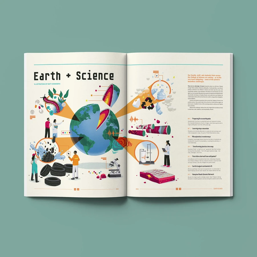
An explainer organizes a complex topic into a main narrative and a small number of supporting elements. A diagram, timeline, comparison table, or definition panel can help when it answers a specific question that prose alone handles poorly.
Keep the hierarchy explicit. The headline introduces the subject, the main text explains it, and supporting panels provide additional detail. Too many equally sized boxes can turn the page into a dashboard with no clear reading order.
This magazine page layout design works for science, finance education, industry reports, and practical guides. Check that visual labels remain accurate and readable. A decorative chart with unclear units will undermine the article rather than make it easier to understand.
For a digital explainer, test whether the supporting elements still make sense when stacked vertically. ThimPress’s introduction to user experience design provides a useful perspective on that reading journey.
6. The Creative Photo Essay
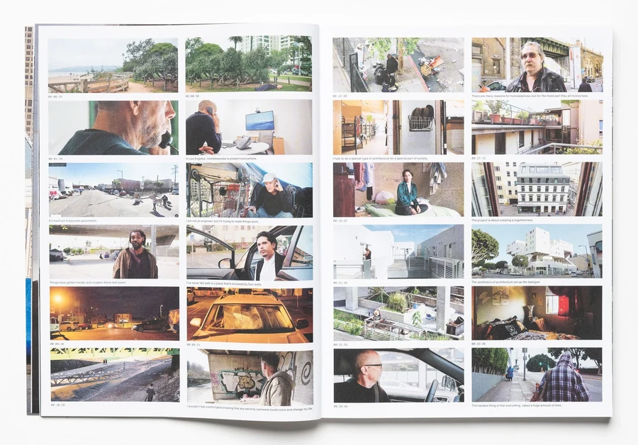
A creative magazine layout can tell a story through image sequence rather than a large amount of text. Begin with an establishing photograph, follow with details or human moments, and close with an image that gives the sequence a sense of completion.
Vary image scale to create rhythm. One dominant photograph and two supporting details often communicate more clearly than six equally sized pictures. Keep captions close to the corresponding images and make reading order unambiguous.
Use deliberate exceptions to the grid, such as one full-bleed image or an unusually large title, while retaining consistent margins and typography elsewhere. Creativity becomes more convincing when readers can recognize the structure behind it.
This format works for documentary stories, fashion editorials, and visual portfolios. If the project needs more advanced editing, ThimPress compares Canva and Photoshop as different tools within a broader design workflow.
Choose the Right Layout for the Story
| Content type | Useful starting structure | Main priority |
|---|---|---|
| Travel feature | Image-led opener and readable continuation | Strong photography with a clear narrative |
| Interview | Portrait and question-and-answer pages | Speaker distinction and reading flow |
| Buying guide | Repeated product modules | Comparable information |
| Educational article | Text with explanatory panels | Accurate hierarchy and labels |
| Photo essay | Sequenced images with short captions | Visual pacing and meaningful captions |
These structures can coexist within one issue. Repeat the underlying styles, then change image scale and page rhythm according to the story. A consistent publication does not require every article to look identical.
Where to Find a Magazine Layout Template
Canva Article Templates
Canva’s article template library includes editable editorial-style starting points. Evaluate templates with real text and images rather than selecting only by their preview thumbnails.
Check the page count, dimensions, editing requirements, and assets included. A cover-only design will not supply the interior system for a complete issue. Free and paid elements can also appear within the same broader library, so inspect your chosen design before committing.
Adobe Express Magazine Maker
Adobe Express provides an online magazine maker with customizable design starting points. It is another option for exploring editorial compositions and preparing smaller publications.
Before building a full issue, test one representative spread and export a sample. Confirm that the available controls, output options, and collaboration setup fit your project. Choose a dedicated page-layout application when your production requirements exceed the editor’s capabilities.
If you are searching for a magazine template free of charge, check more than the initial download price. Verify fonts, photographs, commercial permissions, export access, and any premium elements. A free starting file may still require replacement assets or additional production work.
How to Build Your Magazine Layout Step by Step
Step 1: Define the audience and delivery format
Write a short brief covering the reader, publication purpose, article lengths, visual tone, and distribution method. Decide whether you are creating a printed issue, a screen-focused PDF, a website, or coordinated versions of all three.
For a US print project, Letter size may be a convenient starting point, but it is not a universal magazine standard. Confirm trim size, binding, page count, and delivery specifications with your printer before choosing a template.
Step 2: Build a page plan
Map the issue before arranging individual spreads. Allocate space for the contents page, features, recurring departments, advertisements, and back matter. A page plan helps you catch an overlong section before the entire design depends on it.
Gather near-final copy and approved images. If photographs are missing, note their expected orientation and purpose. A wide landscape placeholder will not tell you whether a narrow portrait can support the same page.
Step 3: Establish reusable styles
Set your grid, margins, typography, and recurring elements. Build a feature opener, a continuation page, and a short department page first. Those prototypes reveal whether your design system can handle the issue’s real variety.
Name styles clearly so collaborators know what to apply. If you are hiring help, ThimPress’s explanation of a graphic designer’s role can help you frame the brief and expected production deliverables.
Step 4: Fit the content and refine the sequence
Place the real article, then adjust the layout around its structure. Edit overly long headings, move supporting panels, and revise image crops. Avoid shrinking body text simply because the first arrangement does not fit.
Review several spreads together. Alternate dense reading with lighter visual moments where the editorial plan supports it. Confirm that section labels, page numbers, and recurring typography stay consistent throughout the issue.
Step 5: Proof and export
Check spelling, captions, credits, missing fonts, image links, and text that overflows its frame. Review page references after final pagination. Have someone unfamiliar with the layout read a proof and report any confusing transitions.
For professional printing, follow your provider’s bleed, color profile, and PDF requirements. Adobe’s print-ready PDF guidance explains production checks such as preflight and linked resources. Export a separate screen version when appropriate rather than forcing one file to serve every purpose.
Adapt a Magazine Layout for WordPress
A printed spread has fixed dimensions; a website has changing viewport widths and interactive navigation. Translate the editorial hierarchy into responsive sections rather than uploading every article as a full-page image.
Use real headings and readable body text, then add suitable image blocks, captions, and related stories. On mobile, columns usually need to stack in a sensible order. Check that advertisements and sidebars do not interrupt the article’s main argument.
For theme planning, compare ThimPress’s WordPress magazine themes and its overview of different blog theme types. Evaluate the article template as carefully as the homepage because sustained reading happens inside individual stories.
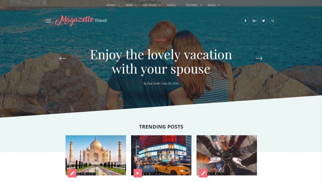
A small promotional website may use a simpler publishing workflow. ThimPress also explains creating a website with Canva; compare its current capabilities with your needs for archives, categories, and ongoing editorial management.
A Worked Example: Planning an Eight-Page Community Magazine
Consider a fictional community magazine with one local business profile, a neighborhood photo story, and a short events section. The editor has limited photography and wants an issue that can be printed and shared as a PDF. A compact page plan helps the team avoid designing more material than it can produce.
Page one is the cover, while page two combines a brief editor’s introduction with a small contents list. Pages three and four carry the business profile, pages five and six hold the photo story, page seven presents events, and page eight closes with contact and subscription information. Confirm the final page arrangement with the printer, especially when binding or a separate cover changes the production plan.
The profile uses a portrait-led opener followed by a stable text page. The photo story uses one large establishing photograph and smaller details. The events page uses repeated modules with the same order: date, event name, location, and short description. Each section has a distinct purpose, but the same type styles and margins connect them.
During the first proof, the editor discovers that the profile is longer than planned. The team shortens repetitive passages and moves a useful background fact into a small panel. It does not reduce the entire magazine’s body type just to preserve one draft’s word count.
The PDF version includes working links where appropriate, while the printed version uses concise contact information. Both receive a final review for correct dates, image credits, and page references. This approach keeps the production decisions tied to the actual content rather than to an attractive but unrealistic template preview.
Magazine Layout Mistakes to Catch Before Publication
- Designing only with placeholder copy: test the longest headline, a dense article, and a page with several captions. Your system should handle awkward content, not just the most photogenic sample spread.
- Confusing variety with inconsistency: change image size and pacing while retaining clear rules for typography and recurring information. Readers should recognize the publication even when the article format changes.
- Treating a PDF as a mobile website: a fixed page can require zooming on a phone. If mobile reading is a priority, consider a responsive article version alongside the downloadable issue.
- Leaving production checks until the end: confirm output requirements early and review a sample export before designing every page. Early testing makes problems with image quality, fonts, and page dimensions less expensive to correct.
FAQs About Magazine Layout
What makes a good magazine layout?
A good magazine layout establishes clear hierarchy, readable text, purposeful imagery, and consistent alignment. It should match the story’s length and tone while giving readers an obvious path through each page.
How many columns should a magazine use?
There is no single correct number. Choose a flexible underlying grid, then test the resulting text widths at final size. The number of grid units does not have to equal the number of visible text columns.
Can I use a free magazine layout template commercially?
Check the template’s terms and the licenses for its fonts, images, and other assets. Permission to edit a design does not automatically answer every question about commercial use or redistribution.
What is the difference between a cover and an article layout?
A cover introduces the publication and promotes selected stories. An article layout supports sustained reading through body text, imagery, captions, and supporting details. A strong magazine needs both to feel connected.
Build a Layout That Serves the Story
Start your magazine layout with the reader and the content. Choose a grid that handles different article types, establish a readable type system, and use images with a clear editorial purpose.
A template can speed up that work, but the finished publication should reflect your own stories and identity. Test actual pages, check the final output, and keep the system simple enough to use consistently in the next issue.
Read More: Booking Page Template: How to Design One that Converts for Travel Websites
Contact US | ThimPress:
Website: https://thimpress.com/
Fanpage: https://www.facebook.com/ThimPress
YouTube: https://www.youtube.com/c/ThimPressDesign
Twitter (X): https://x.com/thimpress_com